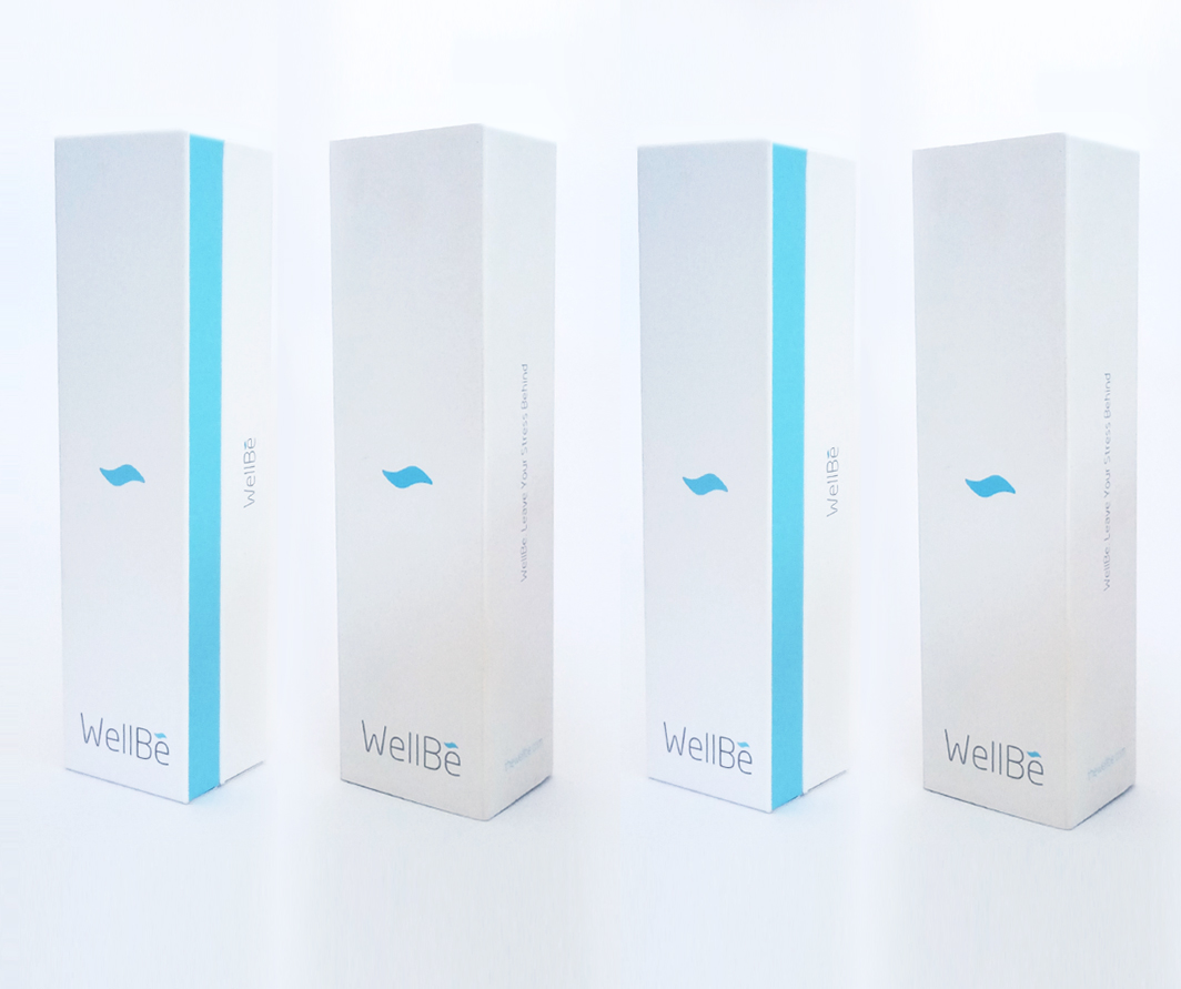
Mindfulness & Package design

Packaging design through a mindfulness perspective published by advertisers such as Weird, Forbes, Cosmopolitan, Shabble and the Holpington Pos. In our stressed world, the keyword Mindfulness We have approached to design a packaging in a soothing and gentle design that will put their customers in a state of euphoria when the bracelets reach their doorstep.
Other challenges arose when it was discovered that our packaging should fit into one of the five potential designs. In any case, after a meticulous design we made sure with our client at every step that we met his exacting standards.
We took a conscious approach to design and packaging, and finally, we completed a beautiful packaging that fits the product and can protect WellBe’s products as they embark on a journey for their new owners.
Simple, elegant and most satisfying. We were proud of the finished result and WellBe acknowledged that the packaging was just what they imagined. WellBe VP, Yigal Schneider gave the seal of approval as he radically reviewed the project, noting that the company could not be more pleased with the result.
The bracelet tracks the user’s pulse and learns to beat it. The product provides insights that offer the user how to be calmer or learn to be calmer.
WellBe’s packaging, not only includes the accompanying bracelet that directs important and meaningful information, also has WellBe’s applause that puts the findings in an intuitive, easy-to-read format that reveals what’s exciting and what eases a user’s stress.
The app provides mindfulness exercises, breathing exercises and meditation exercises, guided imagery and a stress reduction playlist.