Upright Pose
Brand: Upright
Industries
Concumer brand & Electronics, Health Care, Medical Device & Wellness, Gaming & ToysServices
GTM: This is how you create demand and awareness for your product, Packaging Design & Unboxing, Graphic Design, Unboxing Experience, Packaging Production, Packaging EngineeringUpright הייתה מעוניינת לחדור לשוק ה-consumer בארה״ב, מה שדרש עיצוב אריזה ייחודי, מדויק ובעל נוכחות.
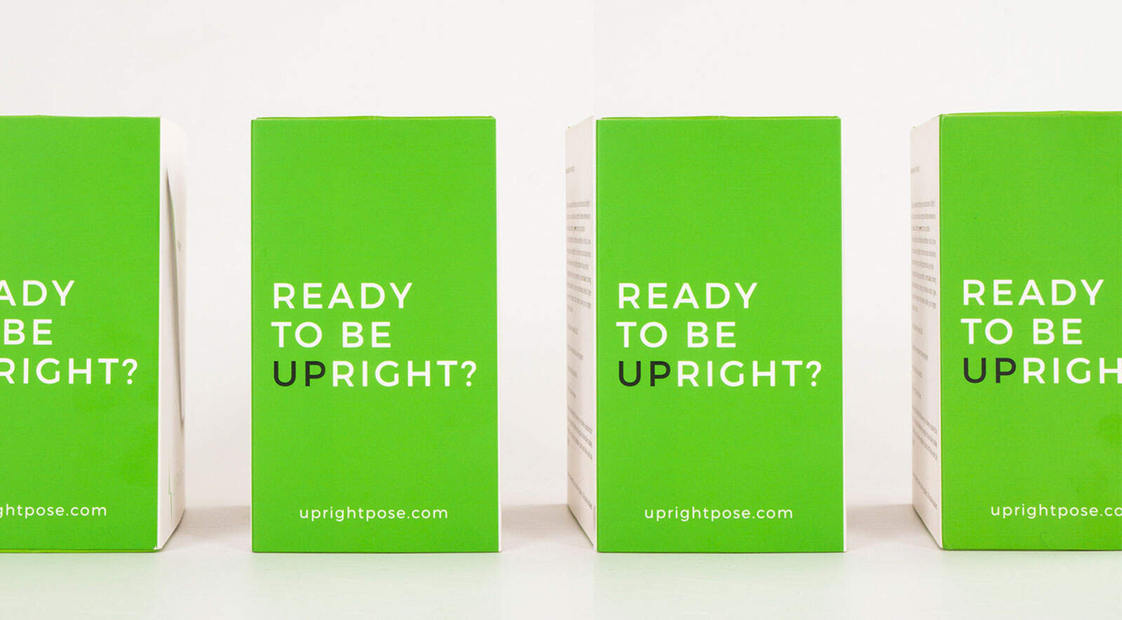
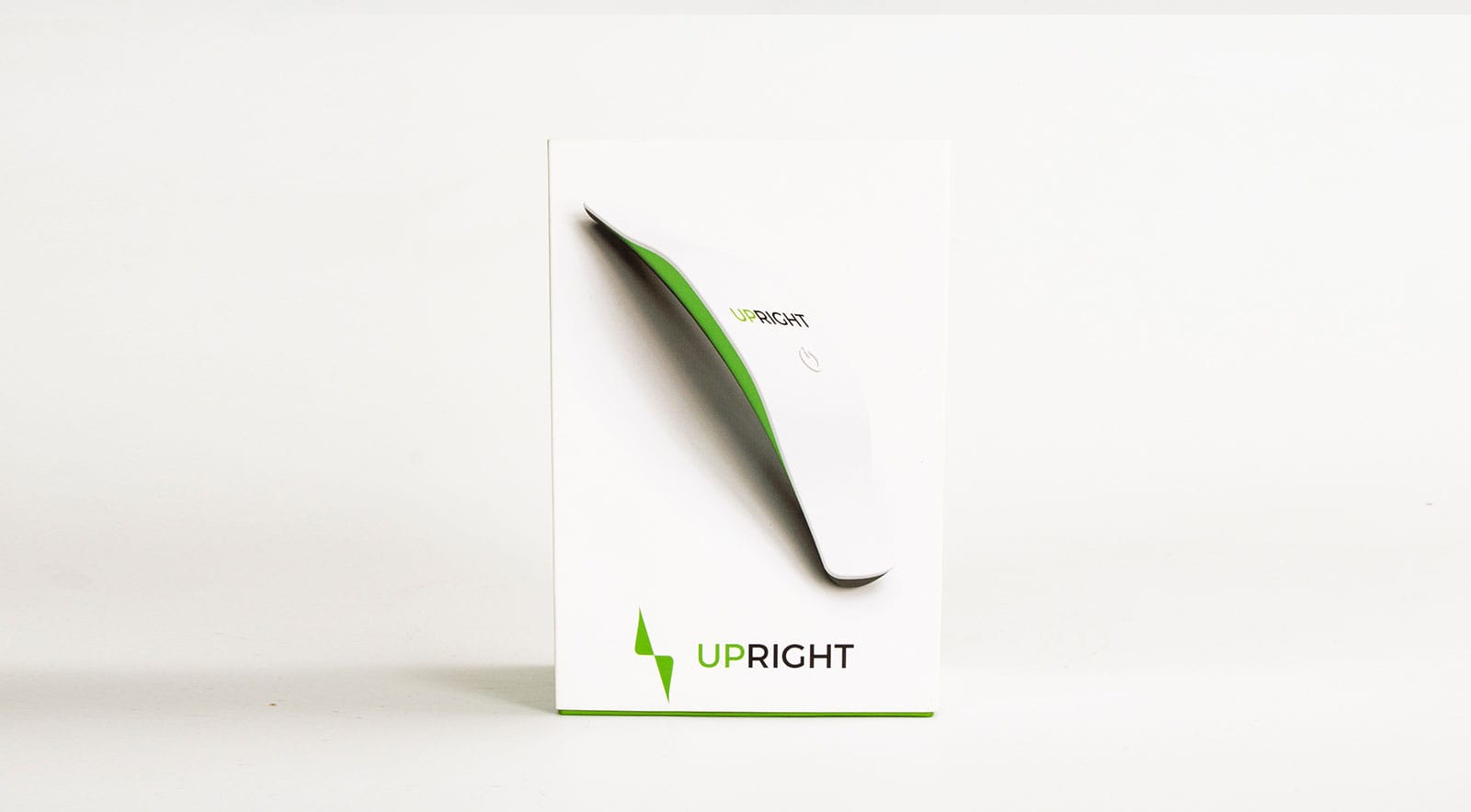
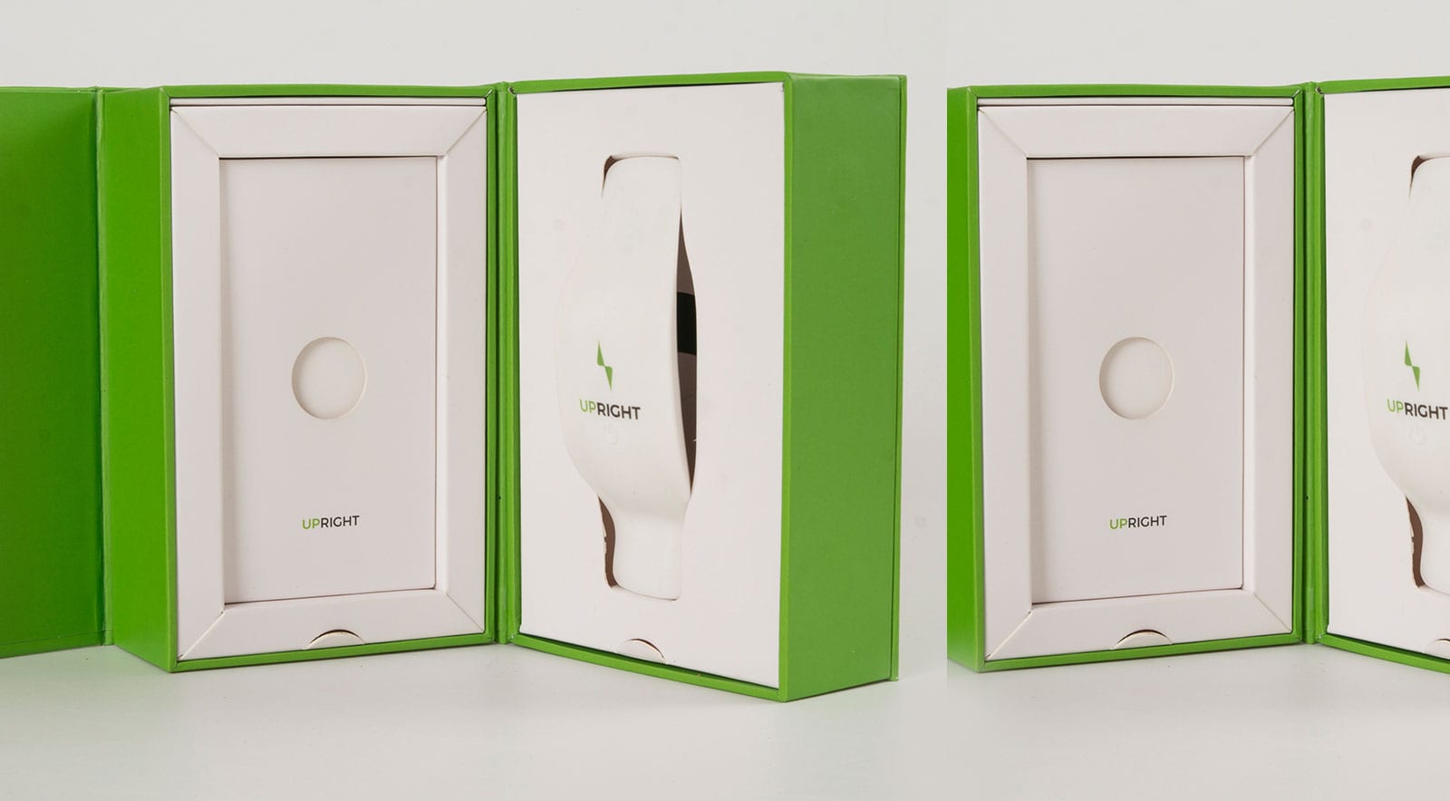
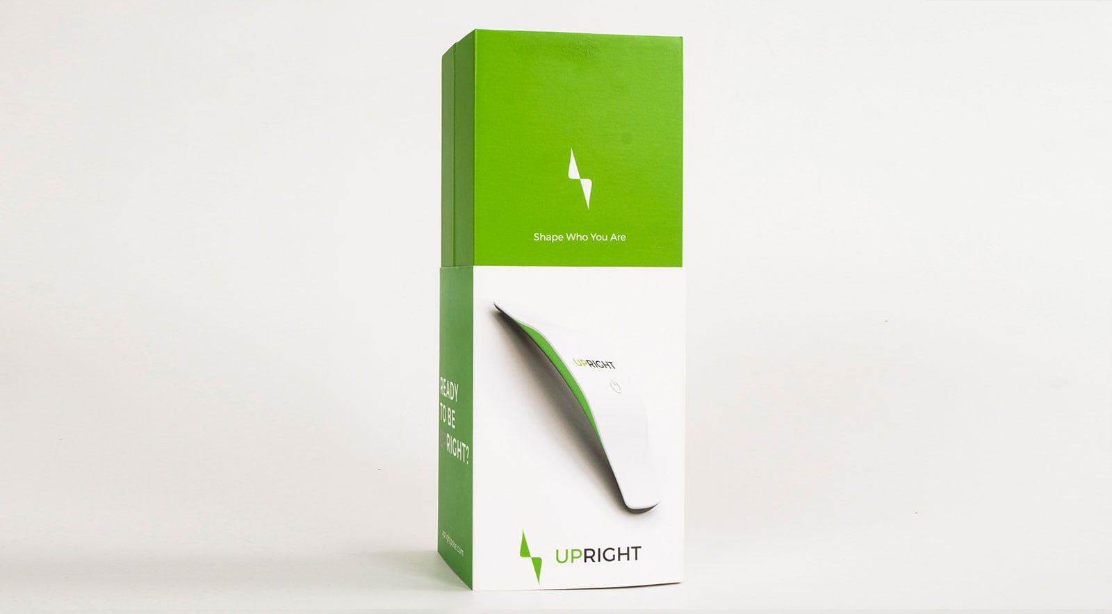
Most wellness packages lean on wellness adjectives but don’t deliver the feeling. We chose clarity with edge: the white felt clinical and intentional, the green felt fresh and posture-focused. But it wasn’t about colors—it was about experience.
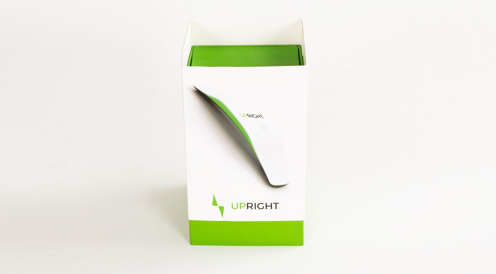
When you open the box, there’s a deliberate pause: not just "unboxing," but a cultivated posture moment. The strategic space around the product allowed it to breathe, to stand in your hands with purpose. It was a subtle invitation: this gadget is yours to elevate.
No talk of "innovative design." Instead, we deliver: you see the design, you feel the posture shift, you experience the brand claim.
- Visual dialogue - white conveys clean clinical precision; green whispers refreshed alignment.
- Unboxing as ritual - the space inside isn’t empty—it performs: tension meets invitation
- Emotional gravity - the first physical interaction feels like posture itself aligning.