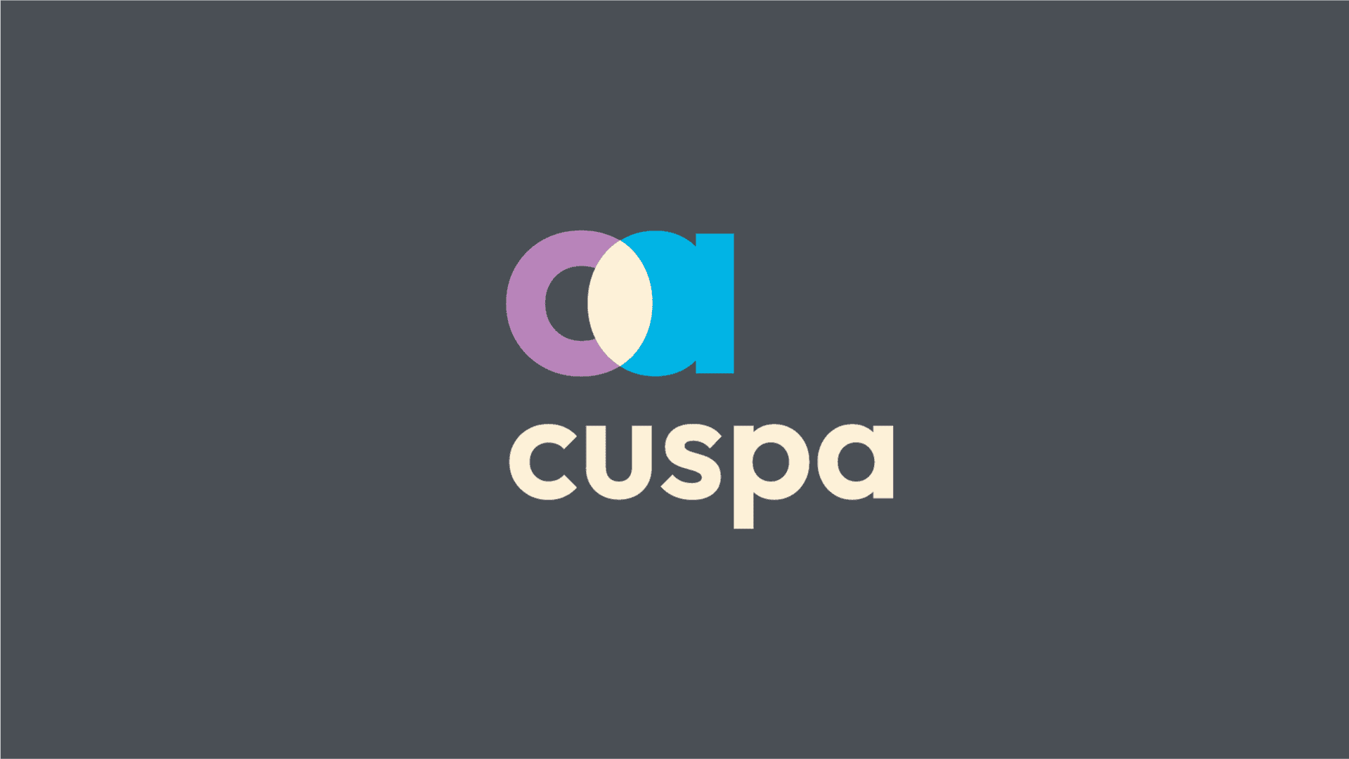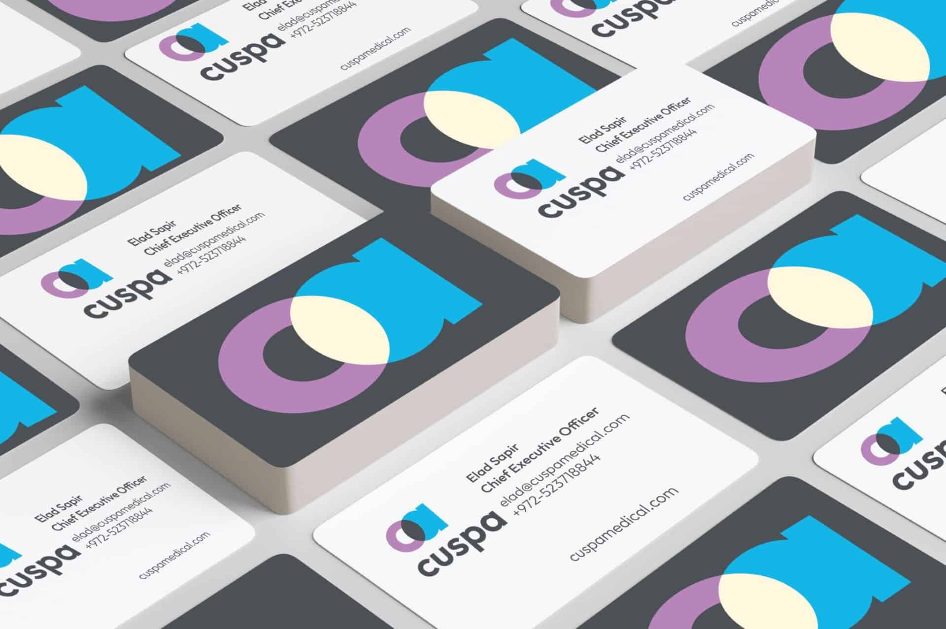

Cuspa
Brand: Cuspa
Cuspa, a heart care company. NotFromHere has designed a new identity that establishes an iconic and innovative brand in the medical field.
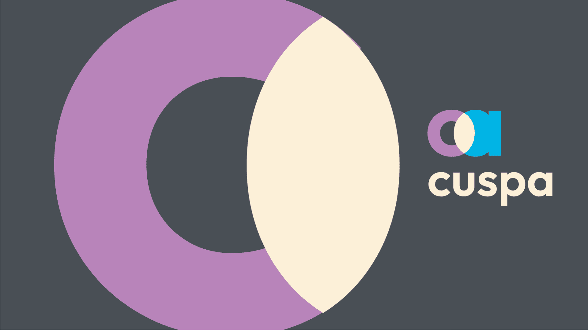
The identity is based on a bold and modern logo that uses minimalist symbols to create the brand story, inspired by the shape of the heart valve.
.
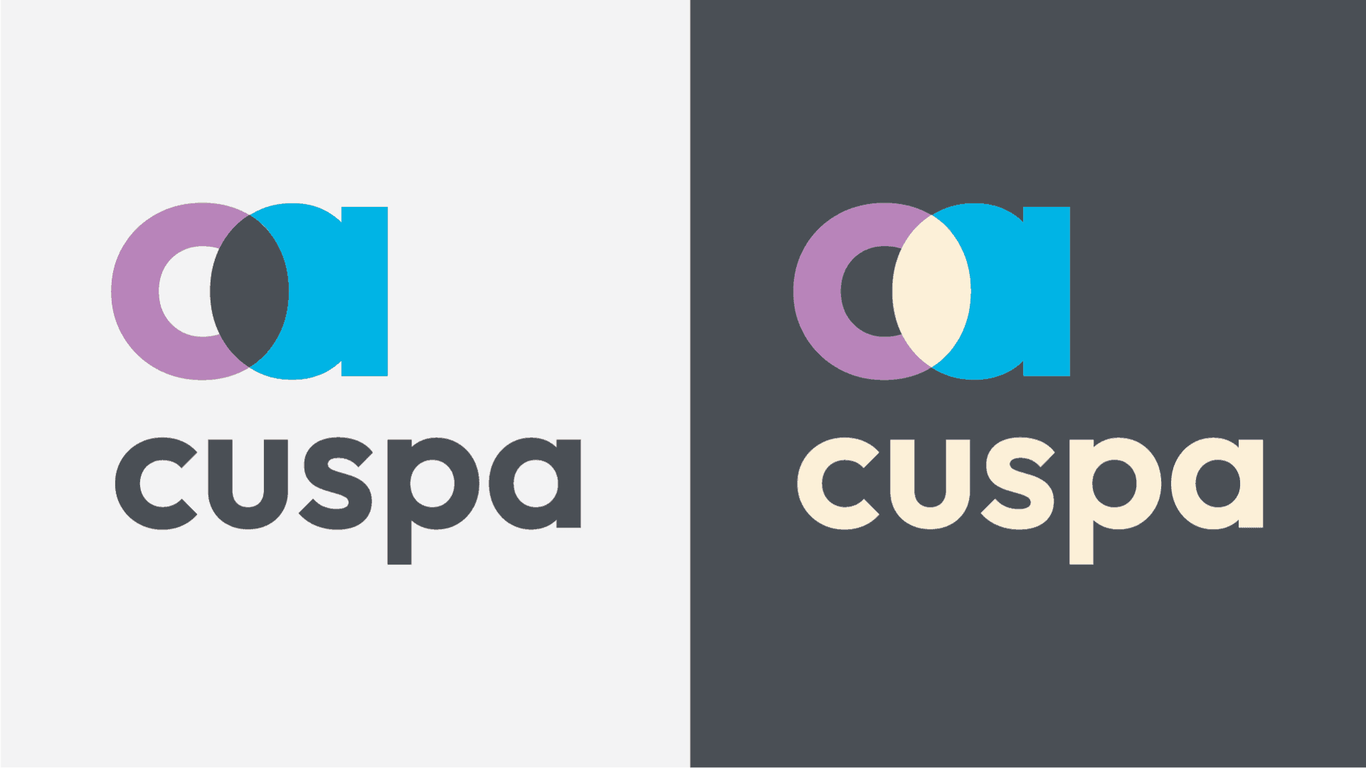
The design team's challenge was to provide a unique result that would not look like all the other companies in its category. Many medical company logos tend to look the same and use blue colors, the visibility created by conveying a similar look and the result is a uniform appearance and lack of graphic prominence. The design challenge was to produce a different brand.
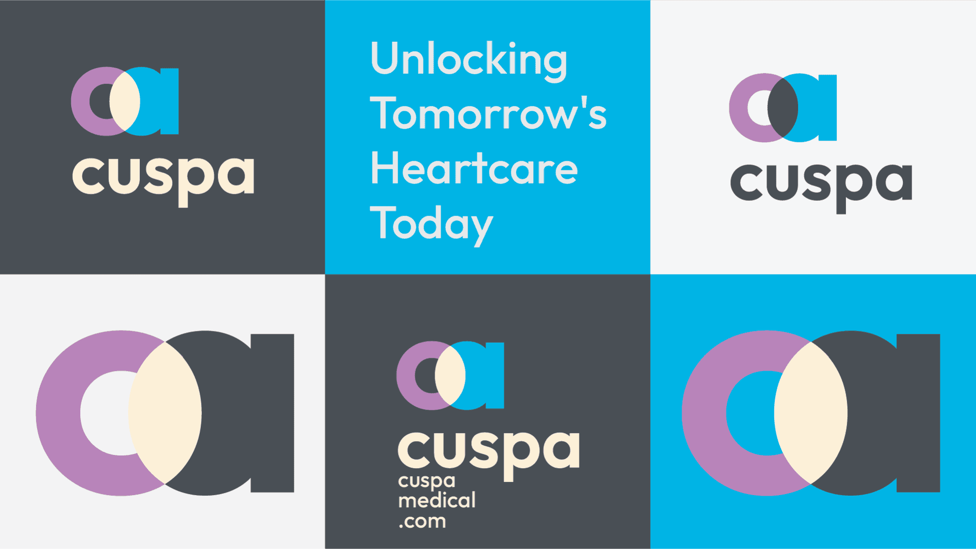
Comprehensive graphic guidelines for the brand were established. A complete visual identity to be used for all different platforms. From the investor presentation, to the wall stickers