[bread]
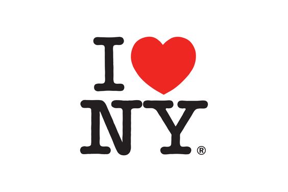
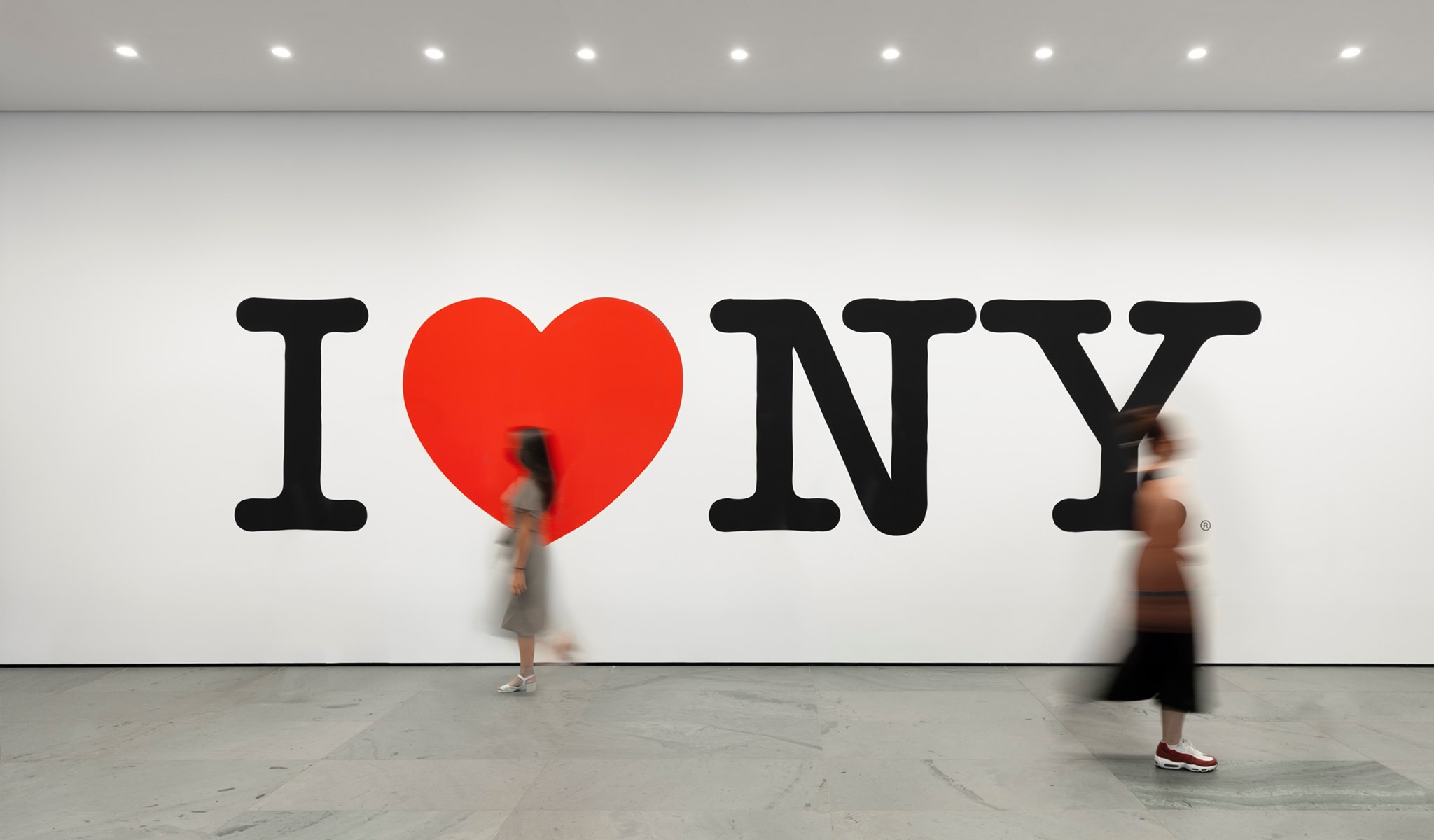
In 2001 I graduated from a design school and went straight to New York. One of the timeless symbols of this city is the subliminal symbol of Milton Glazer I ❤️ NY – one can talk a lot and expand on how genius this designer was – and how with minimum graphic elements he would kick In the viewer's soft underbelly
https://commons.wikimedia.org/wiki/File:I_Love_New_York.svg
https://www.typeroom.eu/milton-glaser-nyc-logo-moma-poster-house-reopen
With the help of two graphic elements letter and form, a red heart shape. A sharp and clear message was conveyed. I ❤️ NY The initial sketch was made in 1977, Milton sketched the draft while riding in a taxi with a colorful chalk scribble the logo on the back of an envelope. At the time, New York was not exactly the most beloved and friendly place, and the New York State campaign was an attempt to evoke identification and connection with this immortal brand. From a two-week campaign, it has become one of the most famous logos in the world.

https://www.miltonglaser.com/
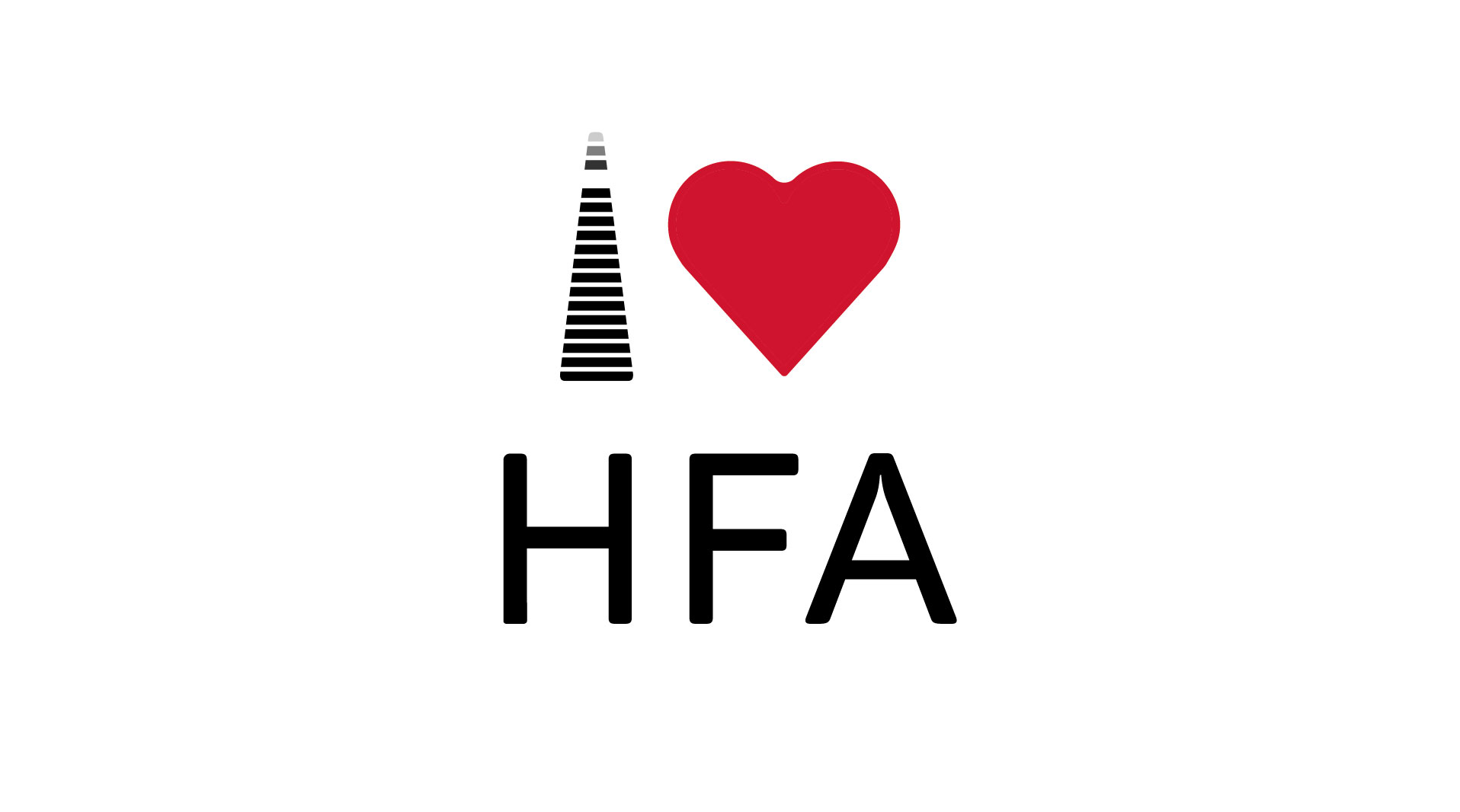
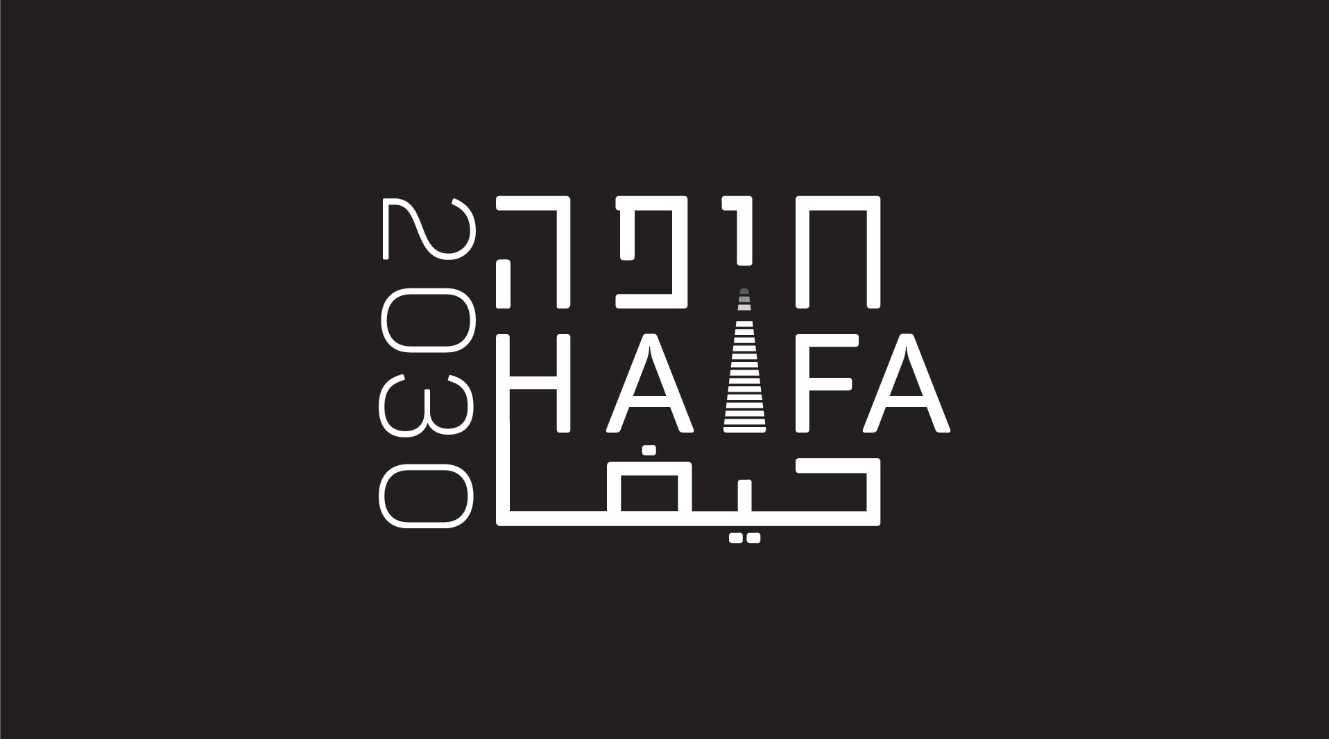
In 2020, we have started working with Haifa 2030, a strategic body that deals with the municipality to implement and execute innovation processes for the benefit of the city. As part of the joint work, in order to enable its activities inside and outside Israel, to bring investors and entrepreneurs to the city.
Haifa 2030 underwent an in-depth strategic branding process. The city of Haifa and the municipality, headed by it are going through many upheavals these days – I think there is something in this period that is similar to the times that were in New York, so there is no better time to say – I ❤️ HFA – the logo was born from the Haifa 2030 logo which uses one of Haifa The many that fill and connect the city.
©NotFromHere
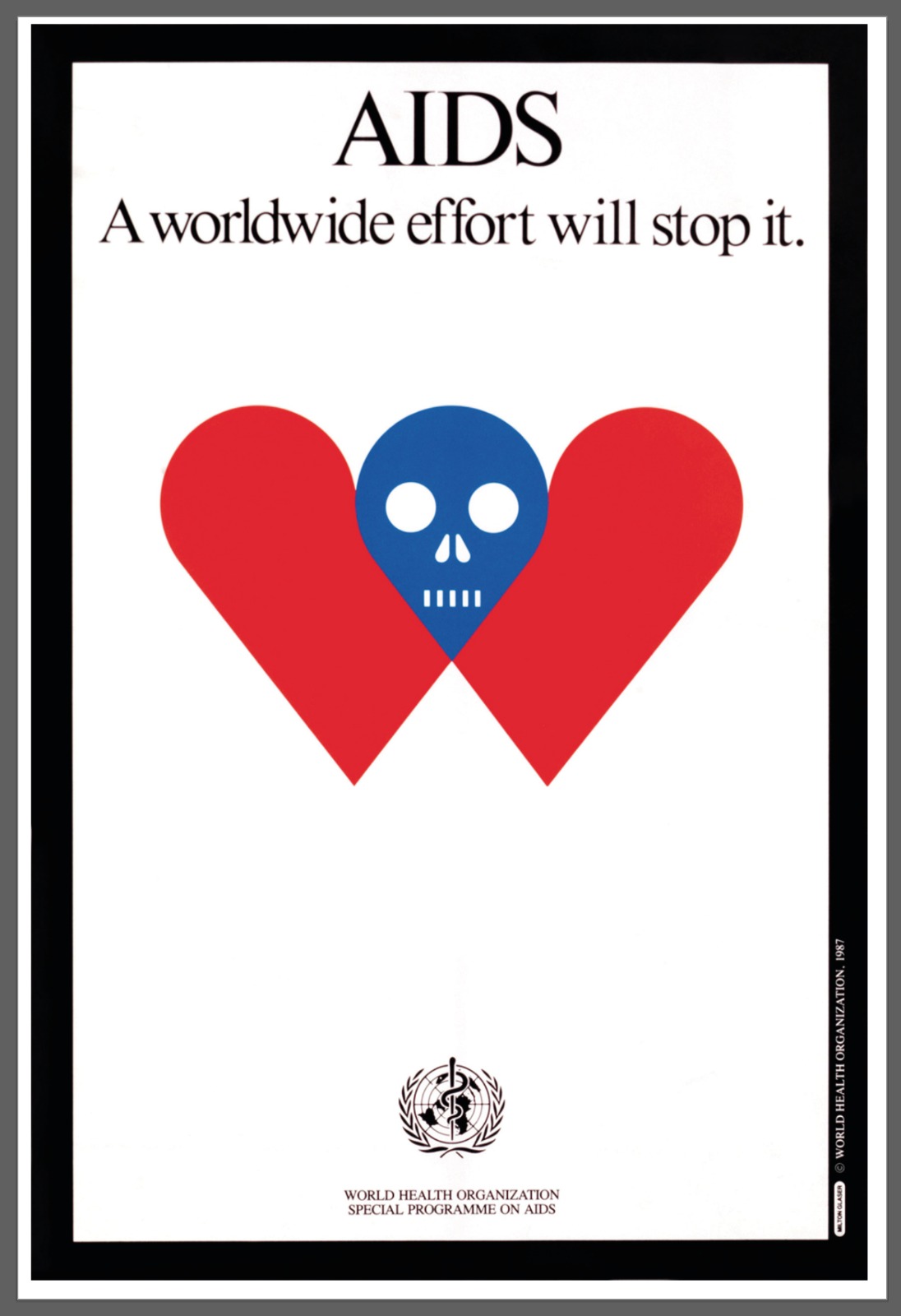
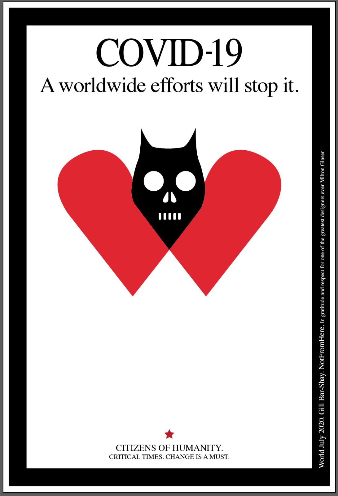
This year Milton Glazer passed away, it was important for me to note this, it is important to pay tribute to an artist of this magnitude, one of the greatest designers, I was looking for something that would suit this period, of course, differentiate and plagues cannot be compared, but again something in that period in the cheerful 80s and epidemic The terrible AIDS, and in this period, with this complacency that we have that everything is allowed and that everything is possible...
©https://www.miltonglaser.com/
©NotFromHere