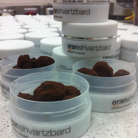
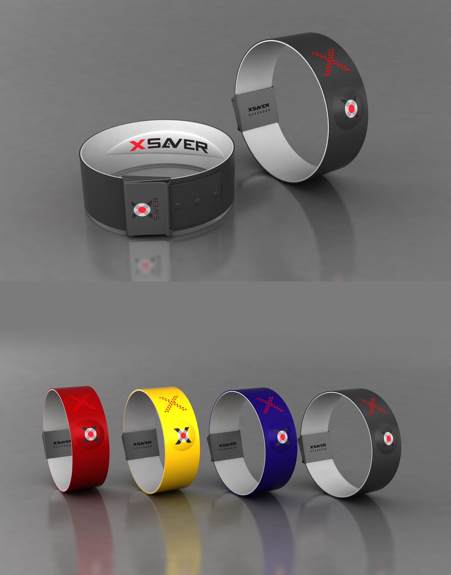
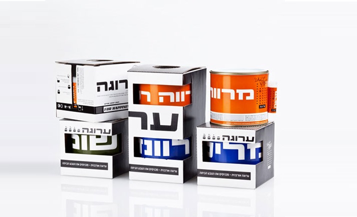
What exactly is the difference between branding and packaging design? While many people make these two things synonymous, you can't talk about one without talking about the other. In short, packaging design encompasses all aspects of product presentation, including the name, label design, and overall look and feel of the actual box or container in which your product comes in. Branding, on the other hand, refers to the macro, branding is the overall look, the visual identity of the company.
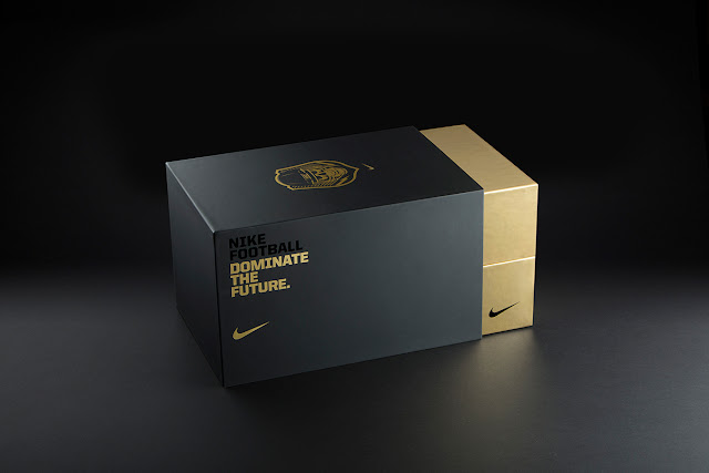
Know Your Audience
Your brand has an enormous impact on your packaging design, which is the encounter point of your users with the brand. Depending on how you want to position yourself and what you're selling, it can help to consider the environment in which your target audience will first be interacting with your brand. Will they be looking at some unboxing video on youtube? Will they be studying it while strolling down the Best Buy store? Or will they be looking at it as part of their daily commute or workout routine? All of these are entirely different experiences with different opportunities for touchpoints. It would certainly help to know a bit about each one if we're hoping to provide something that successfully resonates and persuades your target market.
Keep it Short and Simple
In the complex and often-overwhelming world, simplicity is the key. Simplicity is where clarity begins. In package design, it's important to create an instantly recognizable look for your brand and then make sure that everyone—from the sales rep to the consumer to the retail clerk—gets the same brand values from the package. keep in mind the package in most cases is their first encounter point with the brand
Showcase a Single Product
Whether you're designing a single package for a product or designing for a brand, there are several factors that can improve your design. In branding, clarity and consistency are key; packaging design needs to be different from anything else on store shelves. Let's look at how brands and packages can vary depending on their purpose and target market. Keeping your designs professional-looking is just as important as it is in other areas of graphic design—you want your audience to see that you care about quality and that you care about them. You also need to consider things like materials, finish (glossy versus matte), shape (square versus round), dieline, etc. One factor in deciding between branding and packaging lies in whether you will have multiple products with unique identities under one umbrella brand. Often, creating a cohesive visual identity makes sense when all products share characteristics such as family/series and use cases. But sometimes companies put more thought into one product than another—like Amazon's Fire Phone and Kindle Fire HDX tablets vs.
Avoid Visual Clutter
There's a great deal of information that you must include on your package, and making it consistent with other branding elements makes sense. This will allow customers to quickly identify if they have purchased your product before. Directness is very important in order to get across a strong, specific message that sticks in consumer's minds; Ambiguity might seem clever but it will likely be misinterpreted by potential customers.
