Package Design by NotFromHere

Branding and content and product design for 'Aruga'‘

TimnaNYC_Branding_LogoDesign

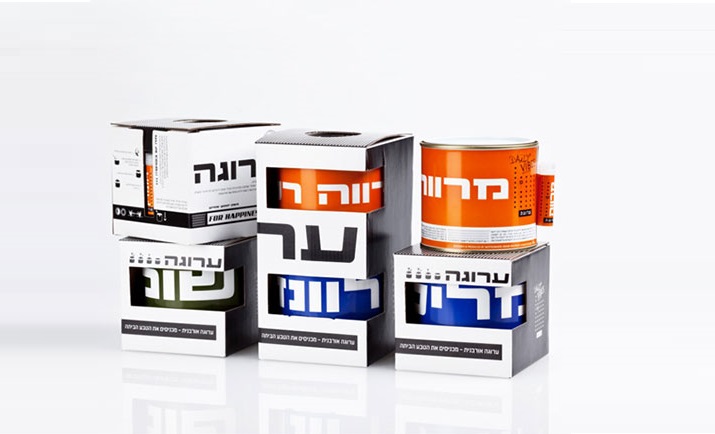
Aruga's can pots bring a fresh, retro-style idea to home design and gardening. The cans are designed to look great on shelves and last a long time with little maintenance. They come in a variety of refreshing colors and with beautiful, fragrant and useful plant species, and most importantly – they are easy to grow at home and enjoy every day. Can pots for the home are of course nothing new, but at NFH we wanted to make the concept particularly attractive to the growing target audience of interior designers, families and single renters who are interested in arranging and designing their homes in a DIY way.

The cans were converted from sealed paint cans with a special anti-rust coating. This way, the pots will stay fresh and gorgeous on the shelves as long as they are indoors. For the project, we launched a revolutionary marketing strategy and designed a campaign that spread the word about these unusual pots for the home, which we also simply love.

Whether you buy them for a loved one, a coworker, or for your own use – 'Aruga' products are a hit for so many reasons and we're glad we were able to reach out and make this product a growing one.

More posts

Wine, Prada and research

I don't know anyone who doesn't like wine. Red, white, pink, sparkling, still, dry, semi-dry, quarter-dry, wine. Here are some results from very diverse studies that examined the advantages and disadvantages of drinking wine. The results are a bit ambiguous :) "Drinking a glass of wine with meals reduces the risk of type 2 diabetes". "A bottle of wine is worth 10 cigarettes" "Red wine improves the health of cells in blood vessels".…

WPO-World Packaging Awards

At the World Packaging Awards in Milan, inside the Versace Palace. 500 projects from 40 countries stood before the judges. Then our name was called. Not once, but twice. GoChess — first place. 32ºN — first place. Two completely different packaging solutions. Both were built with precision, with a story, and with complete respect for the product inside. It was never about trends. It was about faith. Q - Structure is a language. Q…

Milk = MILK

See how easily a dairy brand can stand out from the competition. All with the help of a clean, simple, minimalist design and super creative packaging. The colors of the cartons symbolize the percentage of fat in each package, a number that is also clearly highlighted with a very precise font, which appears on the front. You can safely stop with drawings of cows, houses and lawns. NotFromHere C