Branding & product design for GPS bracelet

[bread]
X-Saver_Branding_ProductDesign

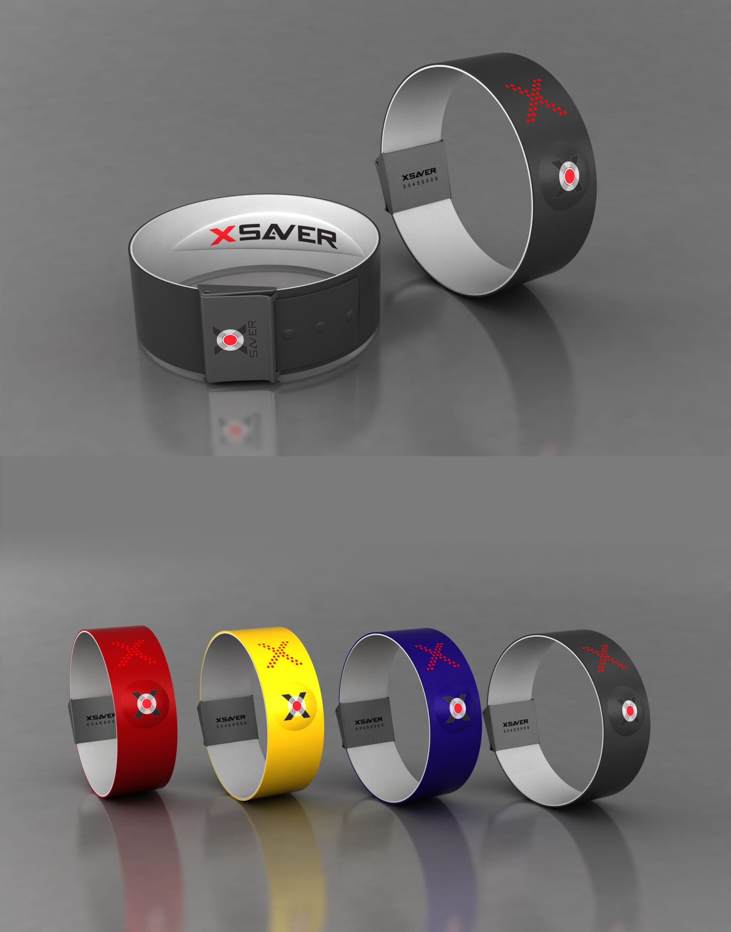
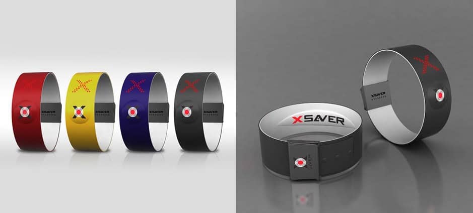
An innovative device designed to help travelers in case of emergency. The bracelet is elegantly designed and easy to use that allows users to wear it. The bracelet is marketed as a fashionable accessory, allowing anyone and everyone to get the help they need when they are in need. Designed for easy and simple use, the device is available in a variety of stylish colors to complement any appearance, allowing for easy detection when needed.

The X-Saver startup contacted us at NFH so we could build the brand and strategy behind it, a unisex bracelet - it's worth mentioning that this bracelet was designed in 2010 before the era of smartphones for everyone. The use of the bracelet does not require internet and can be operated remotely with an SOS button. We created for them a concept that appealed to a target audience of adventurers, challenging athletes and people who travel.

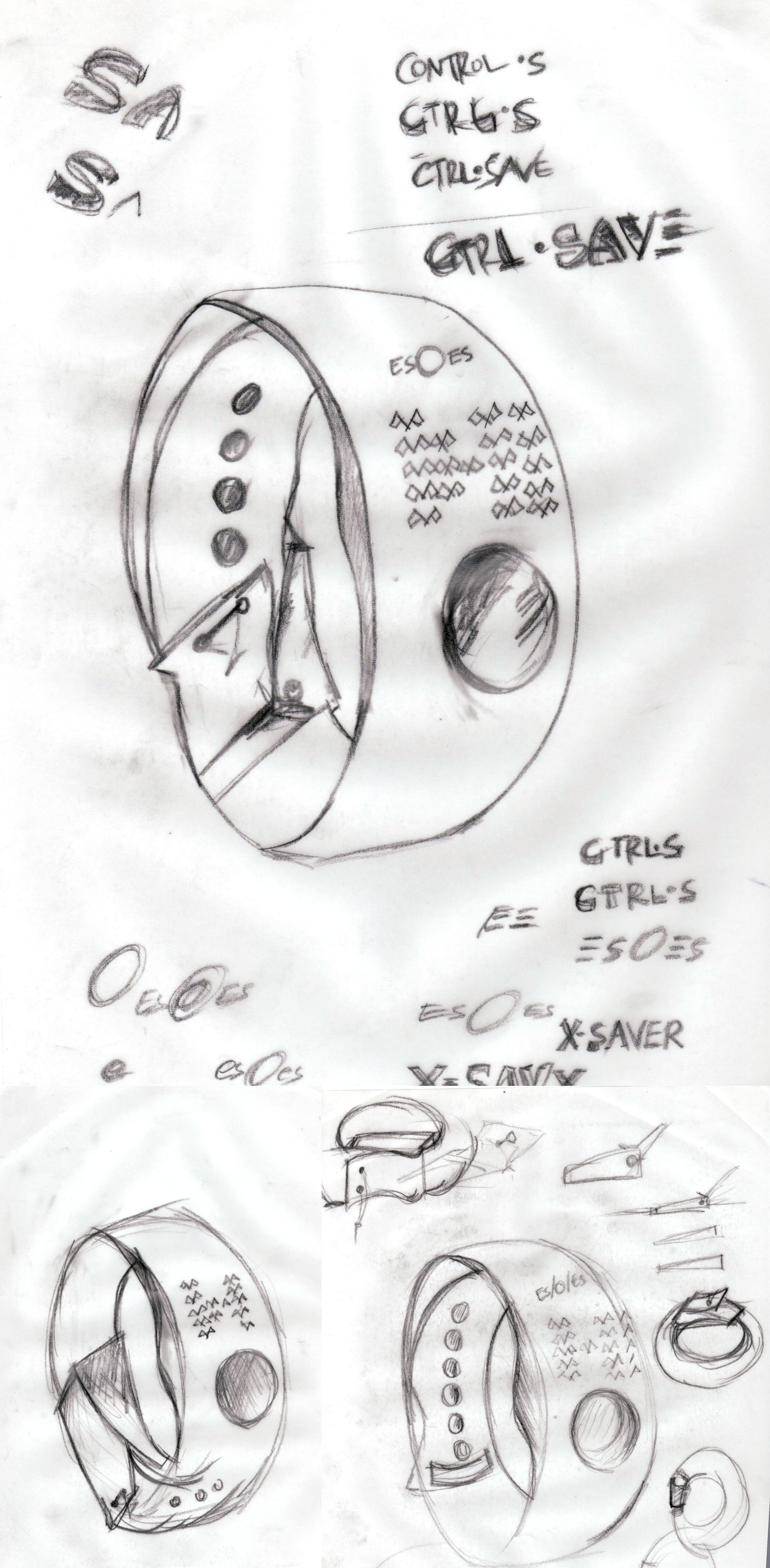
This is a digital clothing item that can save lives, which is why we at NFH are so pleased that we have been able to respond to their request and use our expertise to introduce such a product to the market. At the time the project was revolutionary - and you could say it was ahead of its time - it is worth remembering that it was before the age of the smart gadgets. And a bit about how each project starts, from pencil sketch to becoming a finished product.

X-Saver_ProductSkectes_Product Design

More posts

Wine, Prada and research

I don't know anyone who doesn't like wine. Red, white, pink, sparkling, still, dry, semi-dry, quarter-dry, wine. Here are some results from very diverse studies that examined the advantages and disadvantages of drinking wine. The results are a bit ambiguous :) "Drinking a glass of wine with meals reduces the risk of type 2 diabetes". "A bottle of wine is worth 10 cigarettes" "Red wine improves the health of cells in blood vessels".…

WPO-World Packaging Awards

At the World Packaging Awards in Milan, inside the Versace Palace. 500 projects from 40 countries stood before the judges. Then our name was called. Not once, but twice. GoChess — first place. 32ºN — first place. Two completely different packaging solutions. Both were built with precision, with a story, and with complete respect for the product inside. It was never about trends. It was about faith. Q - Structure is a language. Q…

Milk = MILK

תראו באיזו פשטות יכול מותג חלב לבלוט מעל המתחרים. הכל בעזרת עיצוב נקי פשוט ומינימליסטי של אריזה סופר קריאייטיבית.הצבעים של הקרטונים מסמלים את אחוז השומן שיש בכל אריזה, מספר שגם מודגש בבירור עם פונט מאוד מדוייק, שמופיע בפרונט.אפשר בשקט להפסיק עם ציורים של פרות, בתים ומדשאות. NotFromHere

Leave the first comment