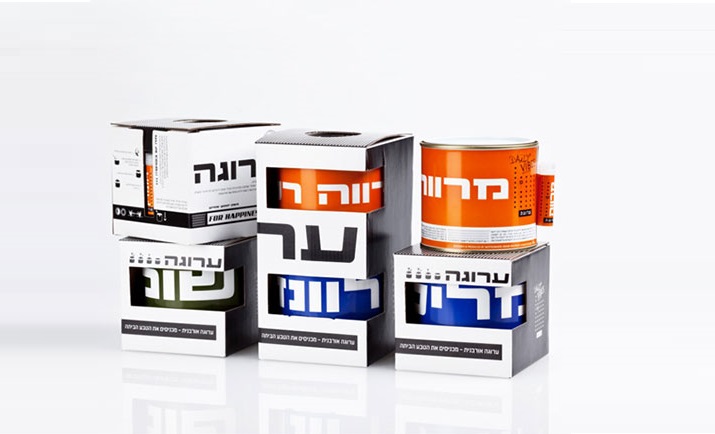
Chocolate packaging design – how to stand out from the competition

Branding design by NotFromHere

In the world we live in, it is difficult to separate the fields. Cosmetics are closely related to fashion, food is closely related to lifestyle, and everyone wants to be in the lifestyle category. Every brand is looking for a way to the consumer's heart. We want to know what they think about and what they need, and how to make them need the things today that they don't yet know they need. Makeup made from pearls from a well-known luxury brand costs at least a quarter of a month's rent, and we, who used to wash our faces with harsh soap, want pearls on our skin. Very challenging today Design packaging For chocolate to stand out on the shelf, not to mention the competition is getting tougher when it comes to online.

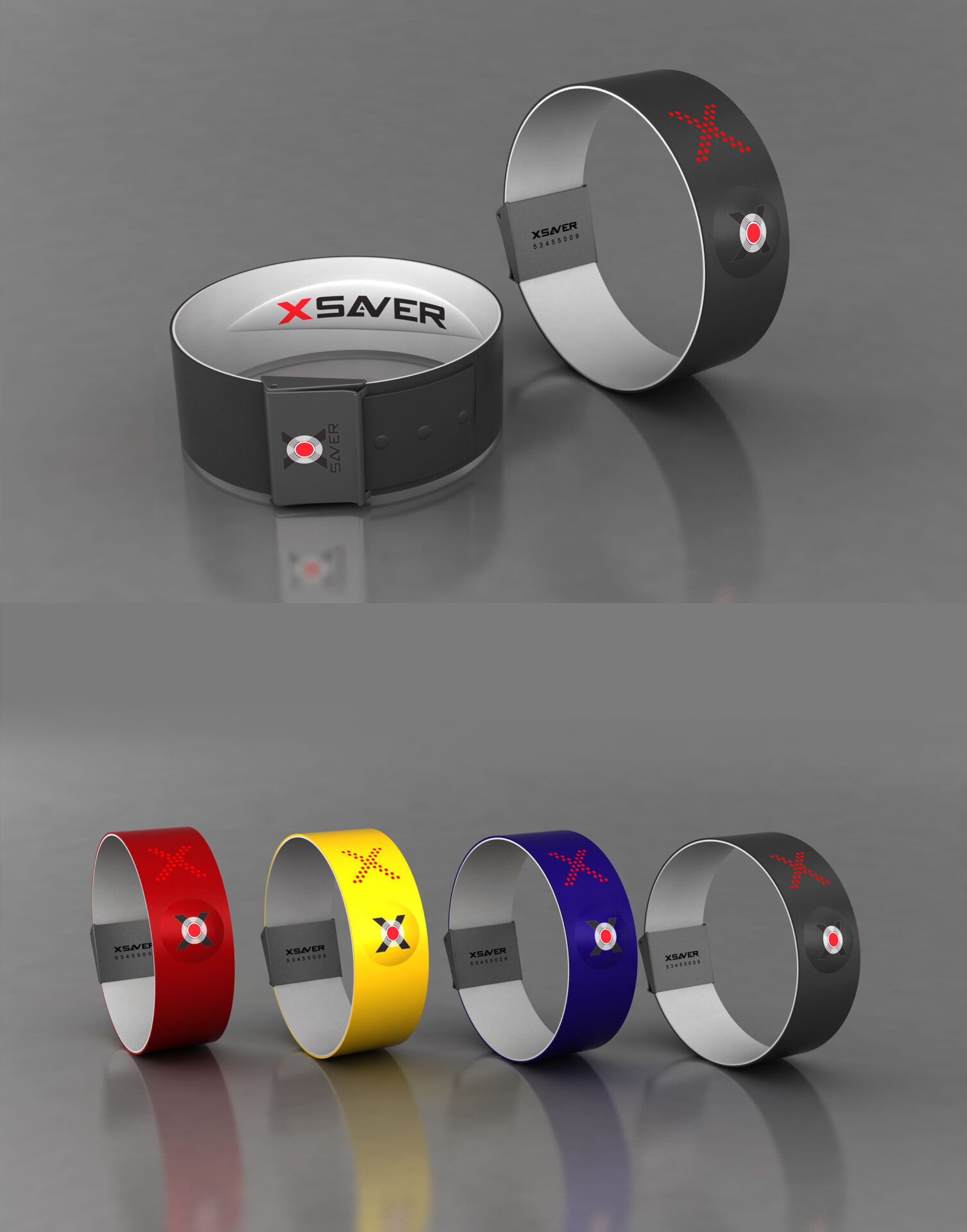
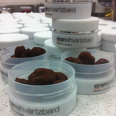
And how do we do it anyway? We need to create differentiation, we need to look for what is unexpected, we need to understand what everyone does, why they do it, and how we can appear different from them. Difference can come in many forms and ways, from our way of thinking, which should constantly be non-standard and constantly looking to use a special material, an unusual color, language and statement that can shock, laugh, move, etc. It used to be enough to think outside the box, today you have to go much further. Take quality praline chocolate and package it in containers of face cream.

More posts

Wine, Prada and research

I don't know anyone who doesn't like wine. Red, white, pink, sparkling, still, dry, semi-dry, quarter-dry, wine. Here are some results from very diverse studies that examined the advantages and disadvantages of drinking wine. The results are a bit ambiguous :) "Drinking a glass of wine with meals reduces the risk of type 2 diabetes". "A bottle of wine is worth 10 cigarettes" "Red wine improves the health of cells in blood vessels".…

WPO-World Packaging Awards

At the World Packaging Awards in Milan, inside the Versace Palace. 500 projects from 40 countries stood before the judges. Then our name was called. Not once, but twice. GoChess — first place. 32ºN — first place. Two completely different packaging solutions. Both were built with precision, with a story, and with complete respect for the product inside. It was never about trends. It was about faith. Q - Structure is a language. Q…

Milk = MILK

See how easily a dairy brand can stand out from the competition. All with the help of a clean, simple, minimalist design and super creative packaging. The colors of the cartons symbolize the percentage of fat in each package, a number that is also clearly highlighted with a very precise font, which appears on the front. You can safely stop with drawings of cows, houses and lawns. NotFromHere C