Graphic Design By NotFromHere

"Good on the Street" Festival Music, Culture and Art

NFH_tov-barehov_brochure

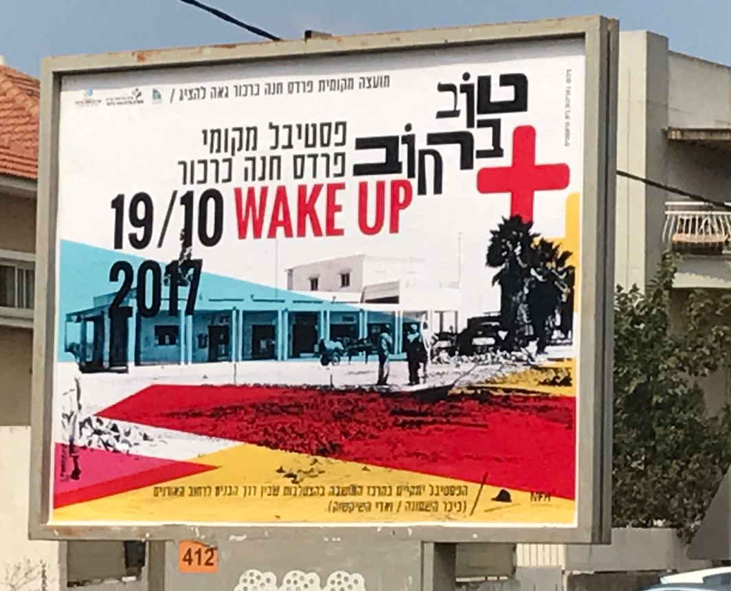
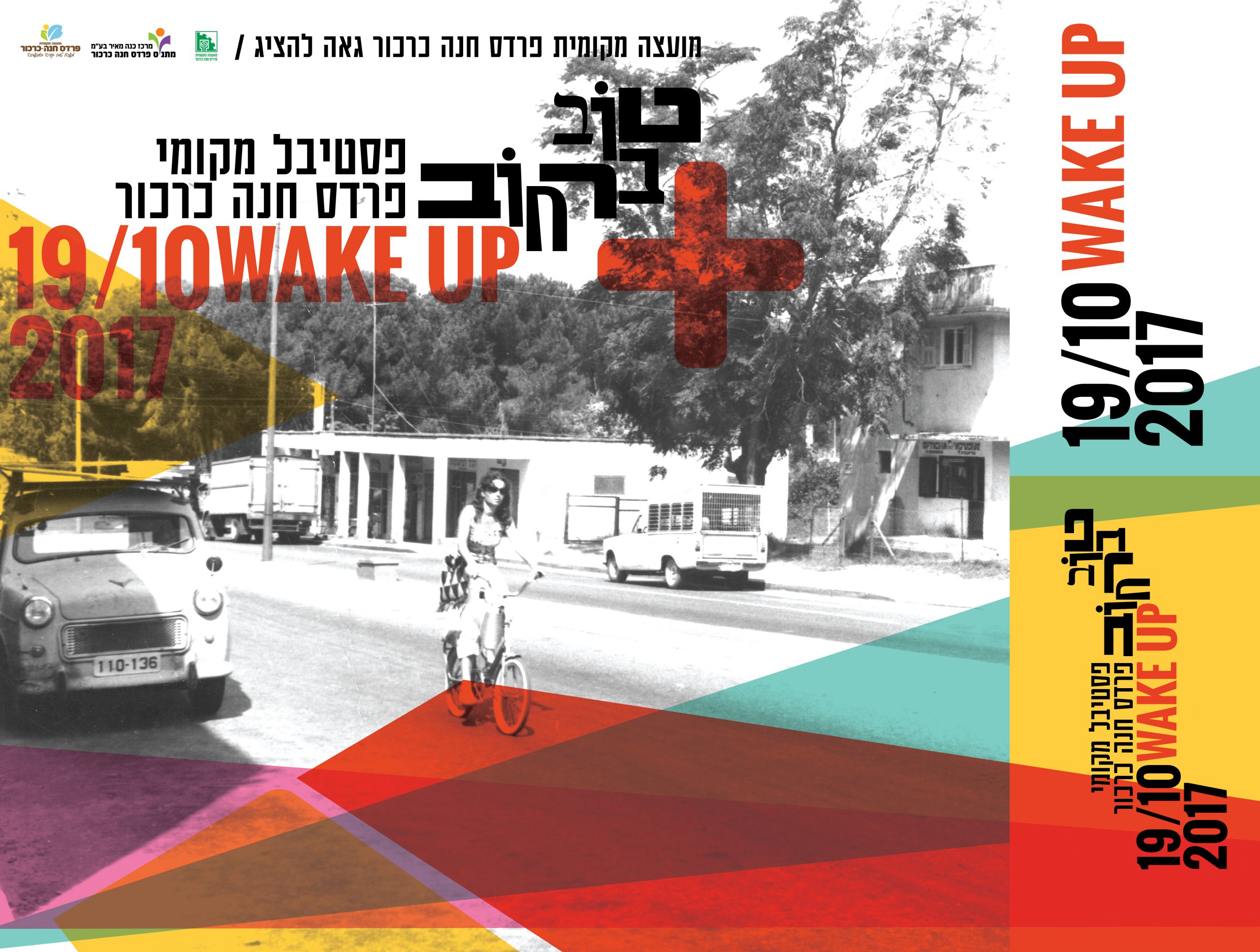
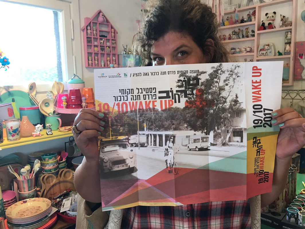
Good on the street. Music festival, Art and culture. Co-production of. NotFromHere And "The Man With The Hat", led to this wonderful festival that takes place in mid-October. We have been working together for several years, and over time we have produced diverse and special outdoor events. The value of culture and art has always accompanied us. Our events always combine business and community. We wanted to revive the boulevards of the Wadi of Pardes Hanna, we wanted to combine the magic of the old and the new. We took the black and white photographs of the colony from the archives of the Beit Rishonim in the colony, as a direct continuation of the concept of the graphic work, which was to create a sense of connection and renewed life for the old colony with a combination of Strong graphic elements in color. I've seen it all...sometimes you just know...Wake Up felt like the most intuitive thing for the message for this festival.

NFH tov barehovtov6

More posts

Wine, Prada and research

I don't know anyone who doesn't like wine. Red, white, pink, sparkling, still, dry, semi-dry, quarter-dry, wine. Here are some results from very diverse studies that examined the advantages and disadvantages of drinking wine. The results are a bit ambiguous :) "Drinking a glass of wine with meals reduces the risk of type 2 diabetes". "A bottle of wine is worth 10 cigarettes" "Red wine improves the health of cells in blood vessels".…

WPO-World Packaging Awards

At the World Packaging Awards in Milan, inside the Versace Palace. 500 projects from 40 countries stood before the judges. Then our name was called. Not once, but twice. GoChess — first place. 32ºN — first place. Two completely different packaging solutions. Both were built with precision, with a story, and with complete respect for the product inside. It was never about trends. It was about faith. Q - Structure is a language. Q…

Milk = MILK

תראו באיזו פשטות יכול מותג חלב לבלוט מעל המתחרים. הכל בעזרת עיצוב נקי פשוט ומינימליסטי של אריזה סופר קריאייטיבית.הצבעים של הקרטונים מסמלים את אחוז השומן שיש בכל אריזה, מספר שגם מודגש בבירור עם פונט מאוד מדוייק, שמופיע בפרונט.אפשר בשקט להפסיק עם ציורים של פרות, בתים ומדשאות. NotFromHere