How to stay relevant when all the cards are dealt

Packaging design for corona test | Packaging design | NotFromHere

2020 started out in a bizarre way. It started in China when we encountered difficulties in the production and import of packaging and within months it spread all over the world and reached us too. Within a few weeks a small and insidious virus caused an almost complete shutdown of the economy and left us stunned and at a loss.

We quickly realized that we had a place, but to stay relevant at a time like this, we need to change strategy and adapt to a reality that changes every day. We have to be sharper and faster than ever.
3@2x 100 2

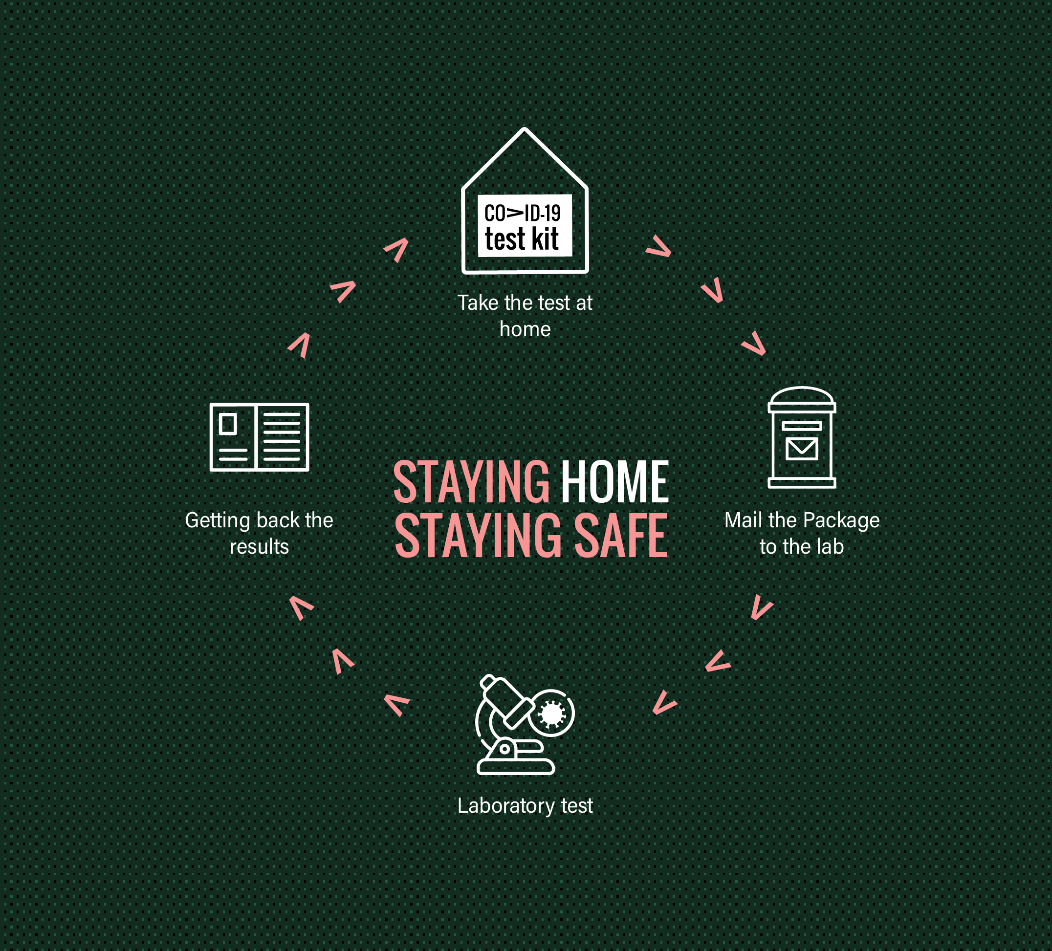
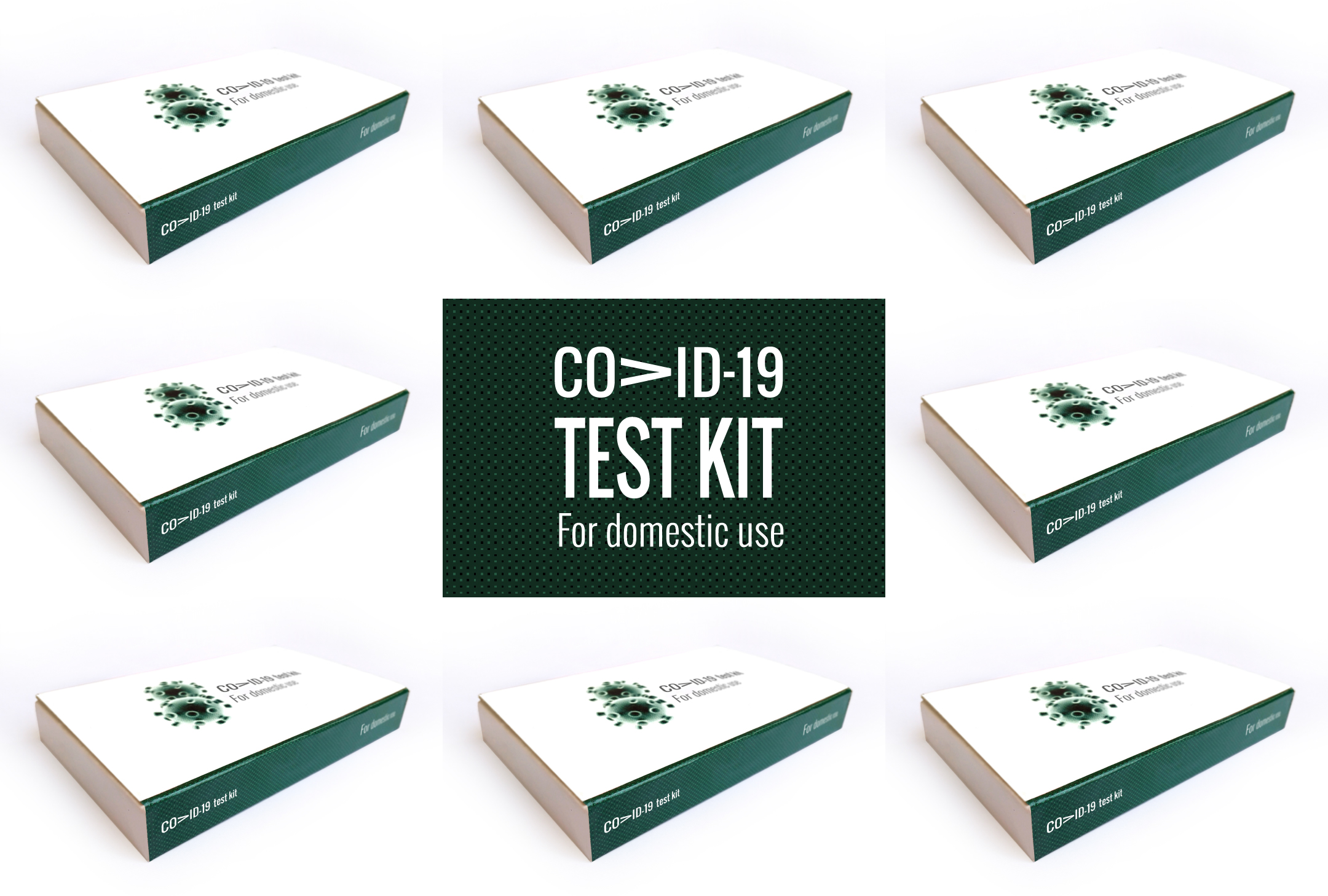
During the lockdown, we developed packaging for companies that wanted to provide a quick and high-quality solution for home testing for the coronavirus, which changed the rules of the game.
The project included planning, Packaging design and production In extremely short times.

In this project, which was one of the projects, you can see a home package for a corona test. After the test is performed, the package is sent back to the laboratory for quick results. On the back of the package there is a shipping label to the laboratory.

v
More posts

Wine, Prada and research

I don't know anyone who doesn't like wine. Red, white, pink, sparkling, still, dry, semi-dry, quarter-dry, wine. Here are some results from very diverse studies that examined the advantages and disadvantages of drinking wine. The results are a bit ambiguous :) "Drinking a glass of wine with meals reduces the risk of type 2 diabetes". "A bottle of wine is worth 10 cigarettes" "Red wine improves the health of cells in blood vessels".…

WPO-World Packaging Awards

At the World Packaging Awards in Milan, inside the Versace Palace. 500 projects from 40 countries stood before the judges. Then our name was called. Not once, but twice. GoChess — first place. 32ºN — first place. Two completely different packaging solutions. Both were built with precision, with a story, and with complete respect for the product inside. It was never about trends. It was about faith. Q - Structure is a language. Q…

Milk = MILK

תראו באיזו פשטות יכול מותג חלב לבלוט מעל המתחרים. הכל בעזרת עיצוב נקי פשוט ומינימליסטי של אריזה סופר קריאייטיבית.הצבעים של הקרטונים מסמלים את אחוז השומן שיש בכל אריזה, מספר שגם מודגש בבירור עם פונט מאוד מדוייק, שמופיע בפרונט.אפשר בשקט להפסיק עם ציורים של פרות, בתים ומדשאות. NotFromHere