In respect for Nina Simone and National Women's Day Aug 9 2021

9.8.2021 is National Women's Day. I wanted to use this data and share a respect for one great woman. Nina Simone was a warrior, a big woman who lived in very complicated times for women. In 2003, after her death, her daughter Simon established a fundraising under her name. We worked on the logo for the Nina Simone Foundation. Designing a logo, working on brand identity is always is one of the biggest challenges within the graphic design world.

notfromhere-nina-simon-foundation-logo-design_gili barshay

©NotFromHere LTD

©NotFromHere Logo Design Nina Simon

©NotFromHere LTD

Based on her iconic image, we have designed a logo that follows her sarong facial structure. During that time, the tracing options of images were less than today, and to be able to create a vector structure, we had to use the pen tool in Illustrator and walk through dot by dot.
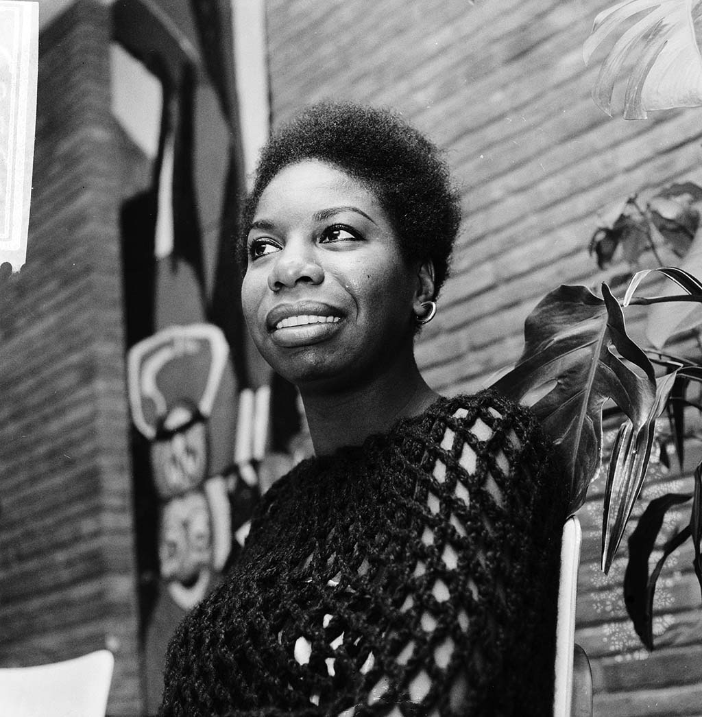
Nina Simone 1965
Nina Simone, 1965

Courtesy Netherlands National Archives (918-5603)

Working on this project for such a legend within the art industry is always something that makes you feel like you have been part of the global movement of art.

notfromhere-nina-simone-foundation-logo-design fun colors for logo

More posts

Wine, Prada and research

I don't know anyone who doesn't like wine. Red, white, pink, sparkling, still, dry, semi-dry, quarter-dry, wine. Here are some results from very diverse studies that examined the advantages and disadvantages of drinking wine. The results are a bit ambiguous :) "Drinking a glass of wine with meals reduces the risk of type 2 diabetes". "A bottle of wine is worth 10 cigarettes" "Red wine improves the health of cells in blood vessels".…

WPO-World Packaging Awards

At the World Packaging Awards in Milan, inside the Versace Palace. 500 projects from 40 countries stood before the judges. Then our name was called. Not once, but twice. GoChess — first place. 32ºN — first place. Two completely different packaging solutions. Both were built with precision, with a story, and with complete respect for the product inside. It was never about trends. It was about faith. Q - Structure is a language. Q…

Milk = MILK

תראו באיזו פשטות יכול מותג חלב לבלוט מעל המתחרים. הכל בעזרת עיצוב נקי פשוט ומינימליסטי של אריזה סופר קריאייטיבית.הצבעים של הקרטונים מסמלים את אחוז השומן שיש בכל אריזה, מספר שגם מודגש בבירור עם פונט מאוד מדוייק, שמופיע בפרונט.אפשר בשקט להפסיק עם ציורים של פרות, בתים ומדשאות. NotFromHere