Milk = MILK

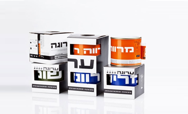
See how simply a milk brand can stand out from the competition.
All with the help of a clean, simple, minimalist design and super creative packaging.
The colors of the cartons symbolize the percentage of fat in each package,

1710420847229

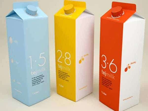
A number that is also clearly highlighted with a very precise font, which appears on the front.
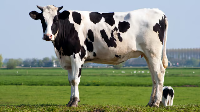
You can quietly stop with drawings of cows, houses, and lawns.


NotFromHere CStars

More posts

Wine, Prada and research

I don't know anyone who doesn't like wine. Red, white, pink, sparkling, still, dry, semi-dry, quarter-dry, wine. Here are some results from very diverse studies that examined the advantages and disadvantages of drinking wine. The results are a bit ambiguous :) "Drinking a glass of wine with meals reduces the risk of type 2 diabetes". "A bottle of wine is worth 10 cigarettes" "Red wine improves the health of cells in blood vessels".…

WPO-World Packaging Awards

At the World Packaging Awards in Milan, inside the Versace Palace. 500 projects from 40 countries stood before the judges. Then our name was called. Not once, but twice. GoChess — first place. 32ºN — first place. Two completely different packaging solutions. Both were built with precision, with a story, and with complete respect for the product inside. It was never about trends. It was about faith. Q - Structure is a language. Q…

Influential Woman NO.4

Excited. I was honored to be ranked fourth on the list of influential women on LinkedIn Israel. It is very flattering to be included among amazing women that I appreciate and respect so much. For me, this position (which is based purely on data and not on commercial considerations) shows that you can truly have an impact when you maintain principles and create from a real and connected place. My path in the worlds of branding and design has always been full of passion, hard work and faith in its power…

Leave the first comment