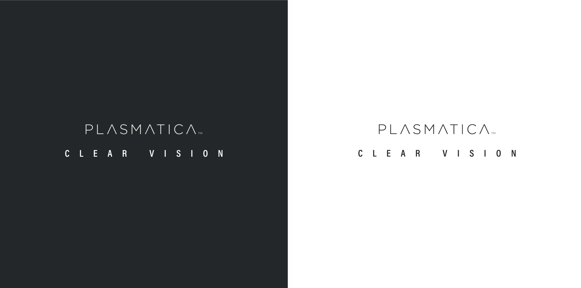
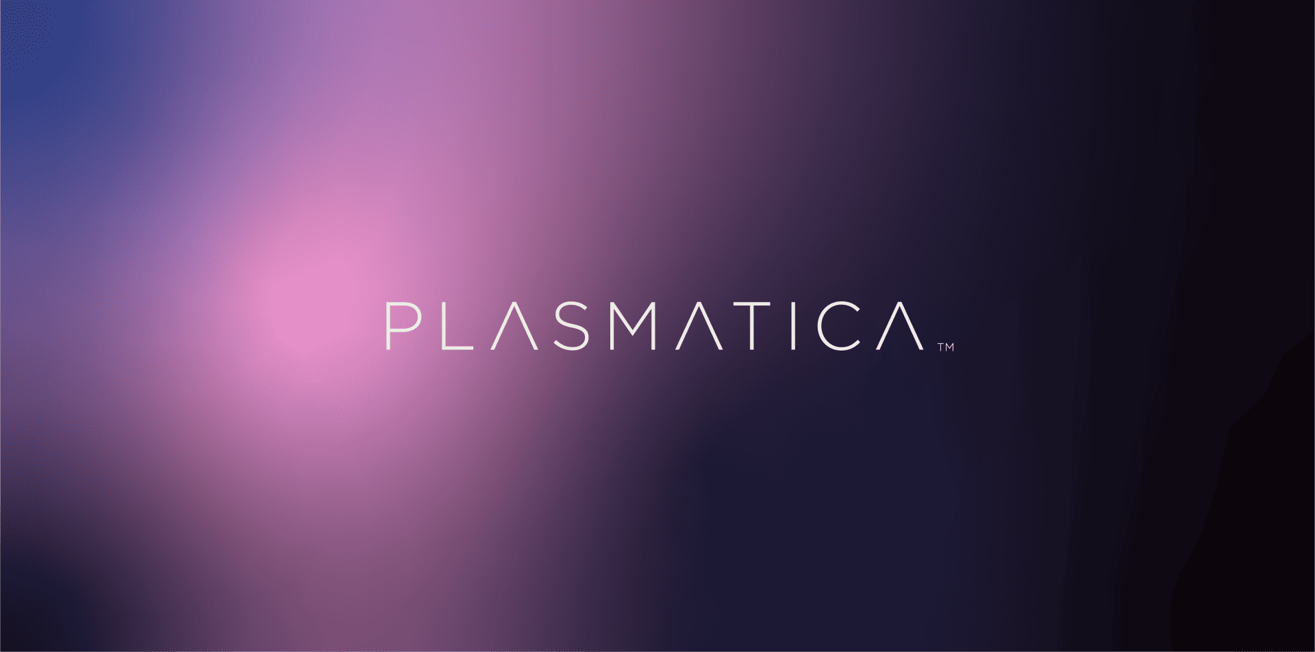
Plasmatica
Brand: Plasmatica
Industries
Health care, Medical device & Wellness, Technology & InnovationServices
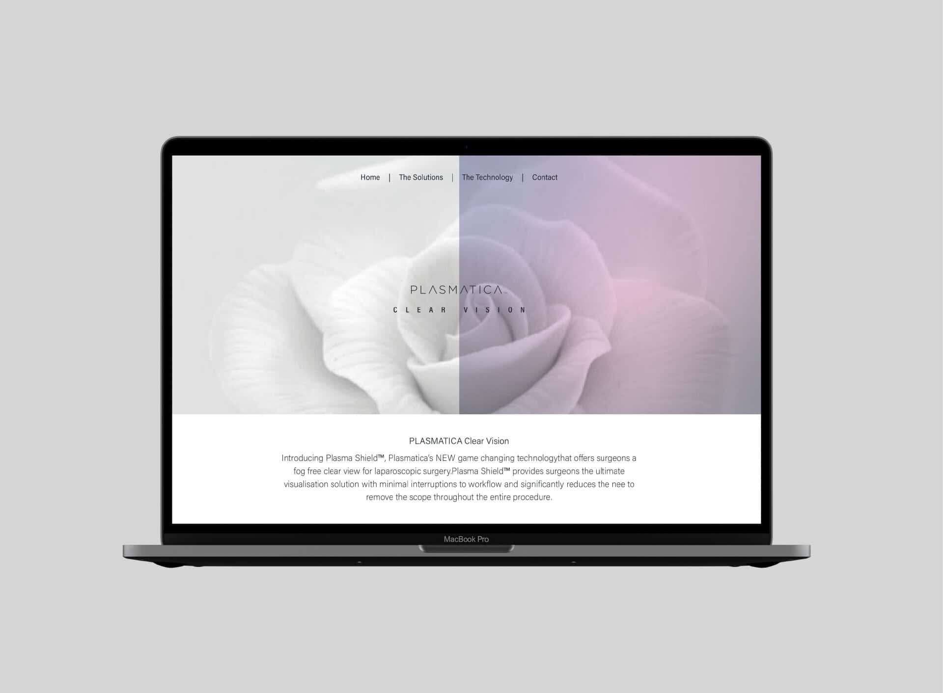
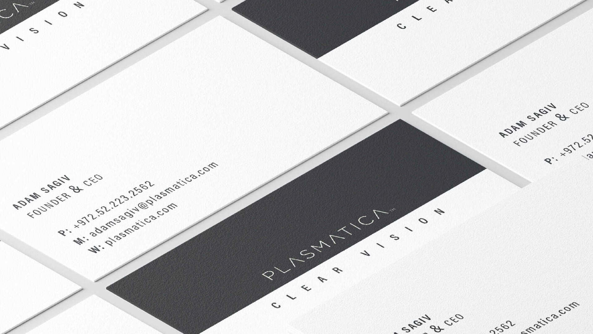
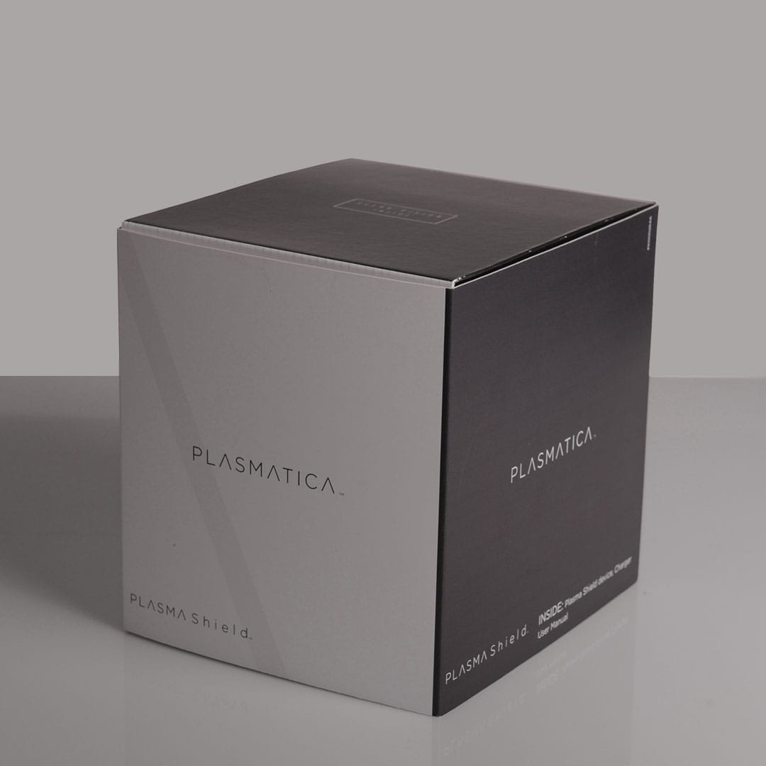
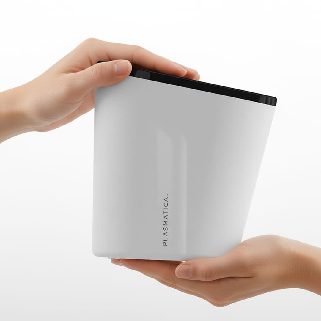
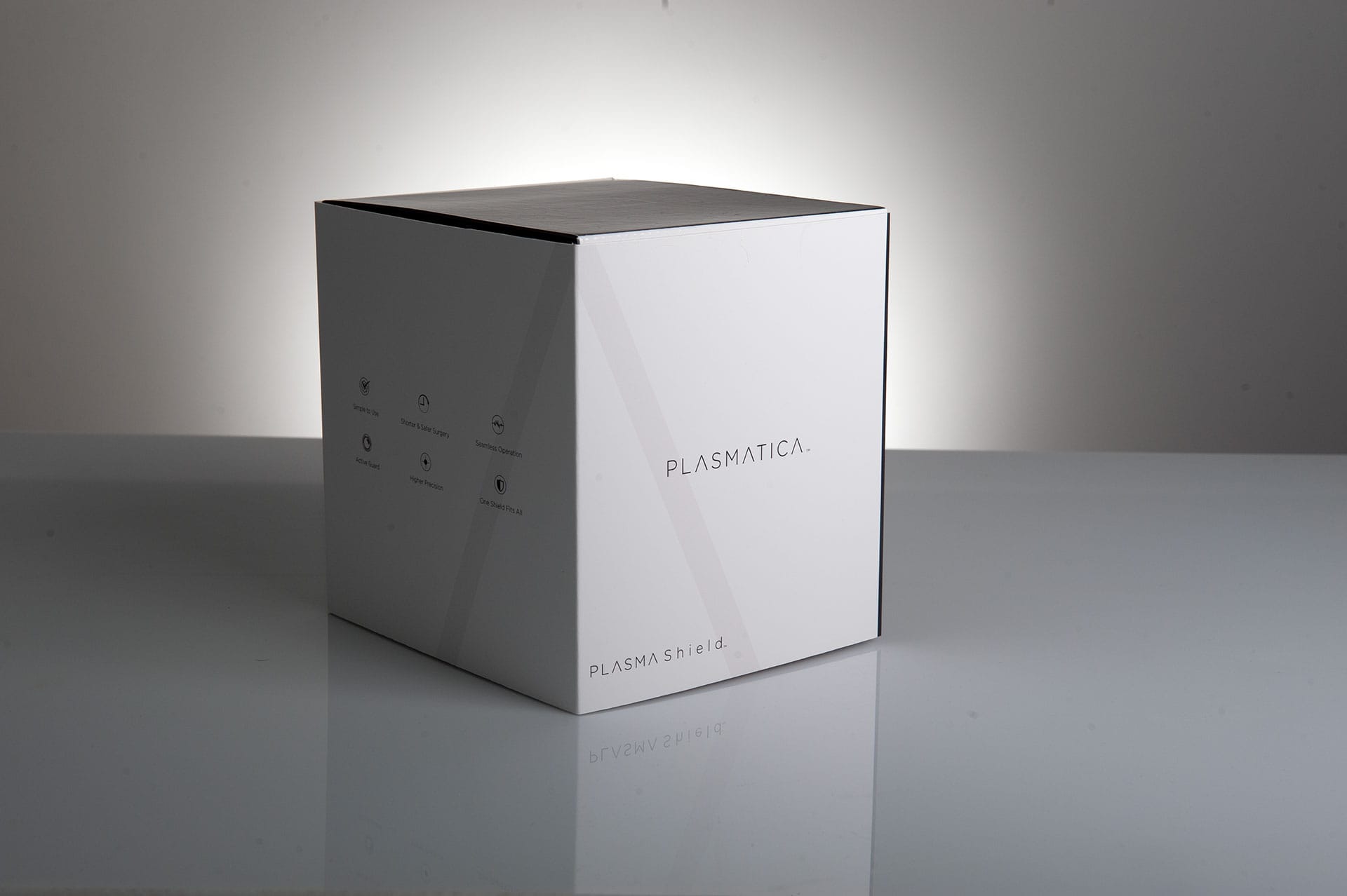
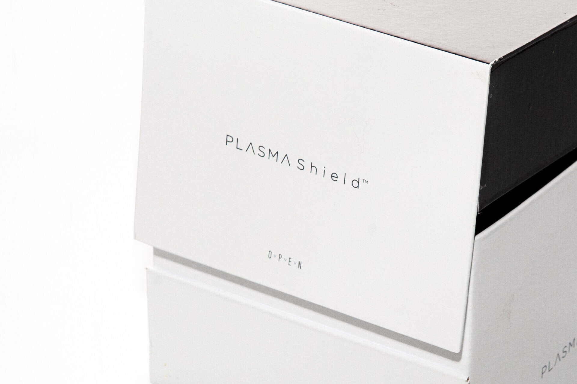
Brand Strategy & Positioning, Package design & unboxing experience, Graphic Design, Unboxing Experience, Packaging Production, Packaging EngineeringA new brand identity for a technology startup that helps surgeons perform better surgeries. A full branding process that includes company logo design, product logo design, packaging design, and product launch.
The brand identity uses graphic elements that simulate the transition between a blurred visual and a sharp visual. The graphic language simulates the result of using the PlasmaShield device. The choice of using thin fonts and a black and white color palette comes to support the product, messages and brand. The visual language uses thin lines to create a sense of graphic clarity. We wanted to create a brand language that speaks to the same prestigious technological standards. We wanted to provide the same clarity in the graphic forms and language.