Haifa2030
Brand: עיריית חיפה
Industries
Brand Experience & Lifestyle, Fashion & LifestyleServices
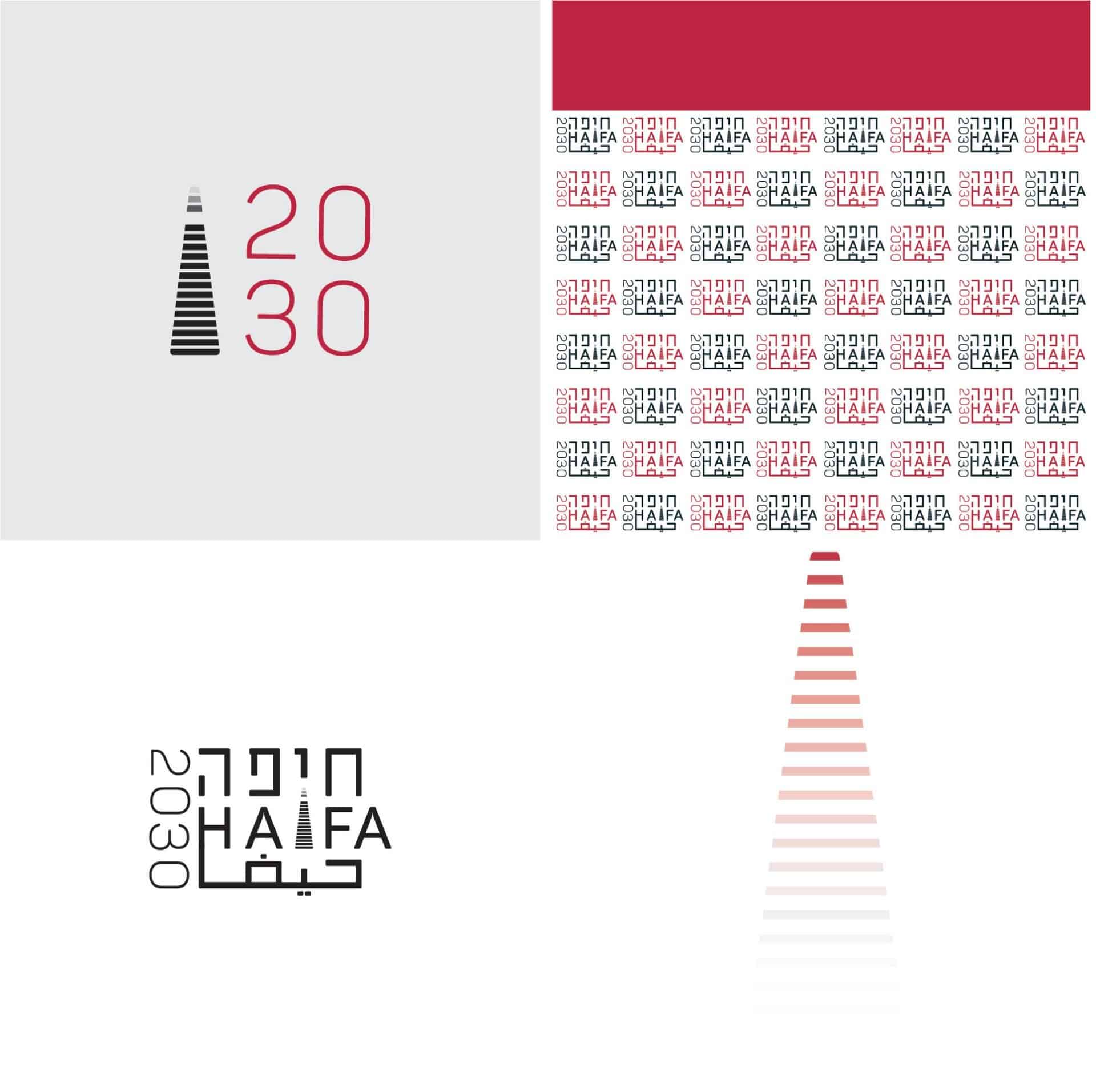
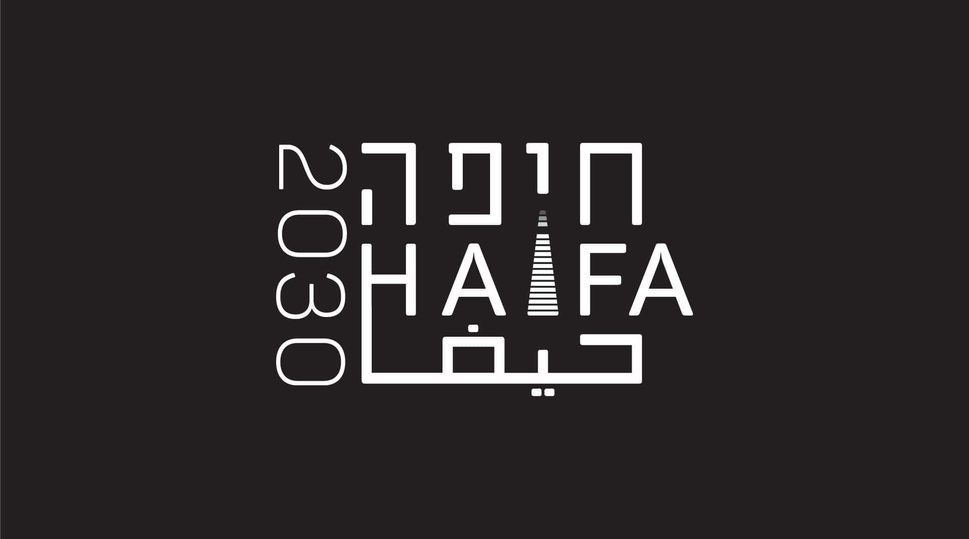
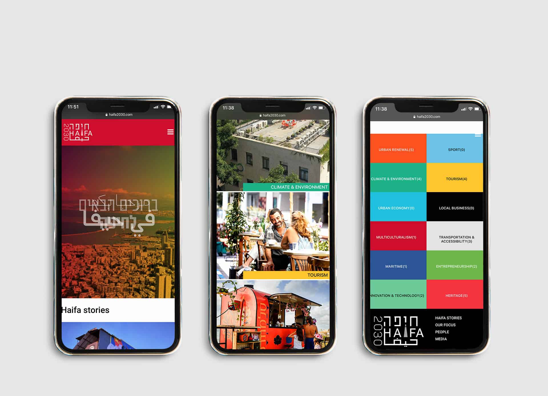
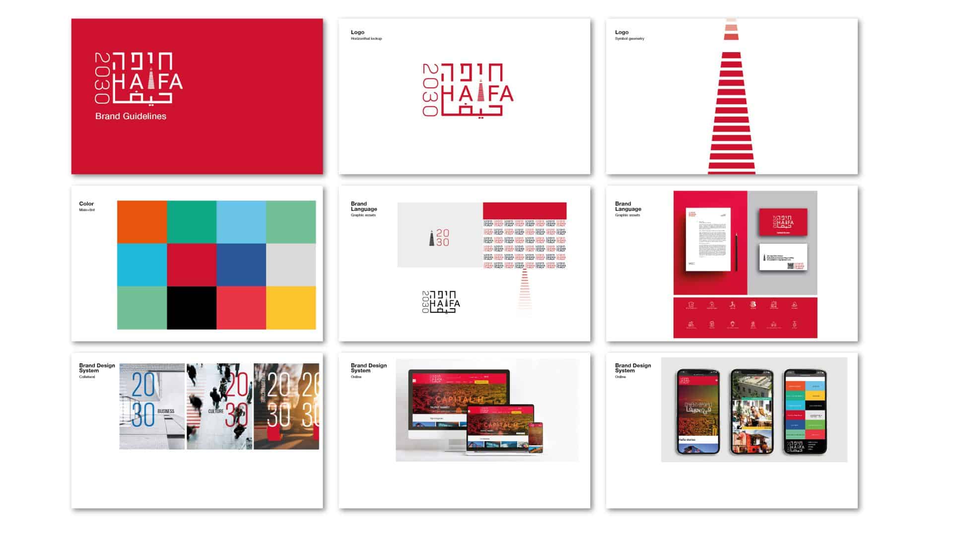
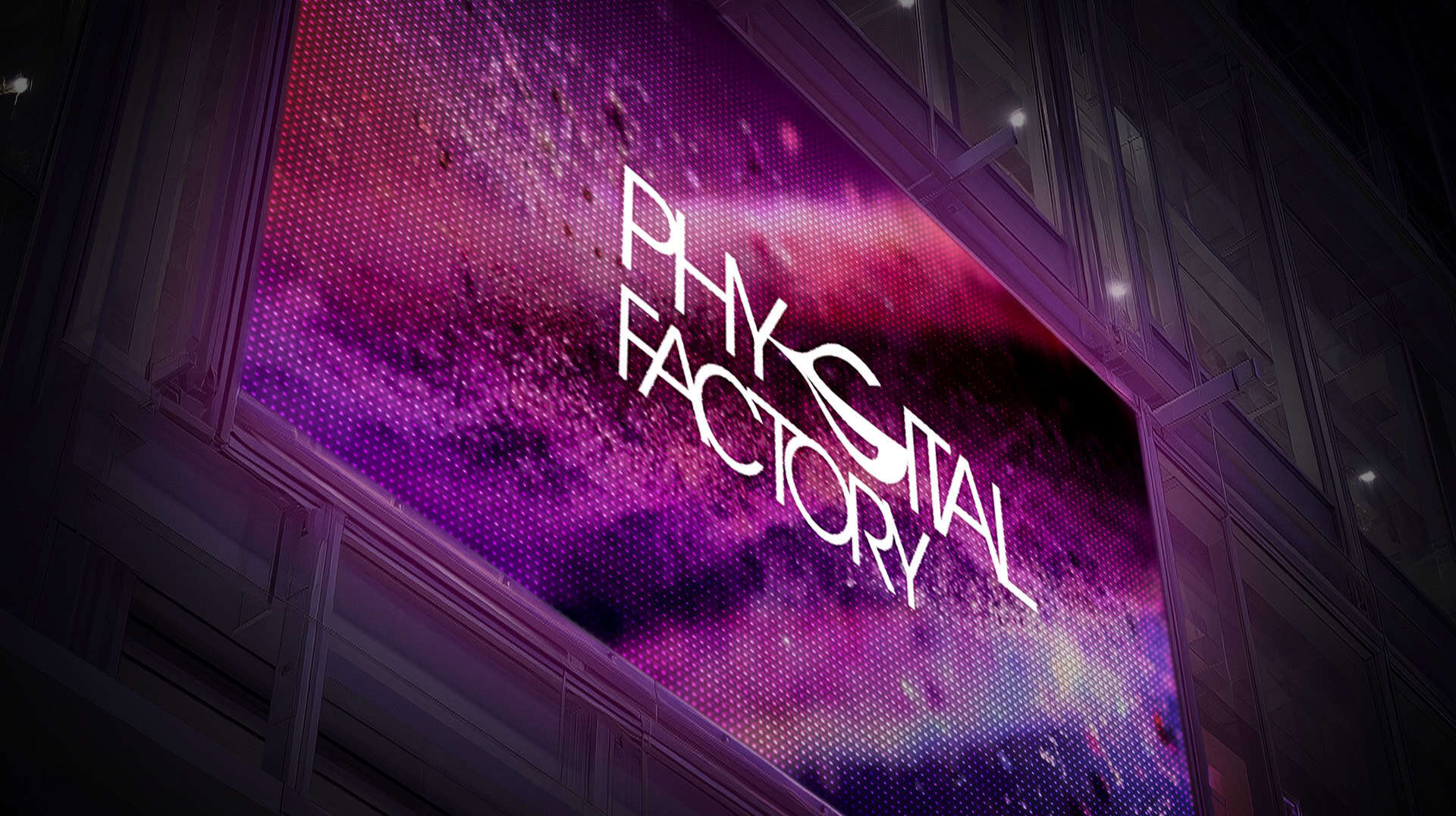
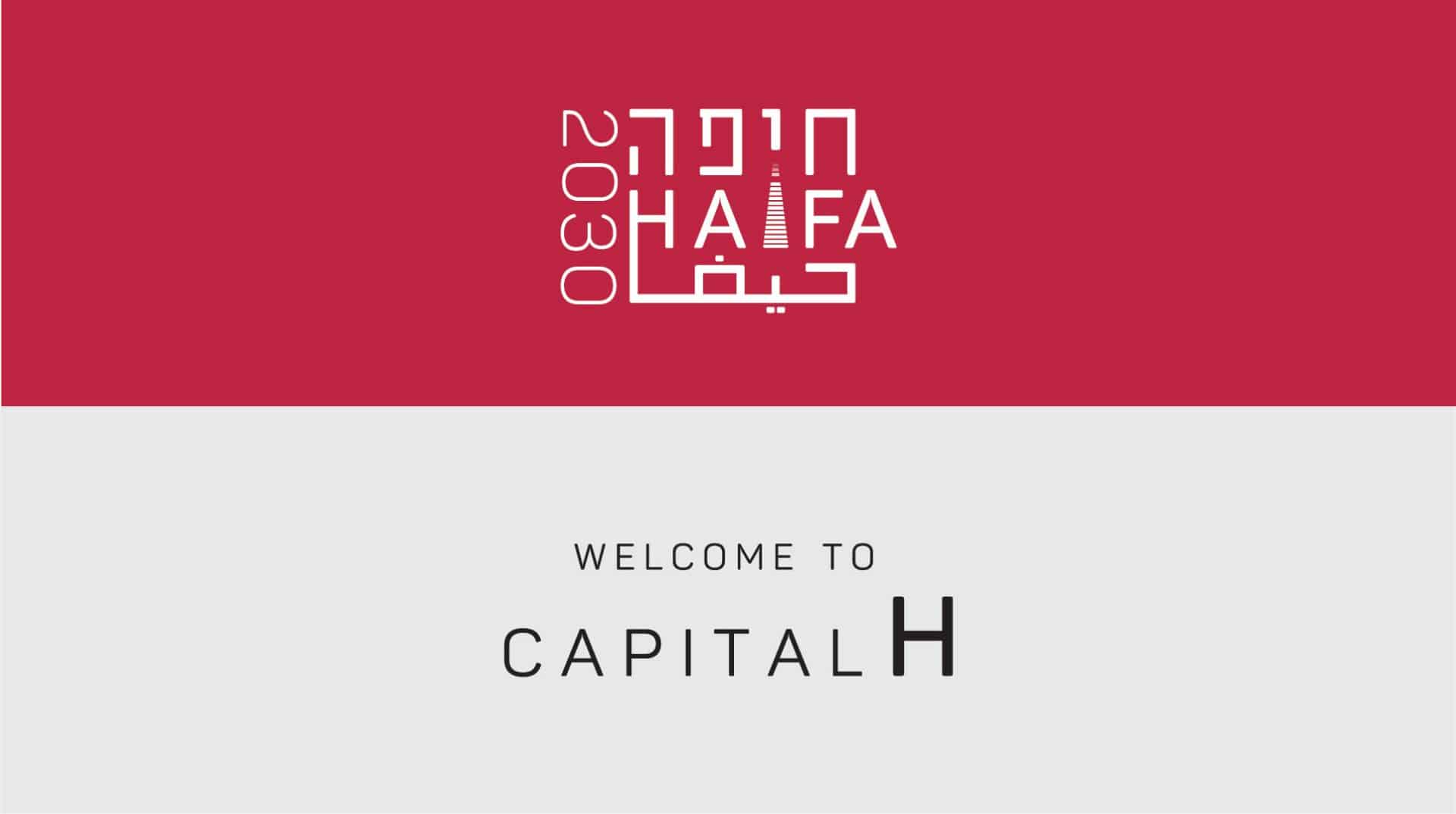
Brand Systems Identity, Graphic Design, User Experience & Interface Design (UI/UX)For Haifa’s municipal consulting arm, we built a visual and digital language that feels native to the city. The three letters reflect its diverse communities, and the “I” transforms into stairs, a symbol of movement, accessibility, and shared identity across parts of Haifa.
Many city brands default to formal emblems or symbolic facades — but here we positioned identity as lived experience. The stair motif is not decorative — it’s narrative, spatial, and functional. It speaks of ascent, public space, and connection.
The digital platform, Haifa2030.com, was conceived as more than a brochure. It’s a field for civic dialogue: a tool for citizens, investors, collaborators to engage, respond, and activate. Every component, interface, image, copy, is aligned with one philosophy: not presentation, but proposition.
Haifa2030 now lives beyond the logo. It is an urban brand that breathes through streets, screens, and voices. A brand that asks you to join, not just observe.