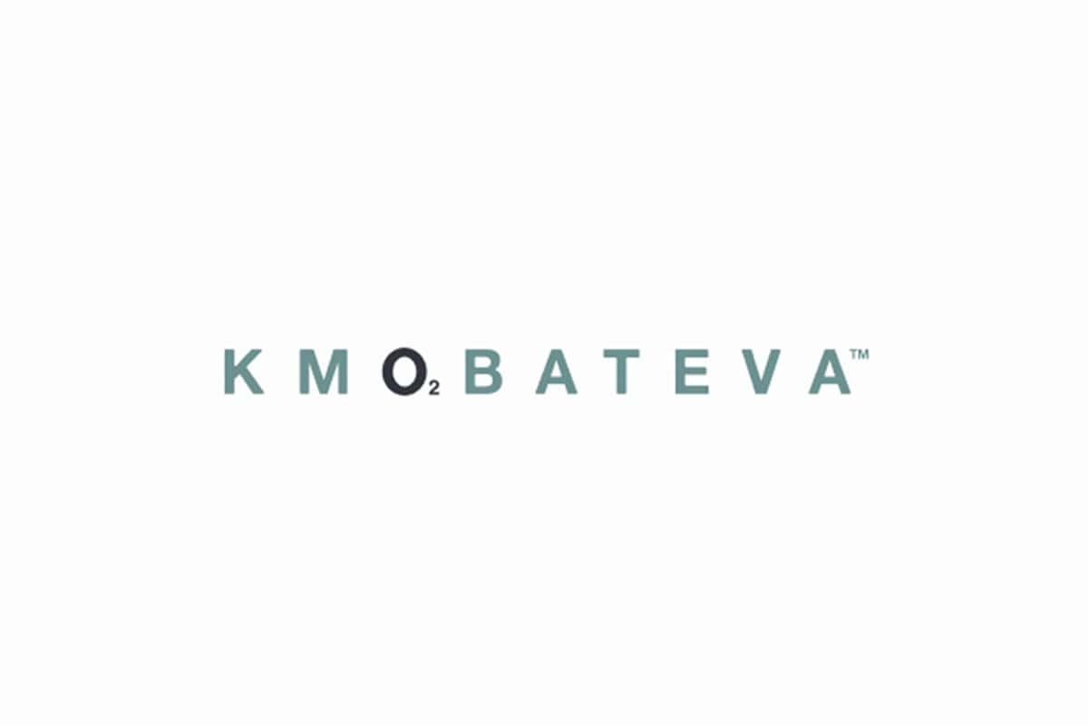
KmoBaTeva
Brand: KmoBaTeva
KMOBATEVA pioneers living water pools—spaces of pure, chemical-free clarity. We shaped the brand identity to feel as naturally compelling as the water itself.
Every design element is rooted in authenticity and simplicity: a minimal footprint, pure origins, and elegant luxury. Instead of embellishing, we refined:
The logo’s “o2” signals the “oxygen—air-in-water” technology in perfect balance.
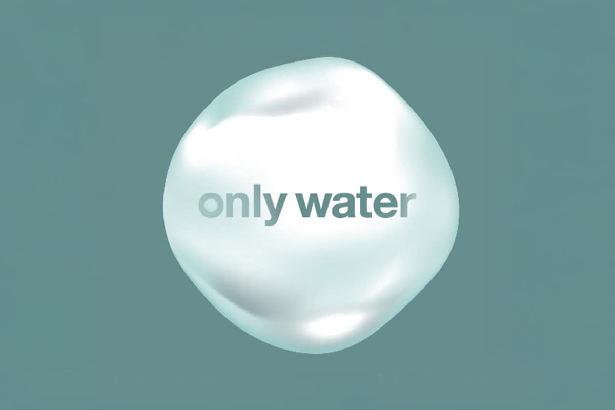
The drop-shaped symbol reflects fluidity, life, and effortless presence.
Messaging and visual style amplify the core manifesto: Only water. Swim Free.
Together, they form a design system that doesn’t dictate; it invites—into refreshment, wellbeing, and eco-habits that feel
intuitive and dignified.
Every detail in the brand language serves this tension: natural and authentic on the one hand, luxurious and precise on the other.
The logo Together, they form a design system that doesn’t dictate; it invites—into refreshment, wellbeing, and eco-habits that feel
intuitive and dignified.
The typography A visual identity that feels like natural immersion, not forced aesthetics.
The color palette Conveys serenity and purity, but with a presence of self-aware luxury. A visual identity that feels like a natural immersion, rather than a forced aesthetic. Symbolism that works emotionally and strategically —
“Only water” becomes a living, breathing narrative. An accurate expression of KMOBATEVA’s sustainability and wellness lifestyle values.
- A visual identity that feels like natural immersion, not forced aesthetics.
- Symbolism that works emotionally and strategically—“Only water” becomes a living narrative.
- Clear alignment with KmoBaTeva’s sustainability and wellness ethos.