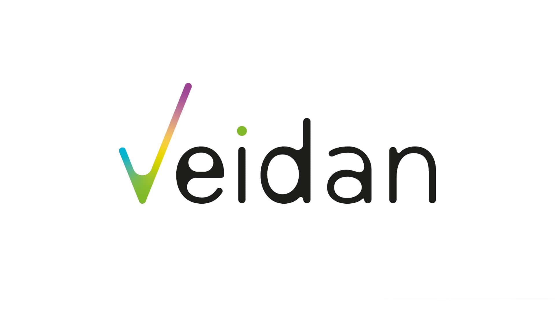
Veidan
Brand: Veidan
Industries
Technology & InnovationServices
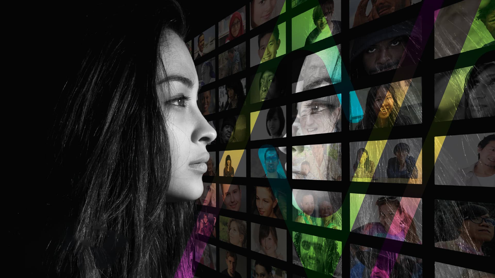
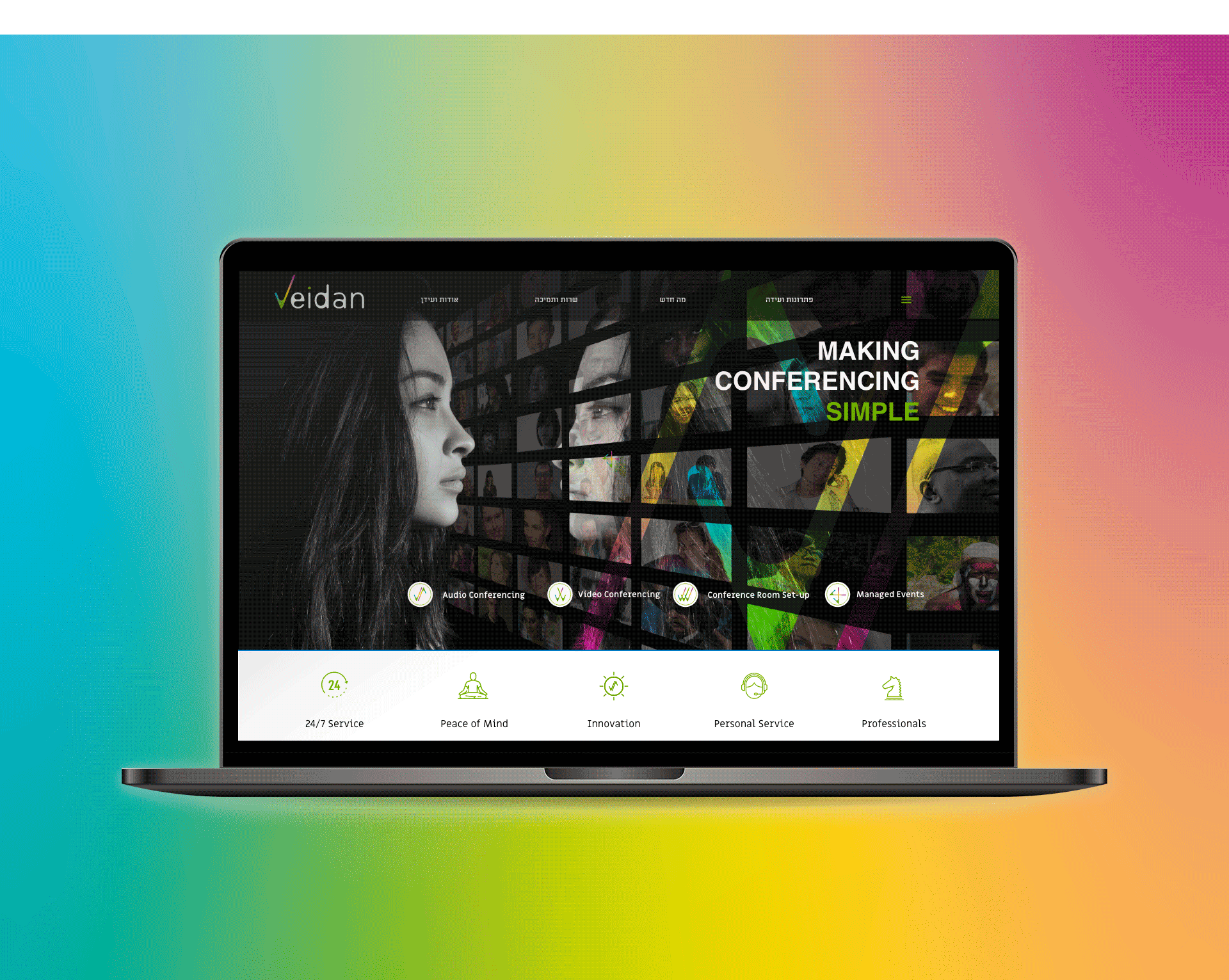
Brand Systems Identity, Graphic Design, User Experience & Interface Design (UI/UX)Veidan provides wide-ranging conferencing solutions, and our mission was to turn these capabilities into a brand language.
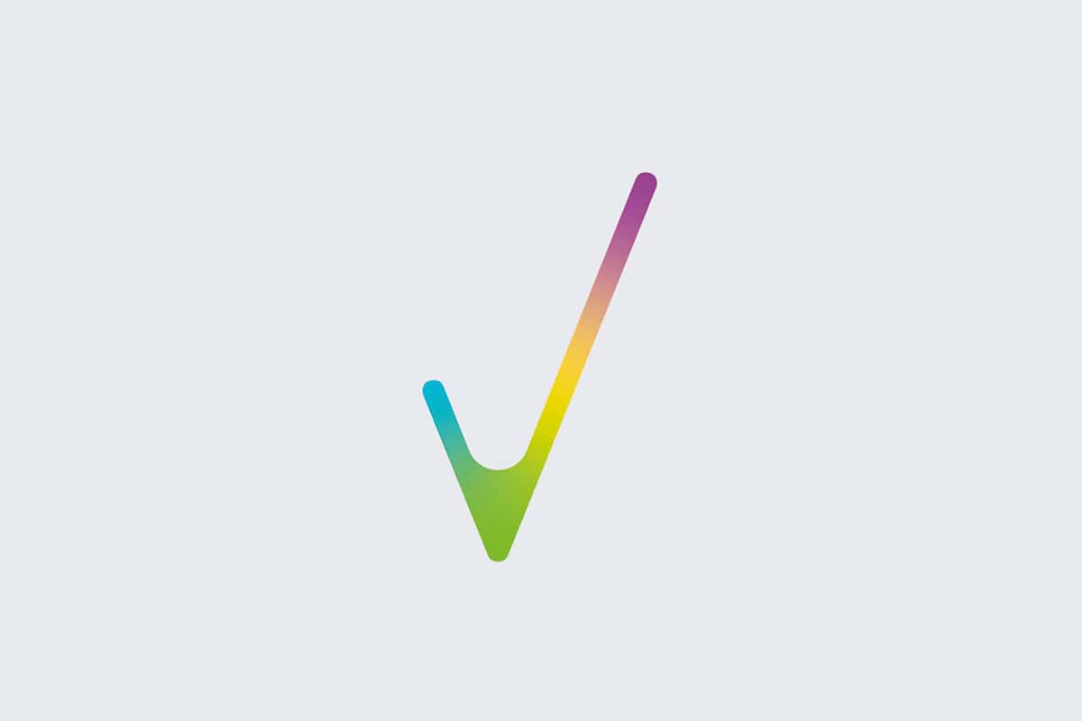
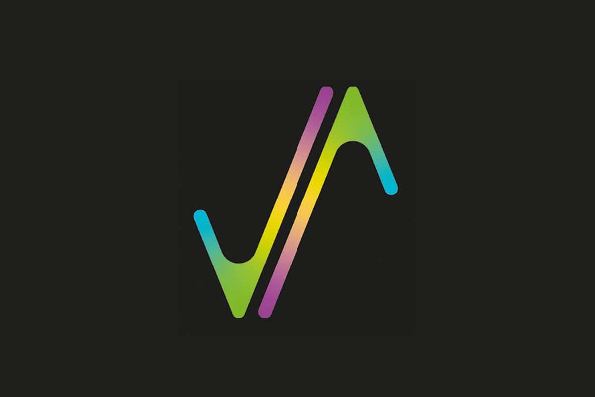
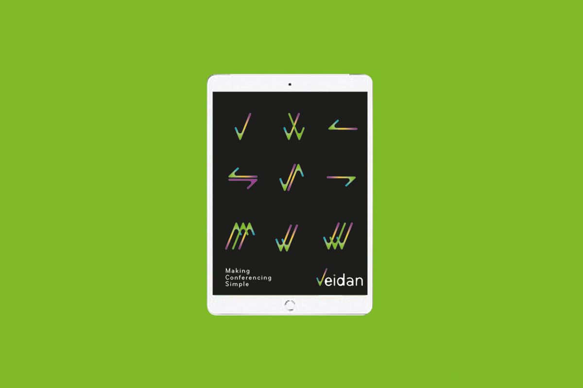
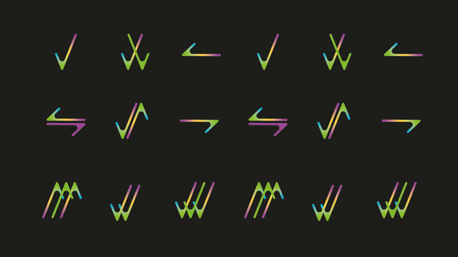
A symbol based on the V – using the letter as a recognizable icon. An internationally recognized icon that symbolizes success, a symbol that creates a positive connotation. We developed icons derived from the symbol, strong gradient colors in a combination of green, purple, blue and yellow – effectively combining the colors of all the different media companies.
A solution adapted to the modern work era
In the process of working with a company of this type that is actually an intermediary for products from other brands, the brand and the relationship between the customers and the company are of great significance. A relationship that is based on trust. A system that is based on support. In fact, the company is the one that connects the customer with his activity in all worlds of communication.