Sonim Branding and Packaging

Sonim_Package-Design_Packaging-Design

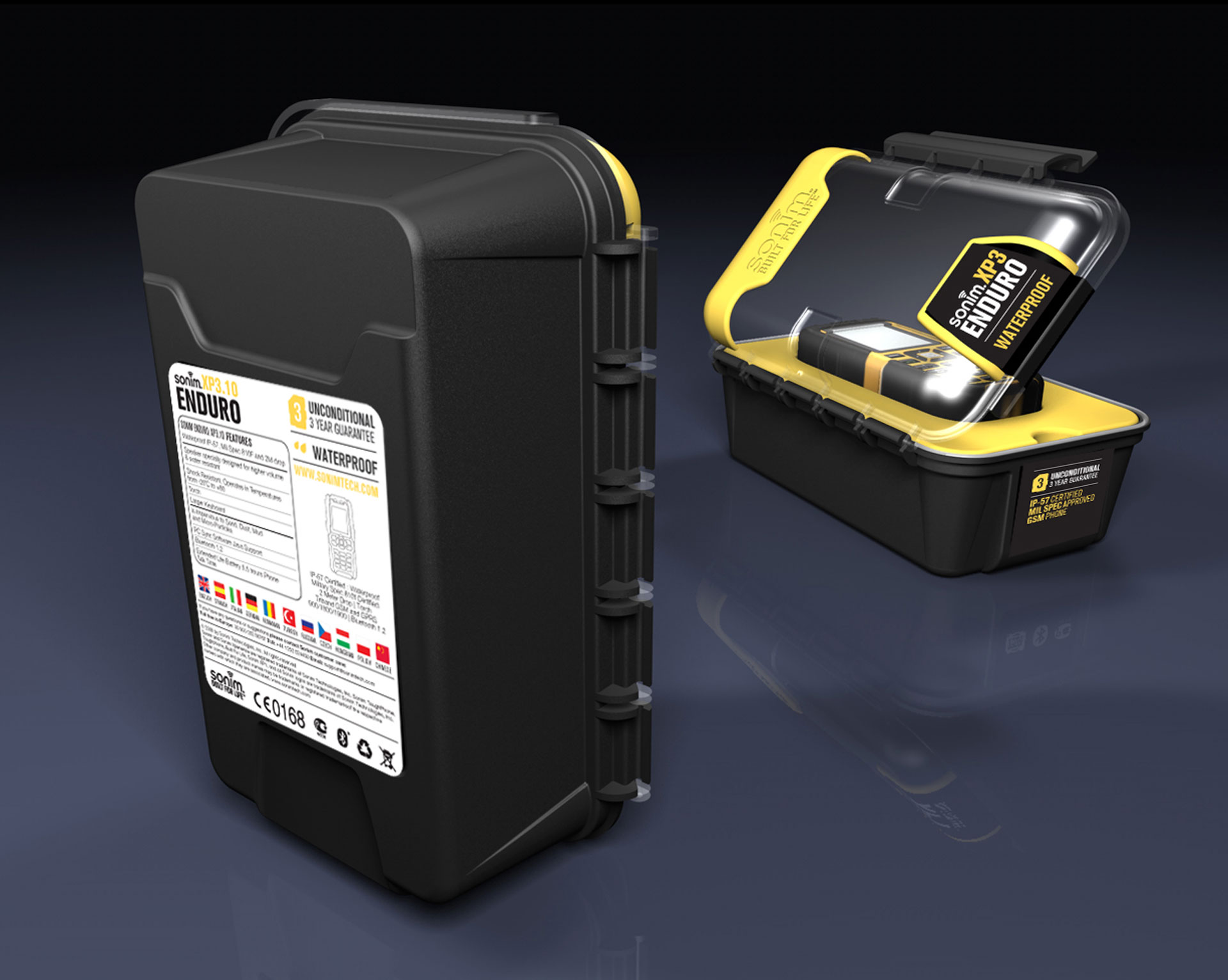
We formed our partnership with the Sonim brand when mobile phones first began to become the dominant communication tool for users around the world. As the world's most powerful mobile phone marketer, Sonim was looking for the right team to...Creative The most powerful in the world that will market its cell phones with a precise advertising campaign, and with packaging that consumers will not be able to take their eyes off; they will take care of the rest.

Sonim phones are specifically designed for demanding customers in the most demanding and hazardous work environments. Their mission to create the world's most rugged phones has been a success, and Sonim continues to maintain its position as an industry leader in rugged and waterproof mobile phones.

project Packaging design And our Sonim branding, completed over a decade ago in 2006, is still a classic example of creative marketing and design combining to create the perfect package for our customers. Our response to Sonim’s needs, to execute a precise marketing campaign and create an elegant and attractive packaging that would illustrate the phone’s qualities even before the Enduro phone was launched, ensured that we delivered on our promise to help Sonim enter the market perfectly.

Sonim_Package-Design_Smartphone-Packaging-Design

More posts

Wine, Prada and research

I don't know anyone who doesn't like wine. Red, white, pink, sparkling, still, dry, semi-dry, quarter-dry, wine. Here are some results from very diverse studies that examined the advantages and disadvantages of drinking wine. The results are a bit ambiguous :) "Drinking a glass of wine with meals reduces the risk of type 2 diabetes". "A bottle of wine is worth 10 cigarettes" "Red wine improves the health of cells in blood vessels".…

WPO-World Packaging Awards

At the World Packaging Awards in Milan, inside the Versace Palace. 500 projects from 40 countries stood before the judges. Then our name was called. Not once, but twice. GoChess — first place. 32ºN — first place. Two completely different packaging solutions. Both were built with precision, with a story, and with complete respect for the product inside. It was never about trends. It was about faith. Q - Structure is a language. Q…

Milk = MILK

See how easily a dairy brand can stand out from the competition. All with the help of a clean, simple, minimalist design and super creative packaging. The colors of the cartons symbolize the percentage of fat in each package, a number that is also clearly highlighted with a very precise font, which appears on the front. You can safely stop with drawings of cows, houses and lawns. NotFromHere C