לעיצוב אריזות בתחום של מדיקל (Health Care) יש משמעות שונה מעיצוב אריזות בכל תחום אחר:
protection: ראשית, האריזה נועדה להגן על המוצר. האריזה צריכה להיות חזקה ועמידה בטלטלות השילוח, ולהביא ללקוח מוצר שלם ומוגן. אמנם זה רלבנטי עבור כל משלוח של כל אריזה, אבל החשיבות של זה בתחום הרפואי היא שהמוצר חייב לעמוד בתנאי סטרליזציה ושילוח של מחמירים של התחום.
information: שנית, אריזת המוצר מספקת מידע חשוב אודות המוצר שבתוכו – תכולה, הוראות שימוש, למי המוצר מיועד, מה תכלית המוצר שבפנים, לאיזה שימושים רפאיים הוא מיועד ובאילו תקנים הוא עומד.
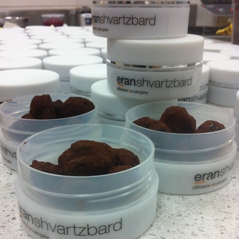
Differentiation: ולבסוף, האריזה מייצרת בידול מהמתחרים. אריזת מוצר ייחודית יכולה למצב מוצר אחד מעל האחר בשוק בעיני הצרכנים. אריזות המעוצבות בצורה שתופסת את תשומת לב הצרכן הן יתרון במכירות המוצר. ובאופן שבו המתשים מזהים את המותג .
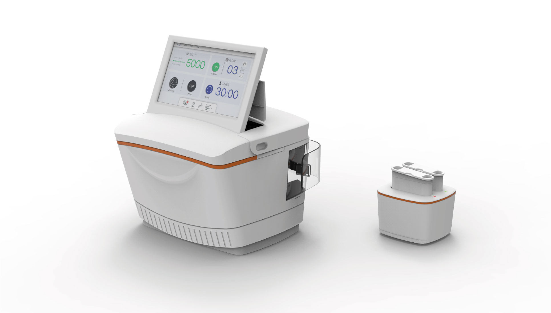
המומחיות של NotFromHere בתחום עיצוב האריזות היא שליטה מלאה בכל התהליך, החל משלב תכנון ועיצוב הפריסה של האריזה, עיצוב האריזה וחווית הפתיחה שלה, עיצוב גרפי של האריזה והחומרים המודפסים ועד לשלב ההפקה והייצור של האריזות. הנסיון הזה במהלך השנים עזר לנו לגבש רשימה של פרטים שחשוב לשים לב אליהם בעת עיצוב האריזה. כל הדגשים האלו, בשילוב שנים של ניסיון במגוון רחב של שווקים, הביאו את האריזות בעיצובנו לזכייה במקום הראשון בתחרות כוכב ישראל בעיצוב אריזות.
Regulation – In every project, the terms and conditions must be understood before any work and design process begins.
Adapting the packaging to the audience The destination – We will understand the need that the product meets among the target audience and adapt the packaging characteristics to it.
Terms of Use – Where the product is used, understanding where the product is used directly affects the size of the packaging and its material
Shipping conditions – The packaging materials and dimensions depend on how it will be sent to the customer.
Creating a holistic story with the product itself – The packaging experience is a complementary experience for the customer with the product and the brand. The packaging itself is an equally important part of the story that the brand conveys in its marketing messages, and can contribute to conveying the story to the consumer.
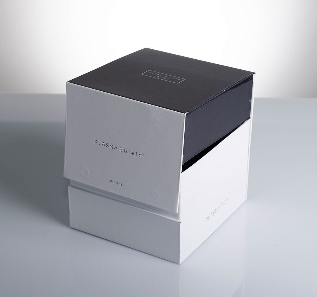
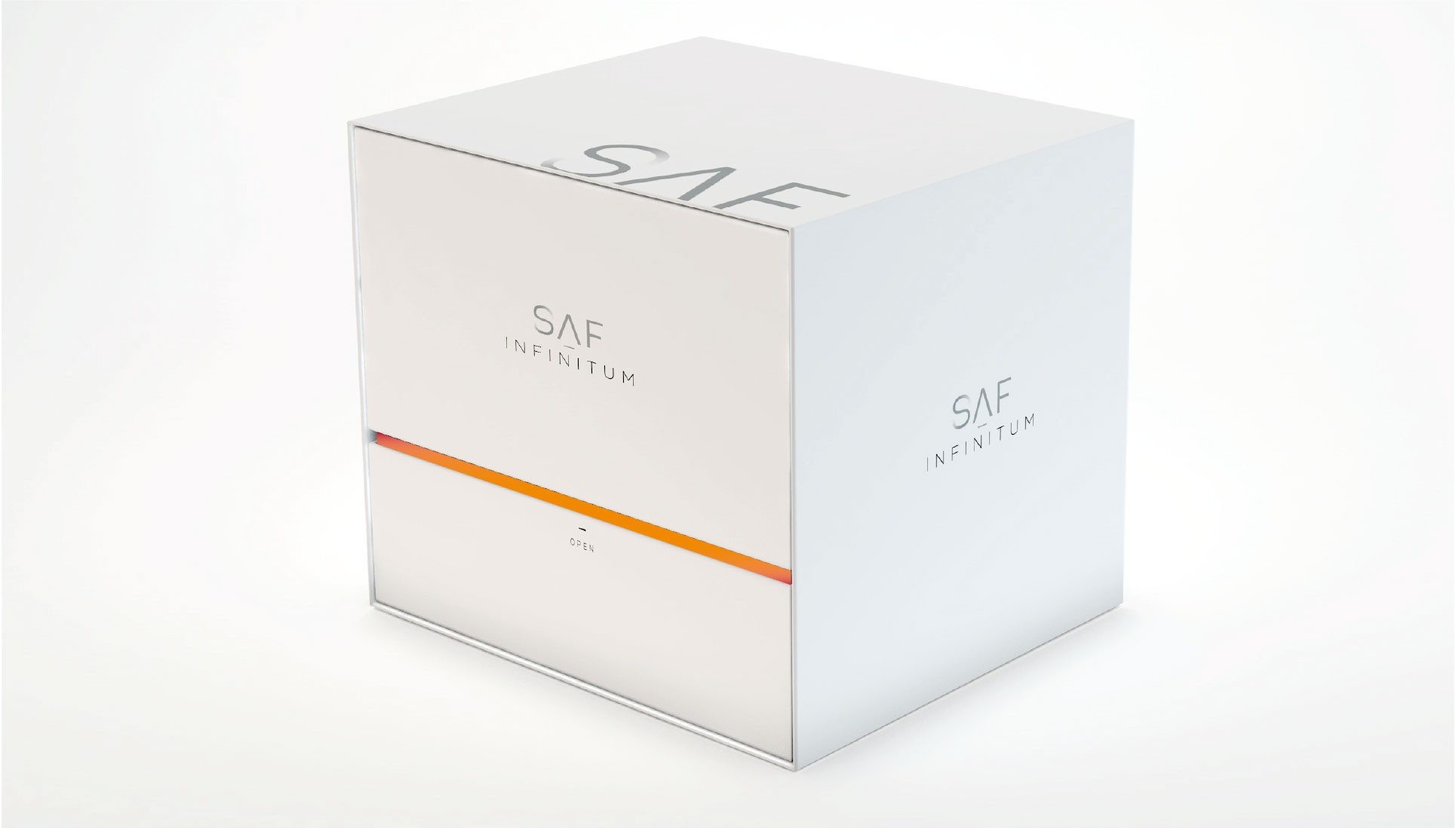
In packaging design for the medical company Plasmatica, For example, thin fonts and a black and white color palette are used that support the product, messages, and brand. The packaging, in line with the branding, conveys a high technological and medical standard, and speaks the language that the product aims to convey.