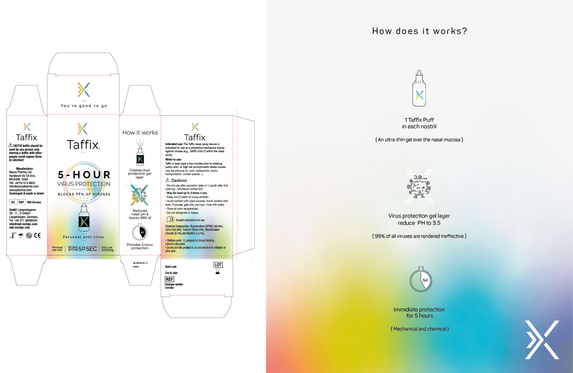
פיתוח זהות מותג,דינמית, חיובית ומקיפה, הכוללת את הנראות הברנד התוויות והאריזות של הבקבוקונים, לסטאטרטאפ חדש שהביא לעולם את האנטי וירוס להגנה מפני וירוס Covid-19
השפה הגרפית עוצבה על מנת לשדר בריאות ויעילות. פלטת הצבעים שולבה מתערובת של צבעים המייצרים תחושה .של רכות. שימוש בממעברי צבעים רכים המייצרים תחושה של רוגע. במוצר מסוג זה חשוב היה לצוות NotFromHere לייצר חוויה חיובית אצל המשתמש. ובאותו הזמן להעביר את המסרים של המוצר.
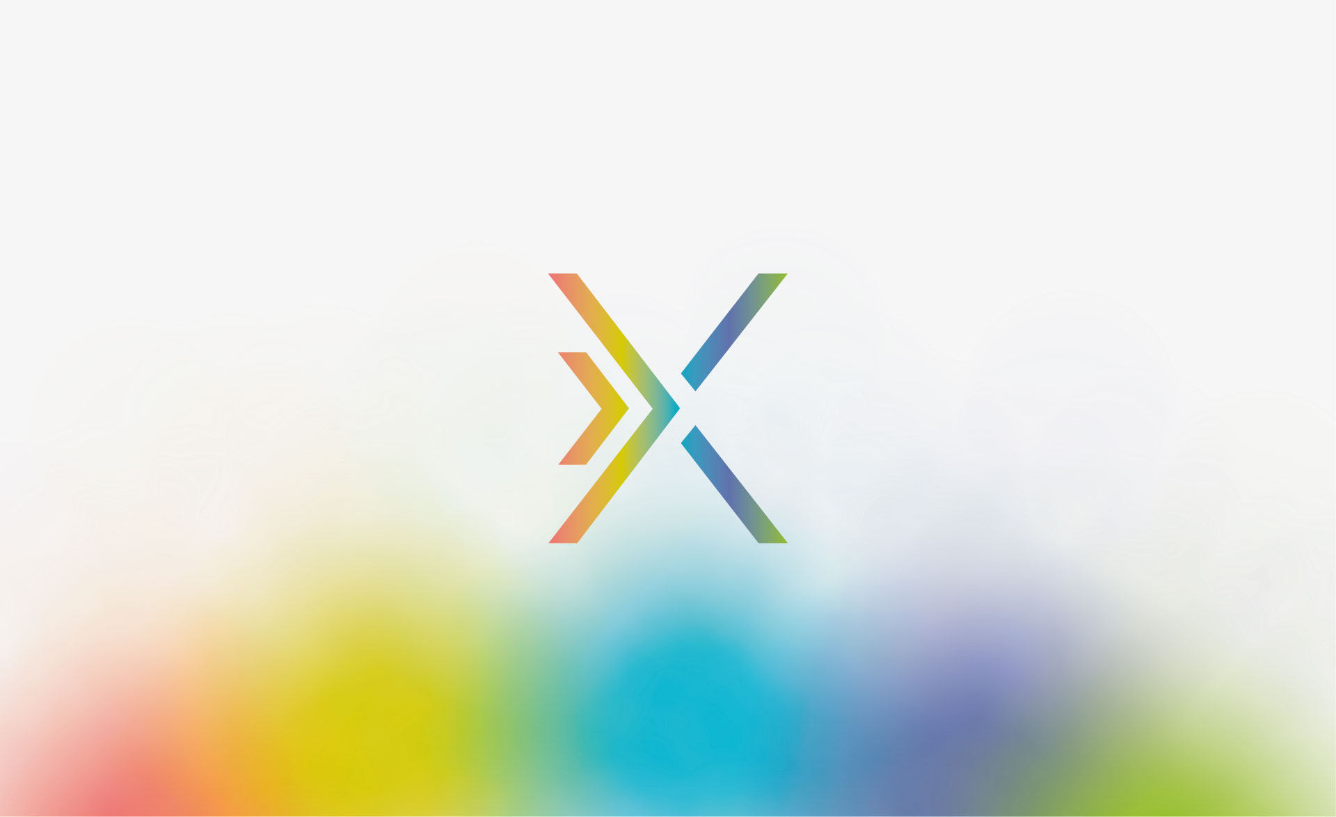
עיצוב הסמל עוקב אחר התהליך שה Taffix יוצר את שכבת ההגנה-. עיצוב המותג הונע על ידי שני גורמים: הוא היה צריך להיות ייחודי מאוד על מנת להבעיר את המסרים ואת התוצאה של השימוש- המסר: You're good to go – בעולם בו ההתרחקות החברתית והסגרים הפכו לכורח המציאות.
האתר עובר כעת תהליך הנגשה ובסיומו יותאם במלואו להמלצות התקן הישראלי (ת”י 5568) לנגישות תכנים באינטרנט ברמת AA ואת המלצות מסמך WCAG2.0 מאת ארגון W3C.
כבר עכשיו, האתר מותאם לתצוגה בדפדפנים הנפוצים ולשימוש בטלפון הסלולרי.
אנו עושים שימוש בשפה פשוטה וברורה עד כמה שניתן.
קיים מבנה קבוע לדפי האתר הדינמיים.
אמצעי הנגישות באתר:
מבחינת התאמה לדפדפנים – האתר נתמך ע”י הדפדפנים נפוצים, בגרסתם העדכנית ביותר.
להגדלת התצוגה באתר – גולשים המתקשים בראייה וברצונם להגדיל את התצוגה באתר יכולים לעשות זאת ע”י לחיצה בו זמנית על המקשים Ctrl” – ו “+” (קונטרול ופלוס). במחשבי PC או Command ו "+" (קומנד ופלוס) במחשבי מקינטוש. כל לחיצה על צמד המקשים האלו תגדיל את התצוגה ב-10%.
כדי להקטין את התצוגה יש ללחוץ בו זמנית על המקשים Ctrl”” ו “-” (קונטרול ומינוס) במחשבי PC או Command ו "-" (קומנד ומינוס) במחשבי מקינטוש.
הפעלת האתר באמצעות מקלדת – גולשים המתקשים בהפעלת עכבר יכולים לגלוש באתר באמצעות מקלדת. לחיצה חוזרת ונשנית על המקש Tab תעביר בין הקישורים השונים בעמוד. לחיצה על Enter תפעיל את הקישור המסומן.
בנוסף ניתן להפעיל את כלי הנגישות המיוצג באתר עם סמל כיסא הגלגלים המופיע מצד שמאל בדף, שבו ניתן לבצע פעולות שונות ומגוונות כגון:
הגדלת טקסט
הקטנת טקסט
גווני אפור
ניגודיות גבוהה
נגודיות הפוכה
רקע בהיר
הדגשת קישורים
פונט קריא
איפוס לברירת המחדל של האתר
נתקלתם בקושי?
אתר norfromhere ממשיך להתעדכן באופן שוטף, ולכן על אף מאמצנו הרבים להנגשת האתר, יתכן ויתגלו חלקים באתר הדורשים מאמצי הנגשה נוספים.
נשמח לעמוד לשירותכם בכל שאלה, בקשה או הצעות לשיפור
באמצעות הממונה על הנגישות באתר notfromhere, גיא לב, בכתובת מייל [email protected]
או באמצעות טופס צור קשר או במוקד שירות לקוחות טלפוני בטלפון 04-9020590
כדי שנוכל לסייע ולתת שירות בדרך הטובה ביותר בבקשה צרפו פרטים מלאים ככל שניתן:
תיאור הפעולה אותה ניסיתם לבצע
קישור -“העתק הדבק” לכתובת הדף בו גלשתם ונתקלתם בבעיה
תיאור הבעיה בה נתקלתם
סוג וגרסה של הדפדפן בהם אתם גולשים במחשב שברשותכם
סוג הטכנולוגיה המסייעת (במידה והשתמשתם)
אנחנו נטפל בבעיה ונחזור אליכם בהקדם עם סיוע אישי ופרטים על הטיפול בו נקטנו.