SAF Infinitum. Redent Nova Branding & Packaging
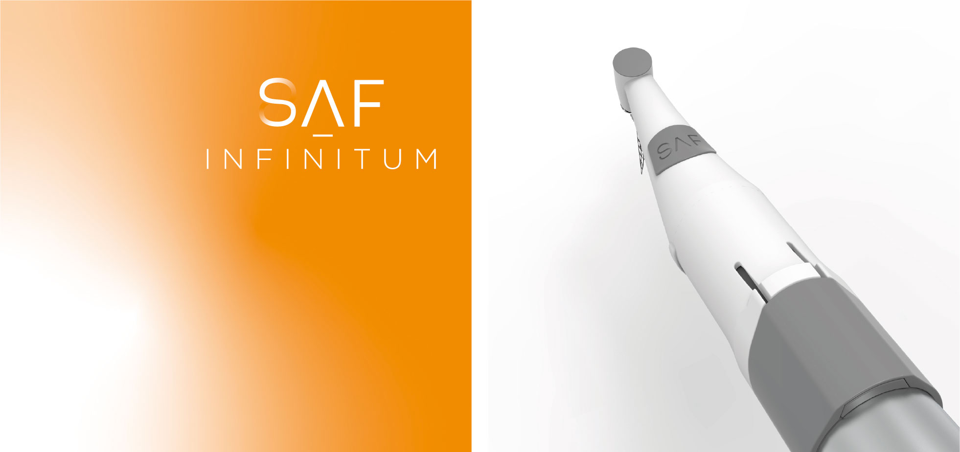
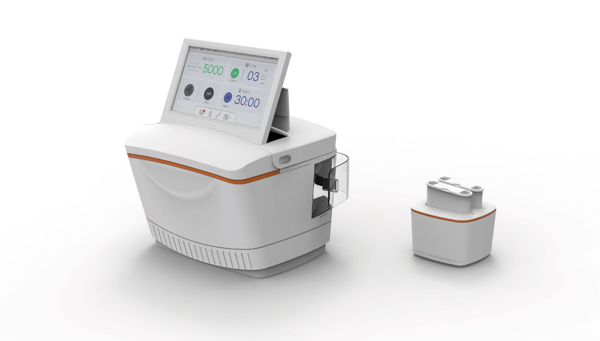
Classic corporate identity for the new innovative dental root canal treatment by Redent Nova. The SAF Infinitum.


The brand identity focuses on the new therapeutic solution using material that can change its shape. The eternal shape of the S is inspired by the shape of the root canal itself. The idea behind the graphic solution was inspired by the actual look of the canal itself. The fading symbol symbolizes the eternal shape of the canal.

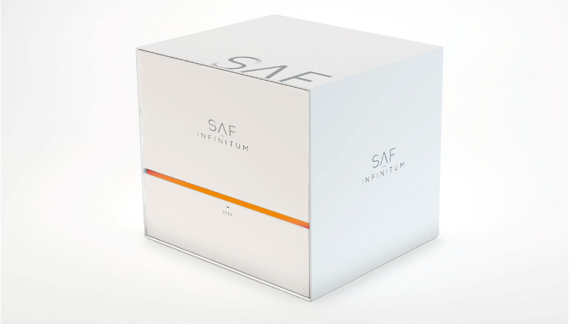
The radiant orange combined with the clean white and touch of gray delivered a very smart look and feel of a premium brand