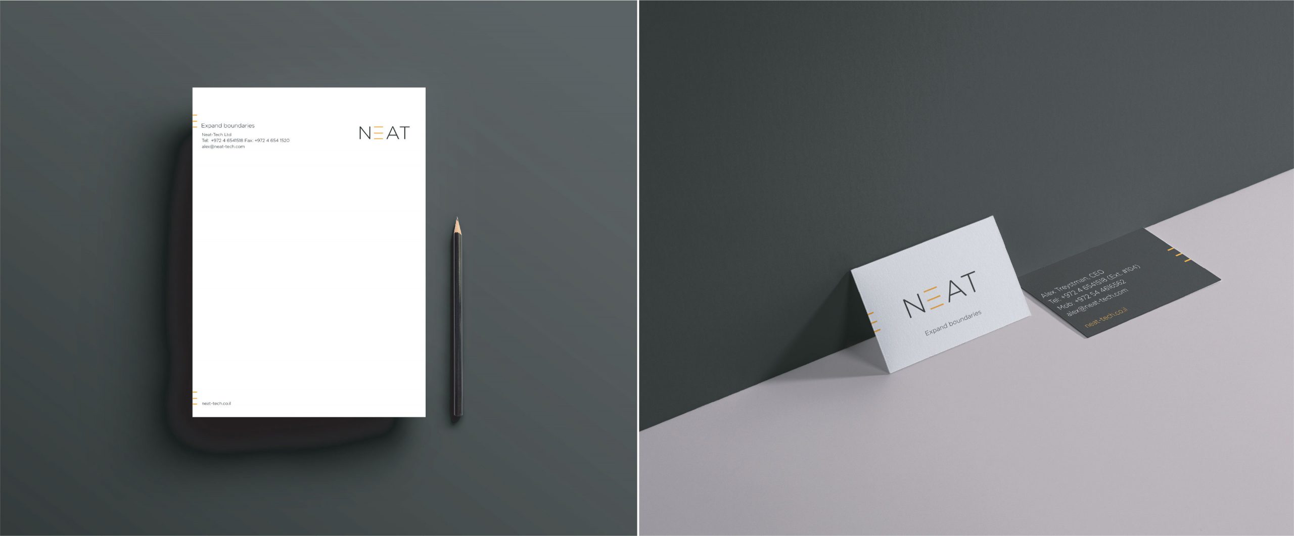
Neat. Brand Identity
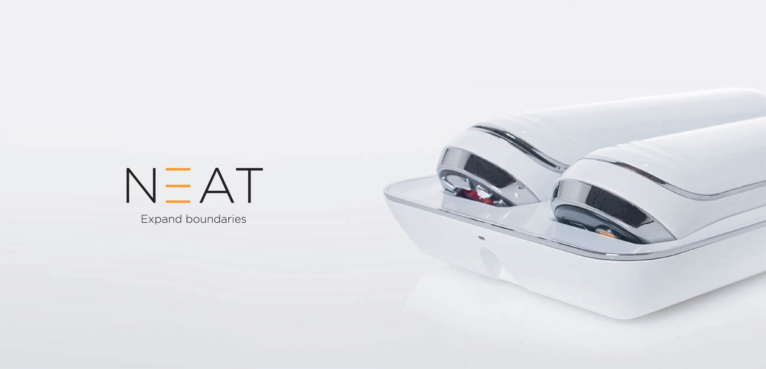
Brand identity for Neat, a multidisciplinary engineering & technology company that delivers product innovation.
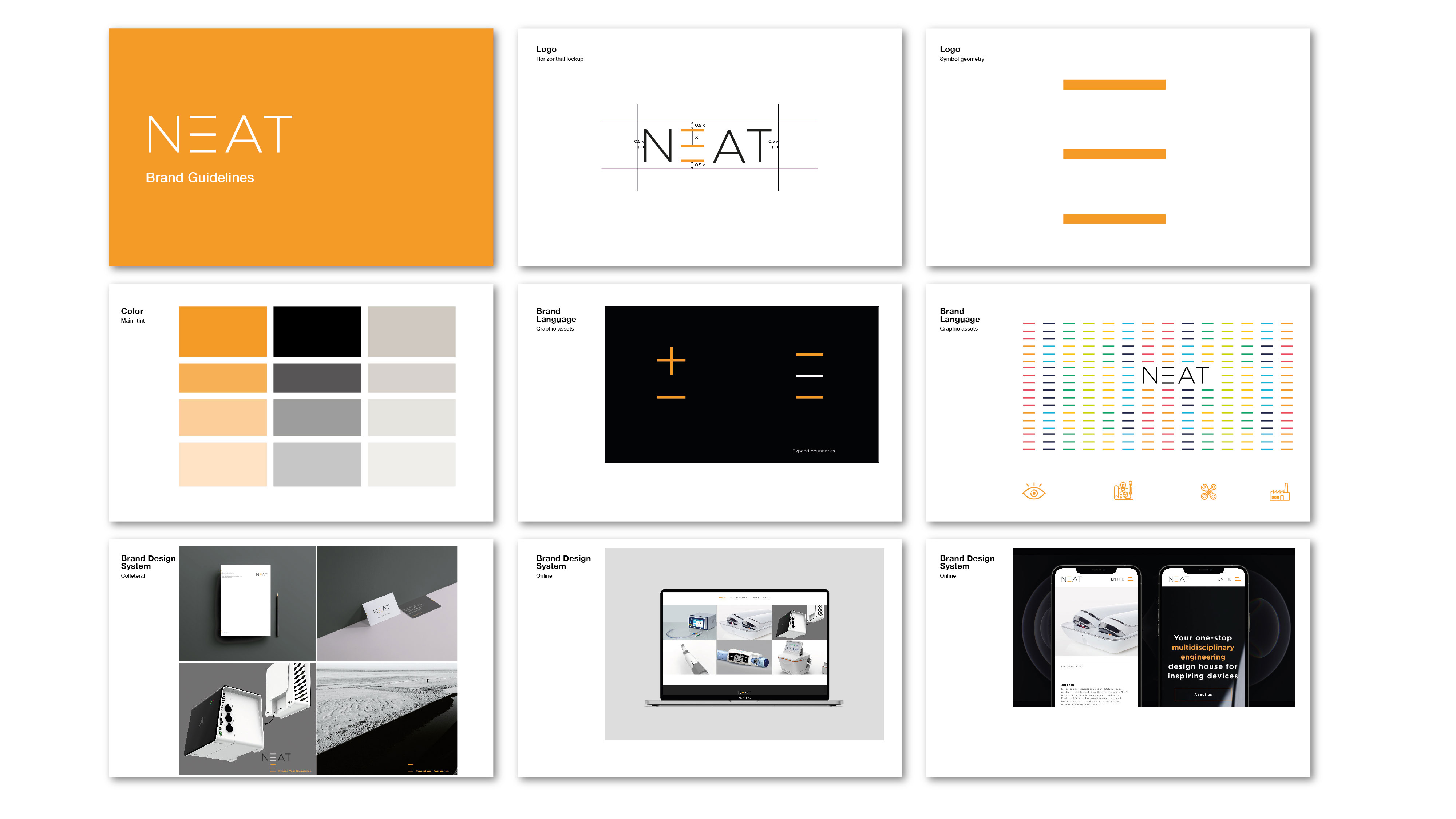
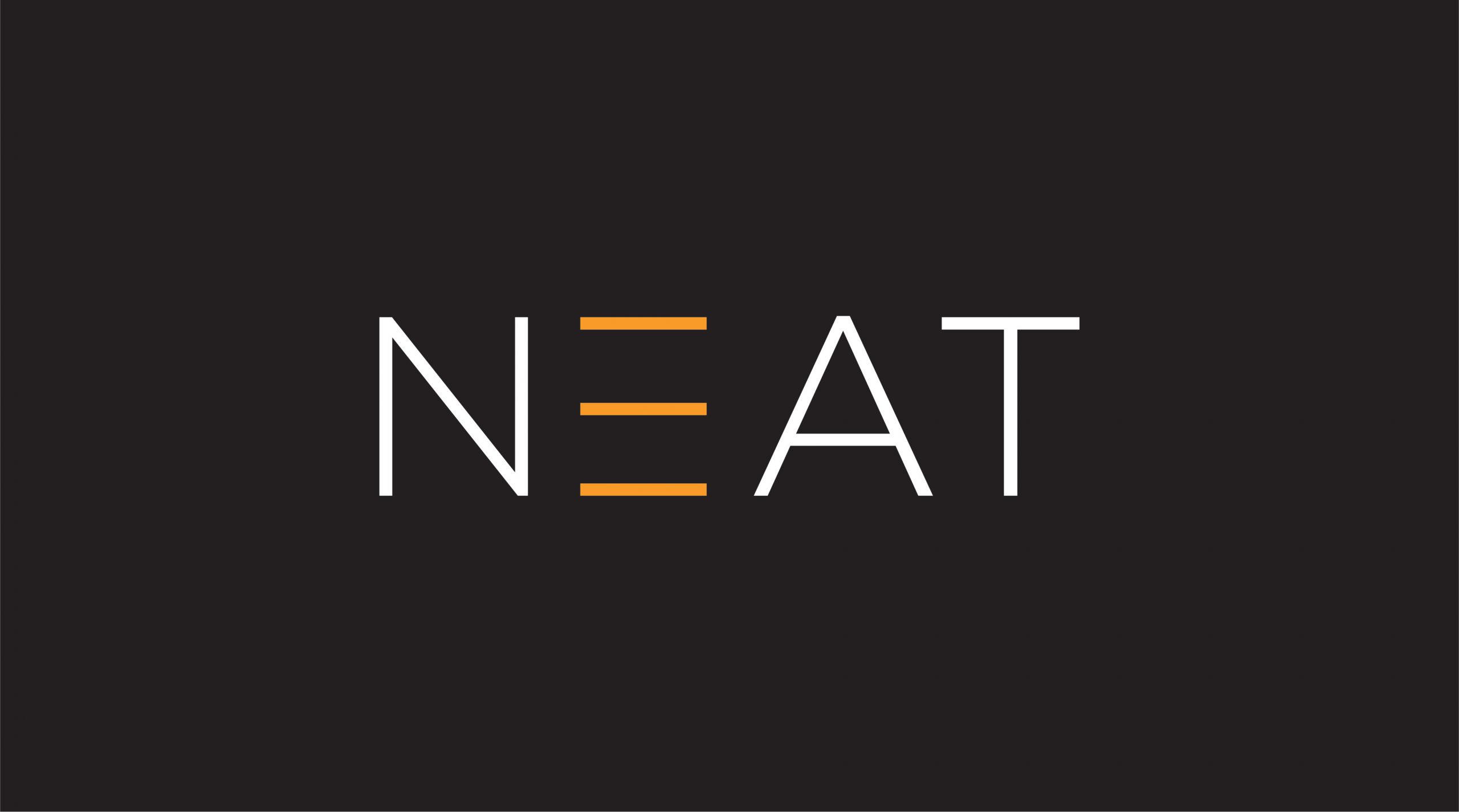
The Neat logo appears in white and bright orange. It features the three lines in place of the full letter E, which reference the innovative mind of the company, and its core message – expanding boundaries.
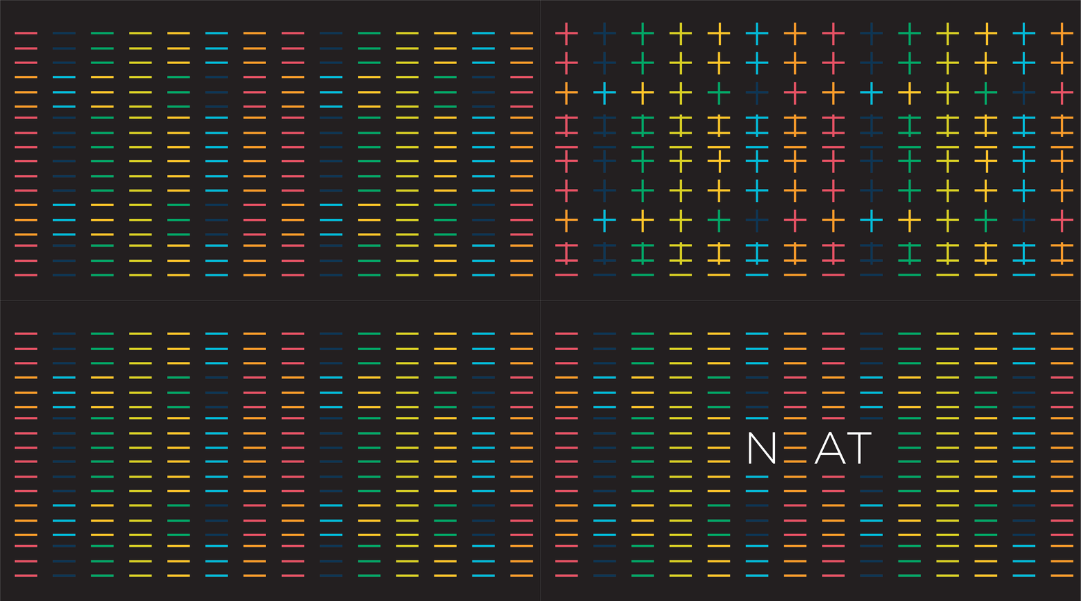
The design team’s approach & vision takes inspiration from the founder of the company and his vision of product engineering. A simple and minimalistic approach.

Working with classic type allows the NotFromHere team to incorporate the minimalistic look into the brand DNA. The biggest challenge here was to support the brand with a holistic look that reflects the founder’s inspiring character on one hand, and on the other hand delivers a well established, classic brand with more than 25 years of experience.
