[bread]
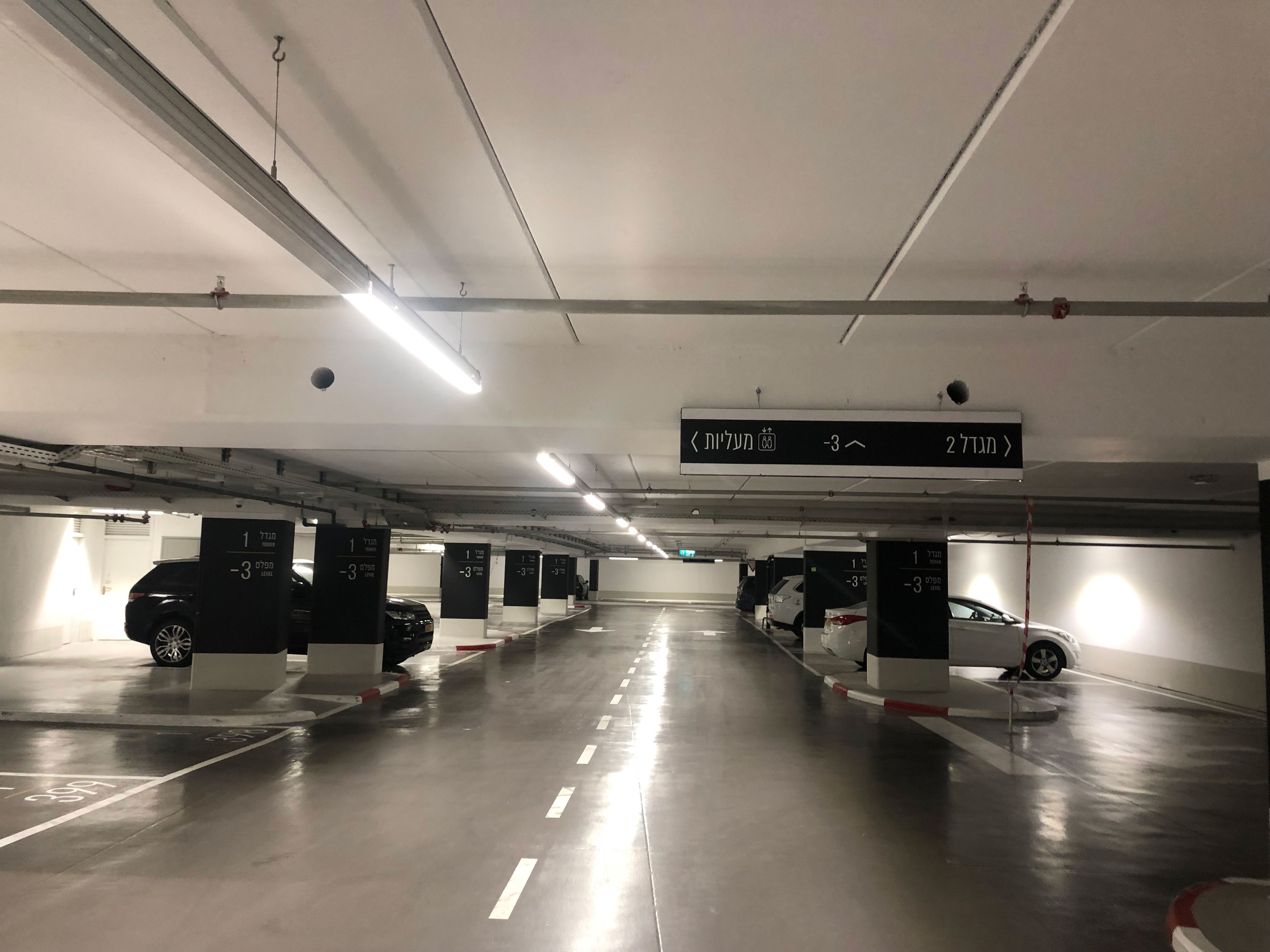
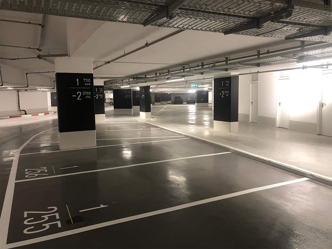
So try to close your eyes and imagine 6000 square meters... Bavli's parking lot, a three-story underground parking lot. The attitude to car parking signage design in a tenant tower is different from public parking design, the designer can enjoy a privilege of design that maintains more minimalistic values. In this project we actually created the branding of the building through the visibility of the parking lots and the signage in the building itself. The current car park is the first in a series of 6 towers, so it is literally an underground city. The graphic concept is a black and white design with a color-based differentiation that we created for the six intermediates. The need to find a car parking allows for minimal cleanliness and cleanliness since most major users know where they are going
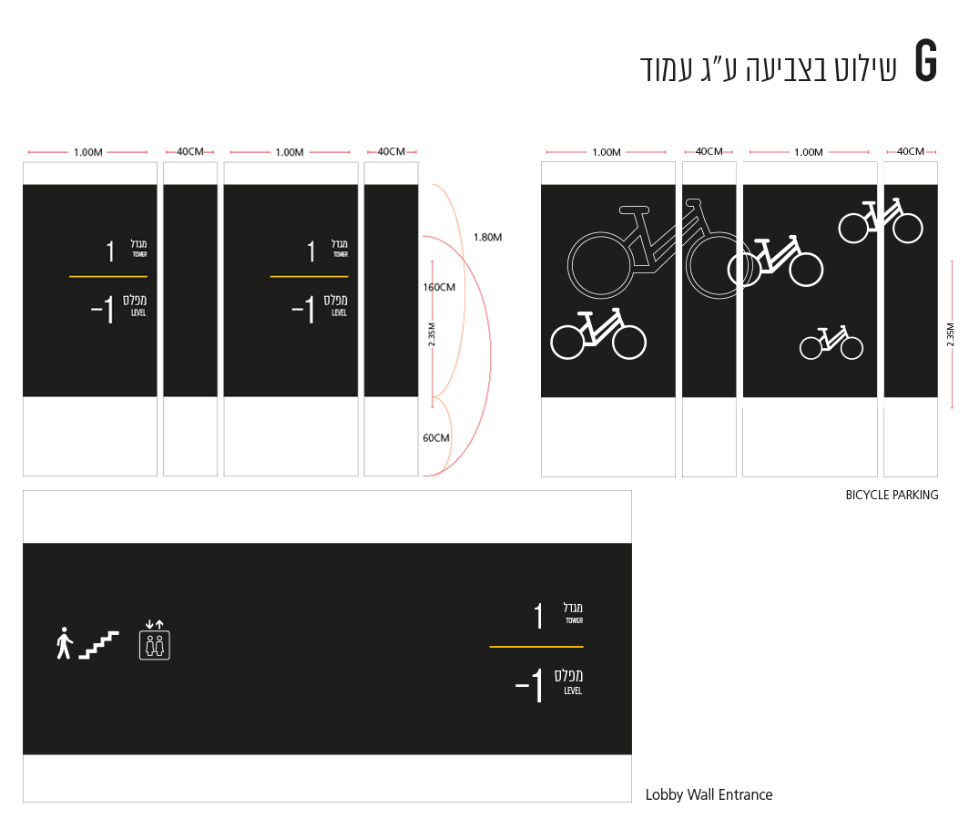
The design of the pillars in the parking lot is designed according to the height of a person. When the center of the eyes meets, the information that appears on the pillar. The signposting on the pillar should refer to location and floor.
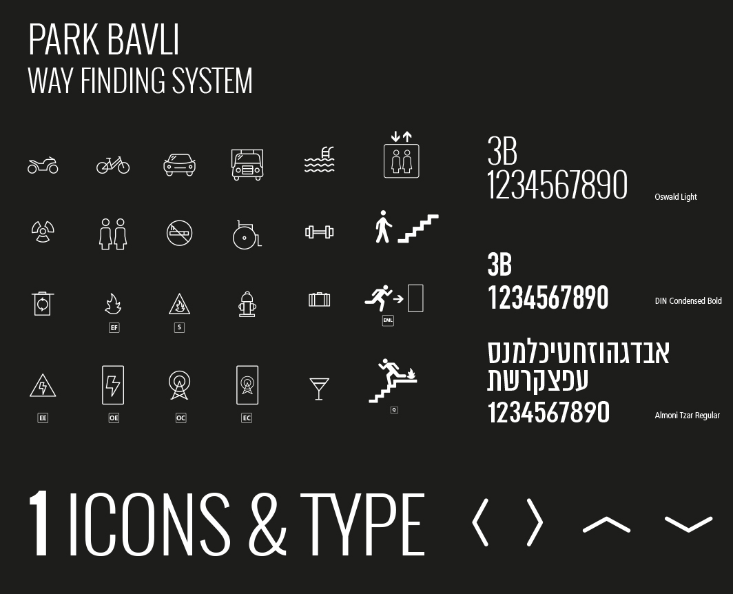
The design of the graphic language, the typography, the font type and the iconic design are a significant part of the parking signage design. Choosing what type of arrows we are using will all be part of the graphic language we have developed for the car park - the basis of all this is the branding of the building itself. Of course, it is important to remember that within a parking signage design system there are also many restrictions and many laws that we must consider in order to pass all permits.