Rideon Package Design

Packaging that is also a case for glasses

Package Design by NotFromHere

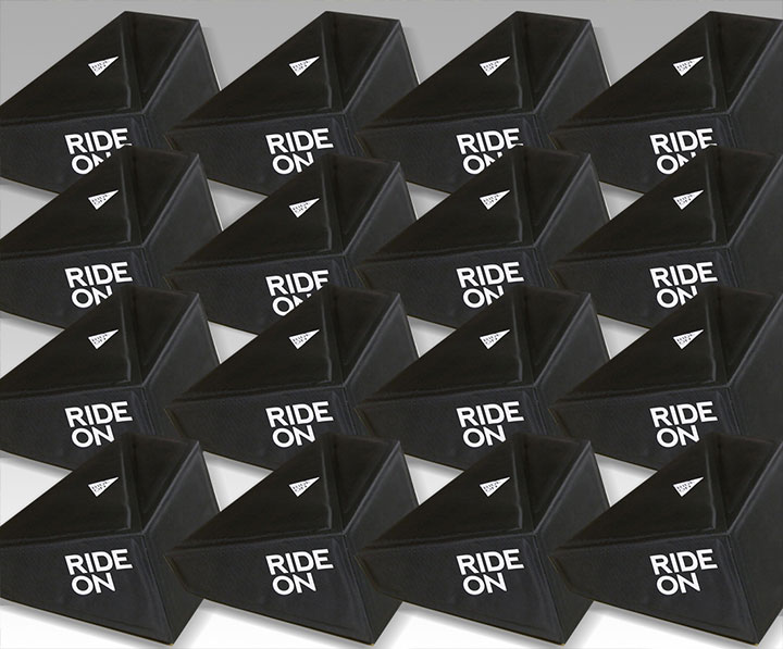
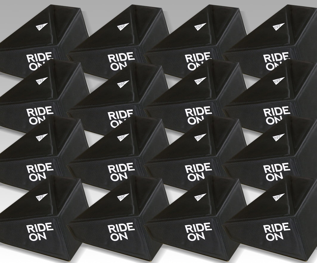
We were happy to take part in the challenge of Packaging design Attractive and functional for RideOn's smart ski goggles, this packaging has two functionalities – it is both a packaging and a case. After a long period of experimentation with design and materials, a connection was created between technology and materials that come from sports.

אריזת המשקפיים של RideOn היו תוצאה של תחכום ומאמץ עיקש. צוות העיצוב שלנו שאב השראה מרכסי הרי האלפים :חדות, זוויות, וכן צורה מעשית שתהיה נוחה לאחסון בחנות. בואו לא נשכח כמה חספוס ועמידות נדרשת בעת רכיבה קשה על המדרונות או בטיולים בסמיכות לציוד ספורט כבד אחר.

Beyond functionality, the packaging needed to stand out on the shelf as part of ski resort rental equipment, for example in retail locations. The positioning had to be the same and accompany riders on mountain ranges around the world. A combination of form, function and simplicity led everyone to agree that the final design was the gold medal winner.

More posts

Wine, Prada and research

I don't know anyone who doesn't like wine. Red, white, pink, sparkling, still, dry, semi-dry, quarter-dry, wine. Here are some results from very diverse studies that examined the advantages and disadvantages of drinking wine. The results are a bit ambiguous :) "Drinking a glass of wine with meals reduces the risk of type 2 diabetes". "A bottle of wine is worth 10 cigarettes" "Red wine improves the health of cells in blood vessels".…

WPO-World Packaging Awards

At the World Packaging Awards in Milan, inside the Versace Palace. 500 projects from 40 countries stood before the judges. Then our name was called. Not once, but twice. GoChess — first place. 32ºN — first place. Two completely different packaging solutions. Both were built with precision, with a story, and with complete respect for the product inside. It was never about trends. It was about faith. Q - Structure is a language. Q…

Milk = MILK

תראו באיזו פשטות יכול מותג חלב לבלוט מעל המתחרים. הכל בעזרת עיצוב נקי פשוט ומינימליסטי של אריזה סופר קריאייטיבית.הצבעים של הקרטונים מסמלים את אחוז השומן שיש בכל אריזה, מספר שגם מודגש בבירור עם פונט מאוד מדוייק, שמופיע בפרונט.אפשר בשקט להפסיק עם ציורים של פרות, בתים ומדשאות. NotFromHere