I hate the chlorine in the pool. A nightmare. The pungent smell, the red, burning eyes, my hair and skin getting an asphalt vibe, the disgusting taste in my mouth, no fun.
How lucky to have friends like you. KMOBATEVA That produce the next generation of pools. Pools of natural water, a real spring just in the yard of your home.
And what an honor to be responsible for their branding.
KMOBATEVA has developed a crazy technology that eliminates the need for harmful chemicals and, of course, eliminates the need for chlorine and all that crap, and all of this without algae.
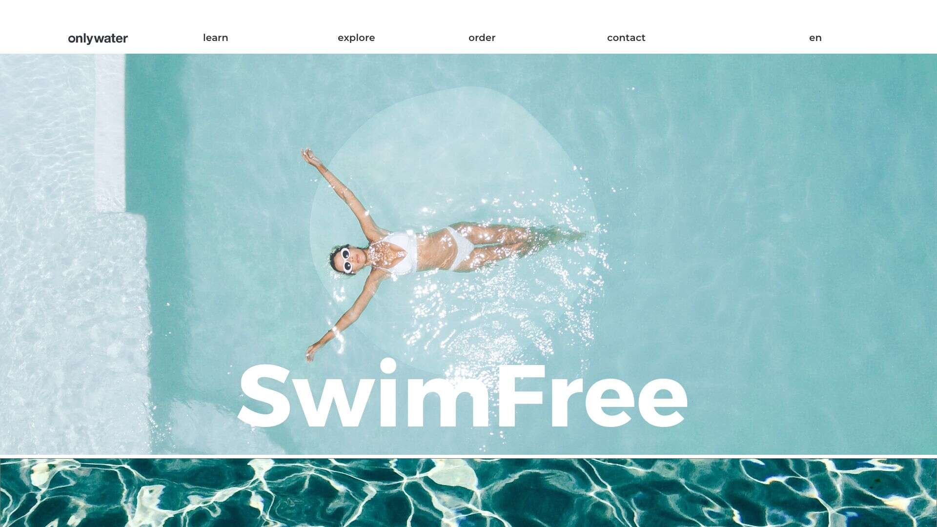
Only Water and technology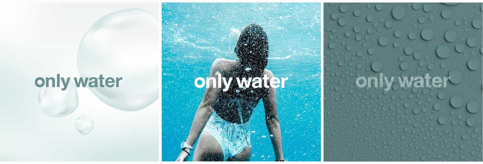
And it works. Like crazy. Both in Israel and in the European market.
Man is a smart creature, he knows what is good for him and what needs to be done to survive here on the planet in the long term, and let's say that being immersed in water on a regular basis is one of them.
Health, sustainability, healthy lifestyle, nature, uniqueness, technology, Co2.
All of these values formed the basis for the branding language we developed for them.
From A to Z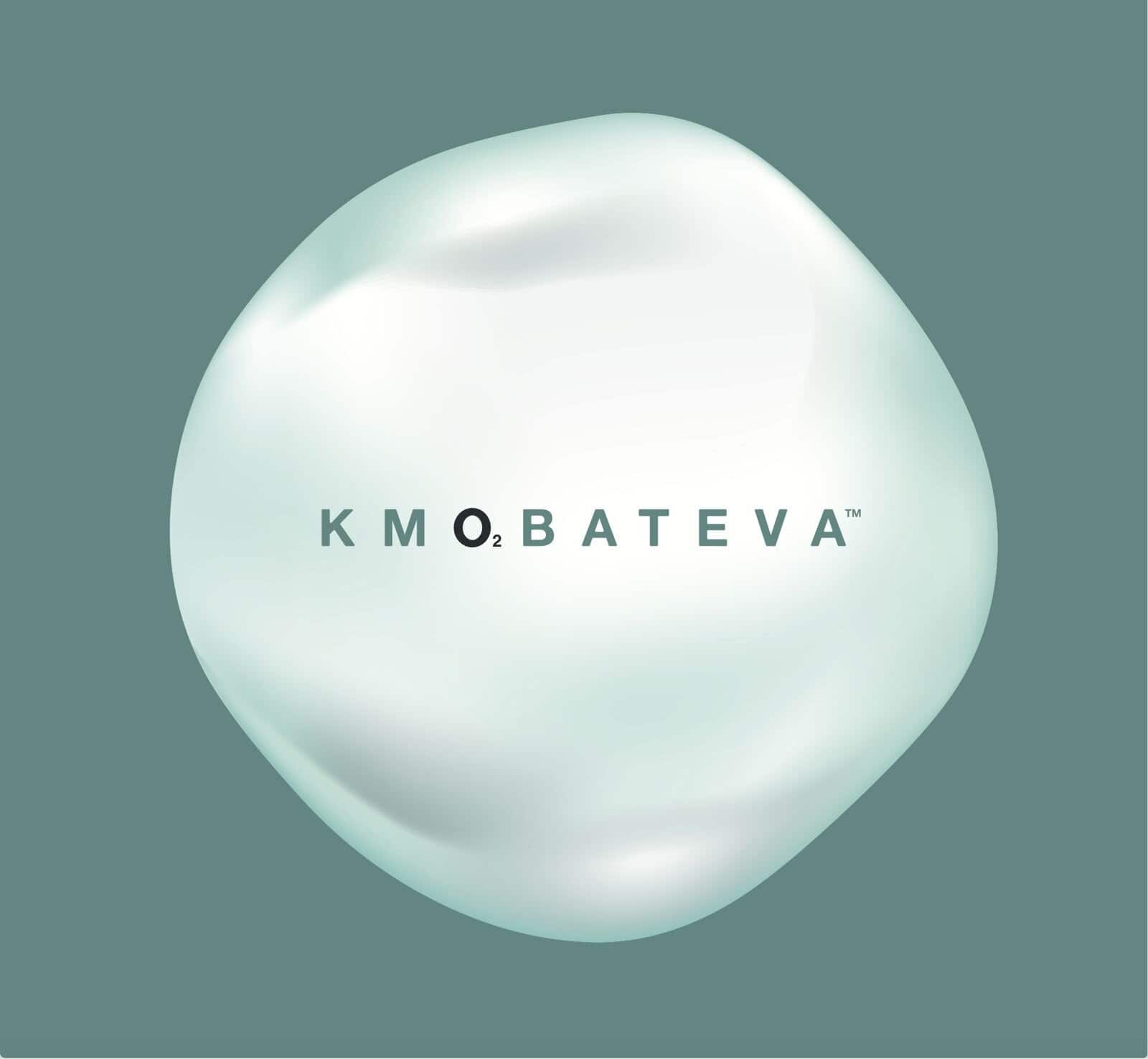
פיתחנו שפה הוליסטית עבור המותג, מהסיפור, הדינאמי – Only Water ועד לכל הנראות והקריאטייב.
A stunning brand that promotes all the values I believe in.
If possible, please also include a project that promotes natural whiskey pools,
I would love to take part.
KMOBTEVA branding
More posts
Wine, Prada and research
October 21, 2025
I don't know anyone who doesn't like wine. Red, white, pink, sparkling, still, dry, semi-dry, quarter-dry, wine. Here are some results from very diverse studies that examined the advantages and disadvantages of drinking wine. The results are a bit ambiguous :) "Drinking a glass of wine with meals reduces the risk of type 2 diabetes". "A bottle of wine is worth 10 cigarettes" "Red wine improves the health of cells in blood vessels".…
WPO-World Packaging Awards
October 9, 2025
At the World Packaging Awards in Milan, inside the Versace Palace. 500 projects from 40 countries stood before the judges. Then our name was called. Not once, but twice. GoChess — first place. 32ºN — first place. Two completely different packaging solutions. Both were built with precision, with a story, and with complete respect for the product inside. It was never about trends. It was about faith. Q - Structure is a language. Q…

Milk = MILK
October 5, 2025
תראו באיזו פשטות יכול מותג חלב לבלוט מעל המתחרים. הכל בעזרת עיצוב נקי פשוט ומינימליסטי של אריזה סופר קריאייטיבית.הצבעים של הקרטונים מסמלים את אחוז השומן שיש בכל אריזה, מספר שגם מודגש בבירור עם פונט מאוד מדוייק, שמופיע בפרונט.אפשר בשקט להפסיק עם ציורים של פרות, בתים ומדשאות. NotFromHere