What is unboxing anyway?
(Those who know can skip this part)
Over the past few years, we have been hearing this term from every possible direction. This term “unboxing” entered the consciousness along with the trend of product reviews. It all started when famous YouTubers with millions of views started uploading reviews of products they ordered online. At first, what was interesting was the product. Long after Amazon changed the rules of the game and when Apple realized (after all, this was before Amazon) that everything
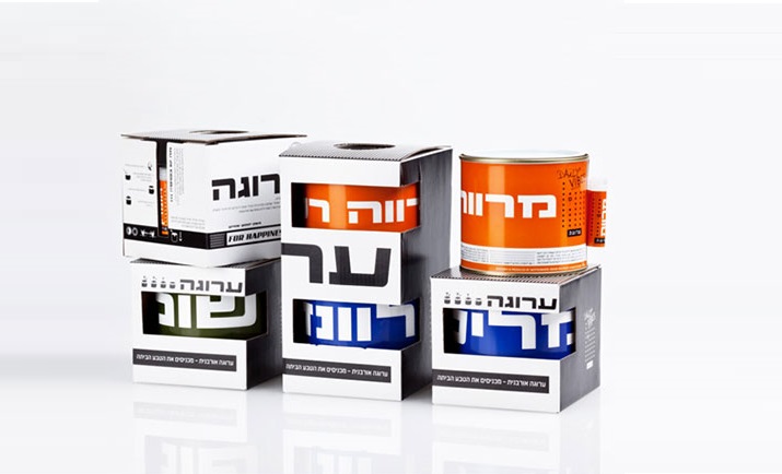
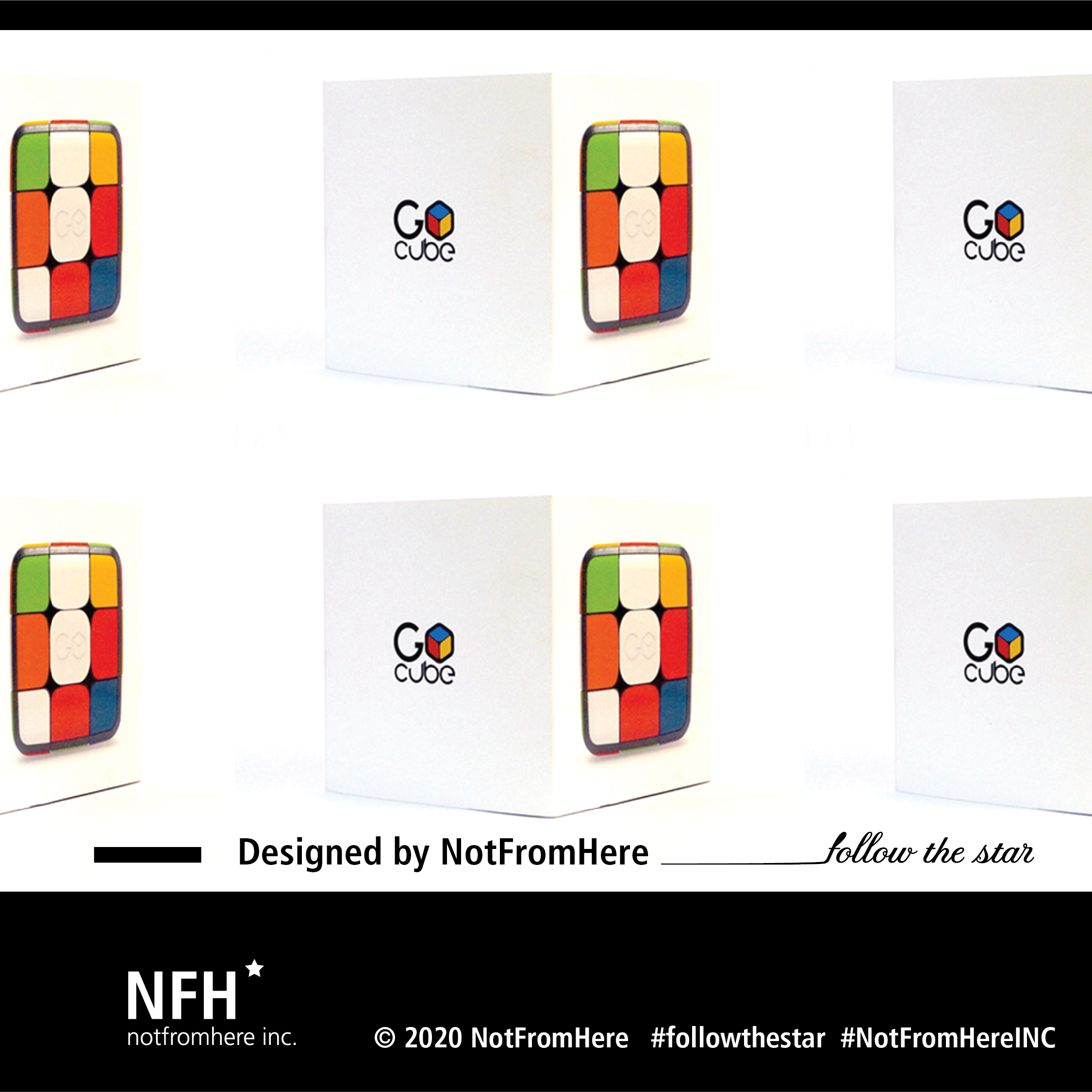
This story of Packaging design A little has changed, even all the terminology of competition and differentiation on the shelves has taken a turn in the plot. There were those who eulogized the packaging and said kaddish to it. After all, now everything is online – there are no shelves and no uniqueness. And for a moment they thought brown cardboard packaging with a one-color logo stamp would be enough for them.
https://www.youtube.com/watch?v=RoHdCWWG5EI&t=20s
So back to Apple, who have always understood and understand the power of a brand. So let's put things on the table: before the customer encounters your product, they encounter the packaging.
So let's go back to YouTubers and reviews for a second. In order to film a review of a product that you receive, you had to open the packaging, and suddenly this term of unboxing was born. So it's true that in the end most of them throw away the packaging or put it in the closet, but the moment of opening and the appearance of the product is the moment when the connection is created, and that's the whole essence of unboxing.
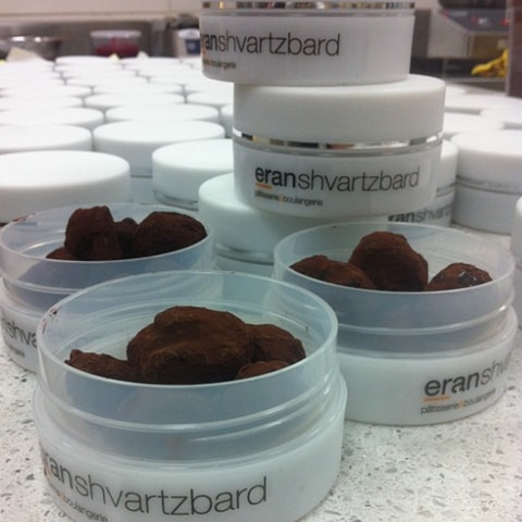
So unboxing = the customer's experiences from opening the packaging.

What is the connection between unboxing and branding?
You're probably asking what the connection is, and if it's worth it for me to invest. After all, it's a piece of cardboard that, at best, is kept in a closet. But here you're wrong. I'll take a short break to talk about Branding, and on the connection between unboxing and branding. Imagine that you were invited to the launch of the perfume of the most prestigious brand in Paris and you arrived in American Eagle sweatpants, I think that's the best metaphor, and I don't need to add anything. The packaging of the product is like the clothes you wear to the most prestigious launch. Because as a customer, it is the most prestigious.
The connection between the earthly and the spiritual
So if online is the spirit, that is, something intangible, and the store is terrestrial, we can say that today everything happens in the spirit and it is almost impossible to touch anything. Again, the question arises why invest in packaging development. The answer is simple: the competition is the same competition, only the rules of the game have changed. The goal is the same goal. We are still competing for the customer, only now the shelves are virtual and we have the opportunity to show them films and lifestyle photos with models. We sell them a story, an experience. We sell them a brand. And this experience is not
Ends after he clicks buy now.
So what is more important – the product or the unboxing?
https://www.youtube.com/watch?v=HsuP2eC6kbQ