Joovy Hong Kong Exhibition 2017

[bread]
Exhibition design by NotFromHere.

A holistic view of a brand allows for the creation of a strong brand language that allows the brand to be developed across all its platforms. The space of the pavilion can be considered as a three-dimensional experience and a dialogue between the visitor and the brand. Creating a holistic language means that every element that is part of the brand is treated with the same graphic language with reference to the media in which it appears. The challenge in designing spaces for exhibitions is creating differentiation and a language that will allow the visitor to remember the pavilion and will also create an experience of connection with the pavilion. The competition that exists at exhibitions is very great, and it can be compared to the competition that occurs on the shelves – how do you differentiate one product from another in the same category?.

Exhibition design by NotFromHere.

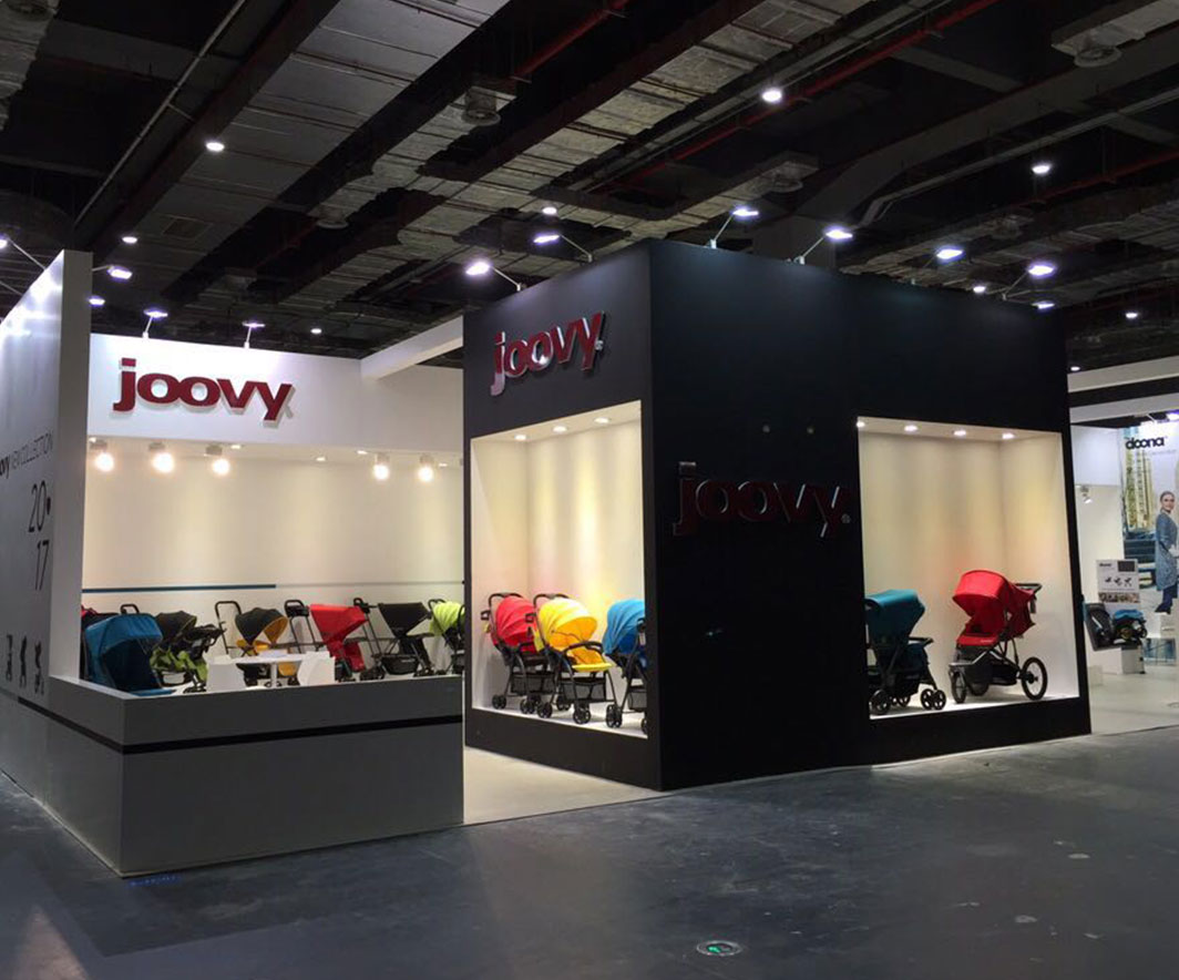
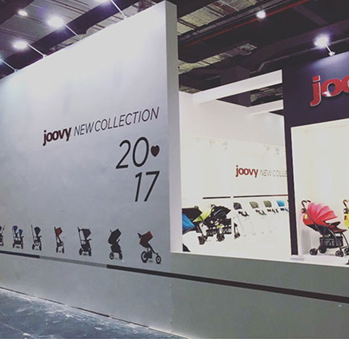
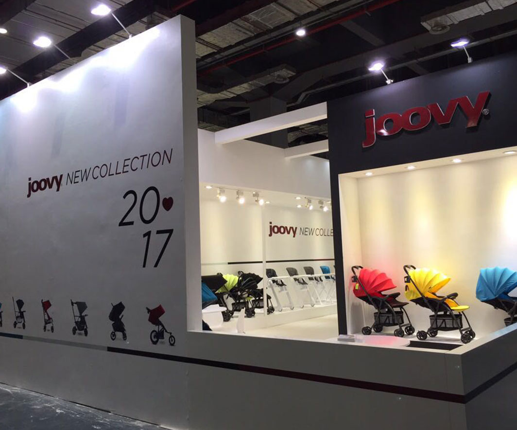
Inspired by the fashionable and elegant design of the brand's baby products, we set out to create the perfect space to showcase the brand's product selection. Joovy – Strollers, feeding aids, play spaces, and toys for a wide range of activities. The space perfectly based on the product message with our unique 3D perspective on how best to present the full range of products to the public Joovy. With the right look, use of space, and aesthetics, we grouped all the categories and created a booth for Joovy designed in the concept of a pop-up store.

More posts

Wine, Prada and research

I don't know anyone who doesn't like wine. Red, white, pink, sparkling, still, dry, semi-dry, quarter-dry, wine. Here are some results from very diverse studies that examined the advantages and disadvantages of drinking wine. The results are a bit ambiguous :) "Drinking a glass of wine with meals reduces the risk of type 2 diabetes". "A bottle of wine is worth 10 cigarettes" "Red wine improves the health of cells in blood vessels".…

WPO-World Packaging Awards

At the World Packaging Awards in Milan, inside the Versace Palace. 500 projects from 40 countries stood before the judges. Then our name was called. Not once, but twice. GoChess — first place. 32ºN — first place. Two completely different packaging solutions. Both were built with precision, with a story, and with complete respect for the product inside. It was never about trends. It was about faith. Q - Structure is a language. Q…

Milk = MILK

See how easily a dairy brand can stand out from the competition. All with the help of a clean, simple, minimalist design and super creative packaging. The colors of the cartons symbolize the percentage of fat in each package, a number that is also clearly highlighted with a very precise font, which appears on the front. You can safely stop with drawings of cows, houses and lawns. NotFromHere C