
Neat Technologies
Brand: Neat
Industries
Hi-Tech. Technology & StartupsServices
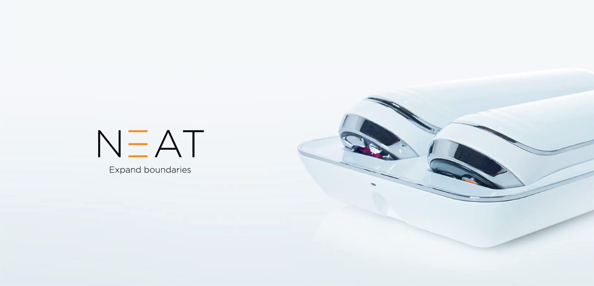
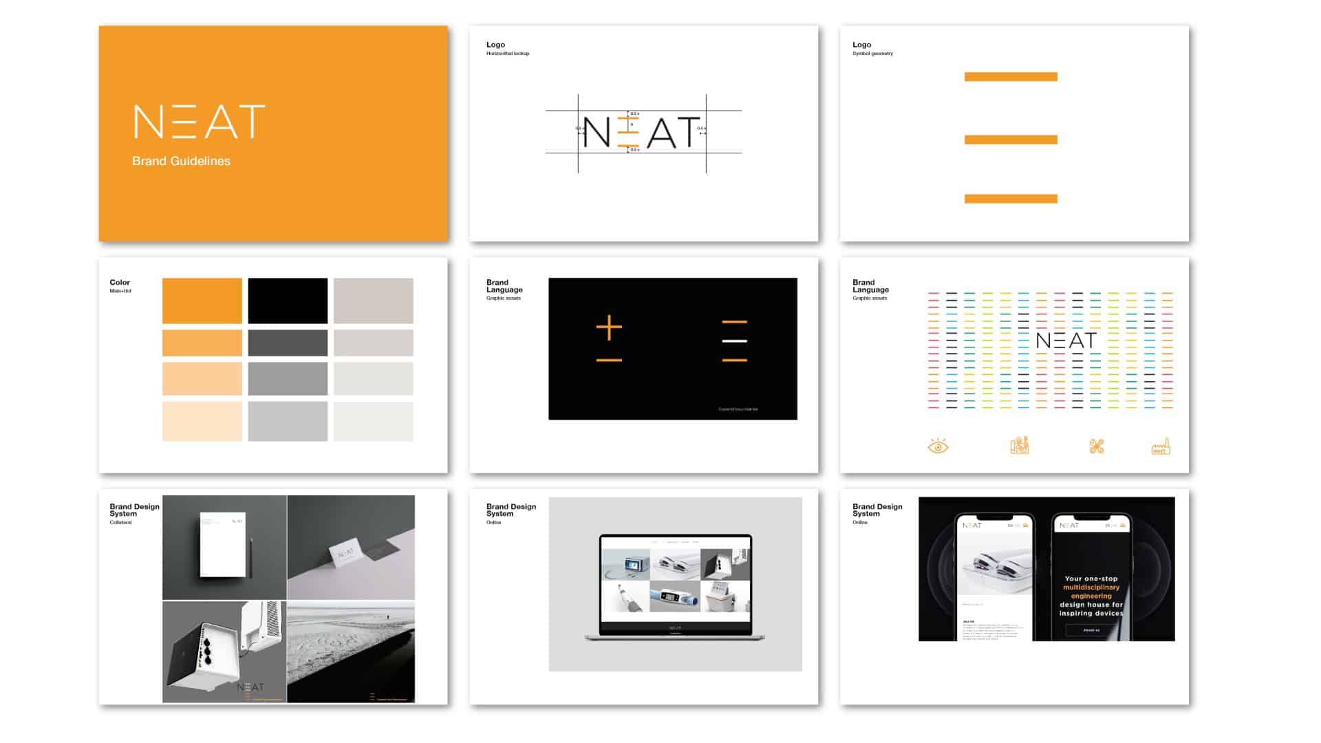
Brand Strategy & Positioning, Digital design and developmentNeat is a multi-disciplinary engineering and technology company that moves at the pace of innovation — and they approached us to incorporate their vision into their brand identity. The mission: not only to build a striking logo, but to create Graphic language That creates a holistic experience that connects the product to the brand on a deep and meaningful level.
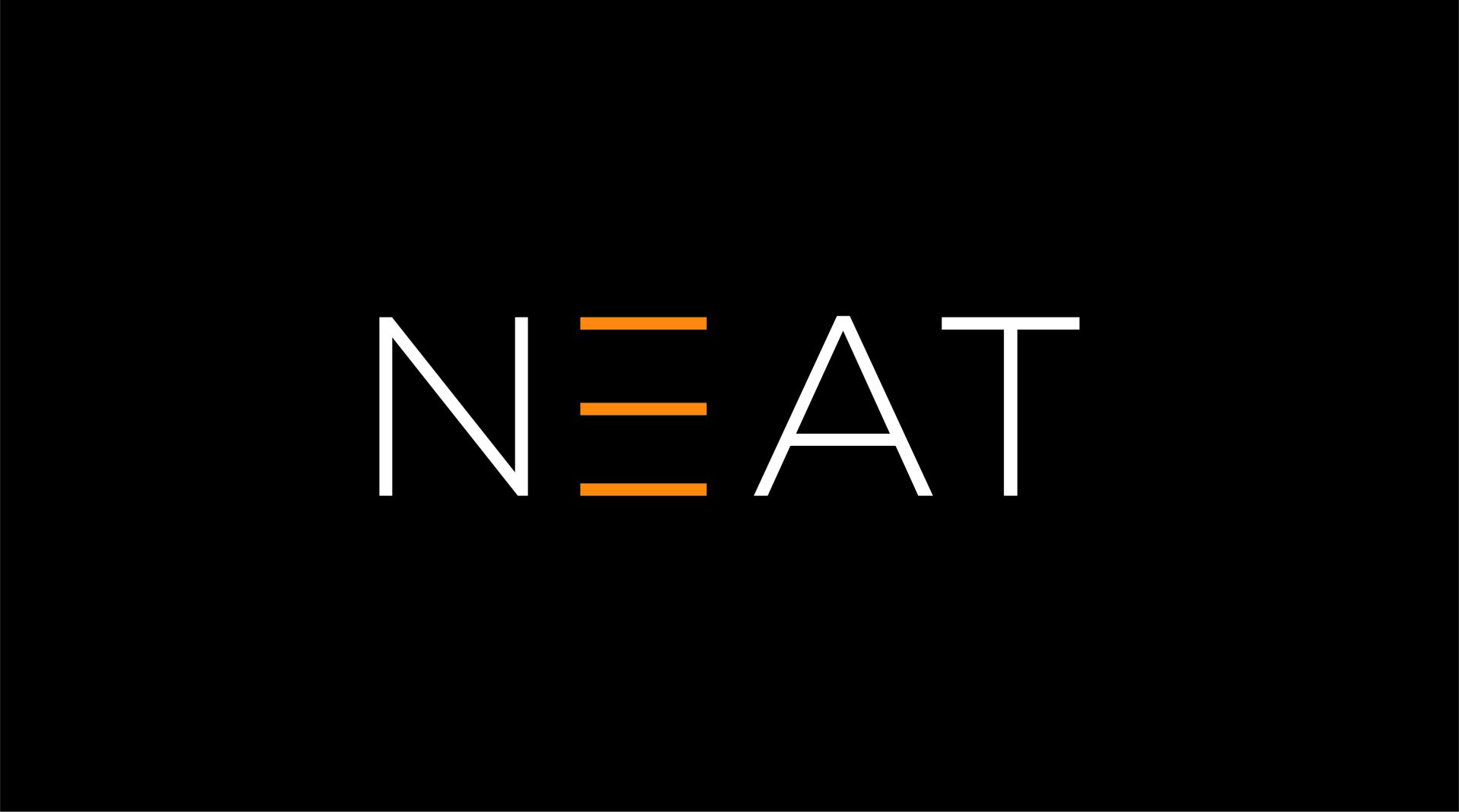
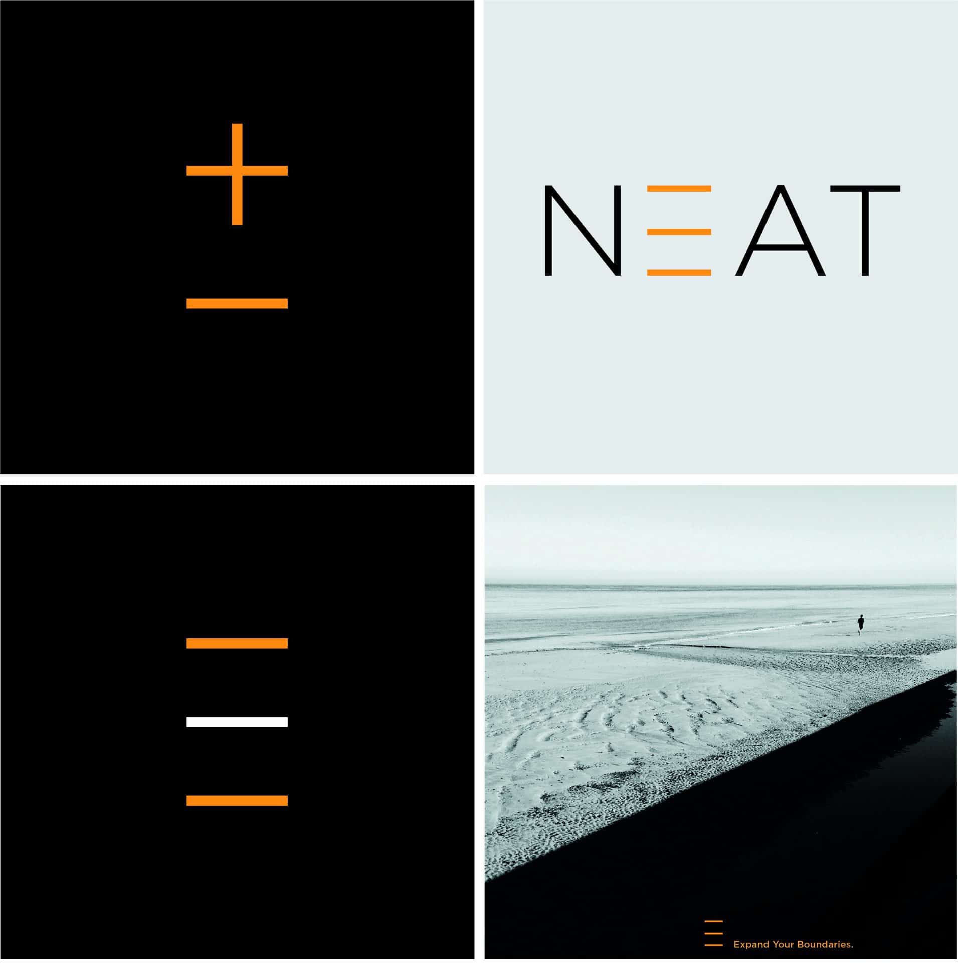
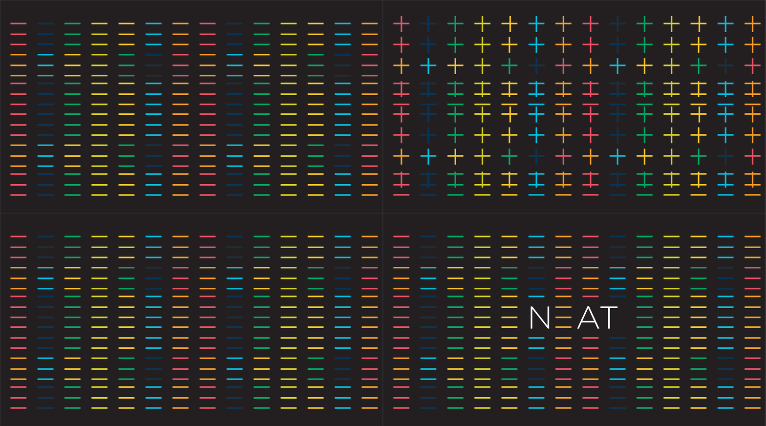
The new logo uses short, focused lines, an elegant replacement for the full E — representing the spirit of the founders and the constant movement forward. The colors — white and bright orange — bring a clean yet strong visual contrast that expresses technology alongside humanity. Classic typography serves as a bridge between minimalism and the DNA of a long-standing brand with many years of experience.
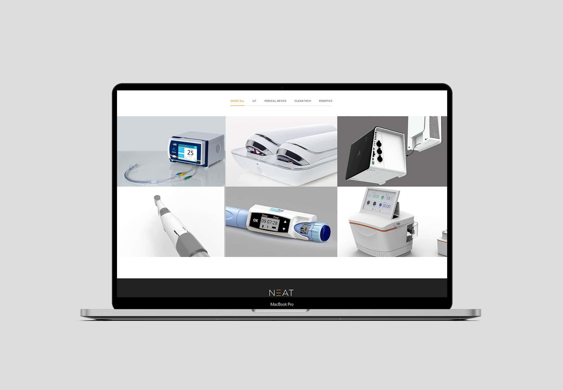
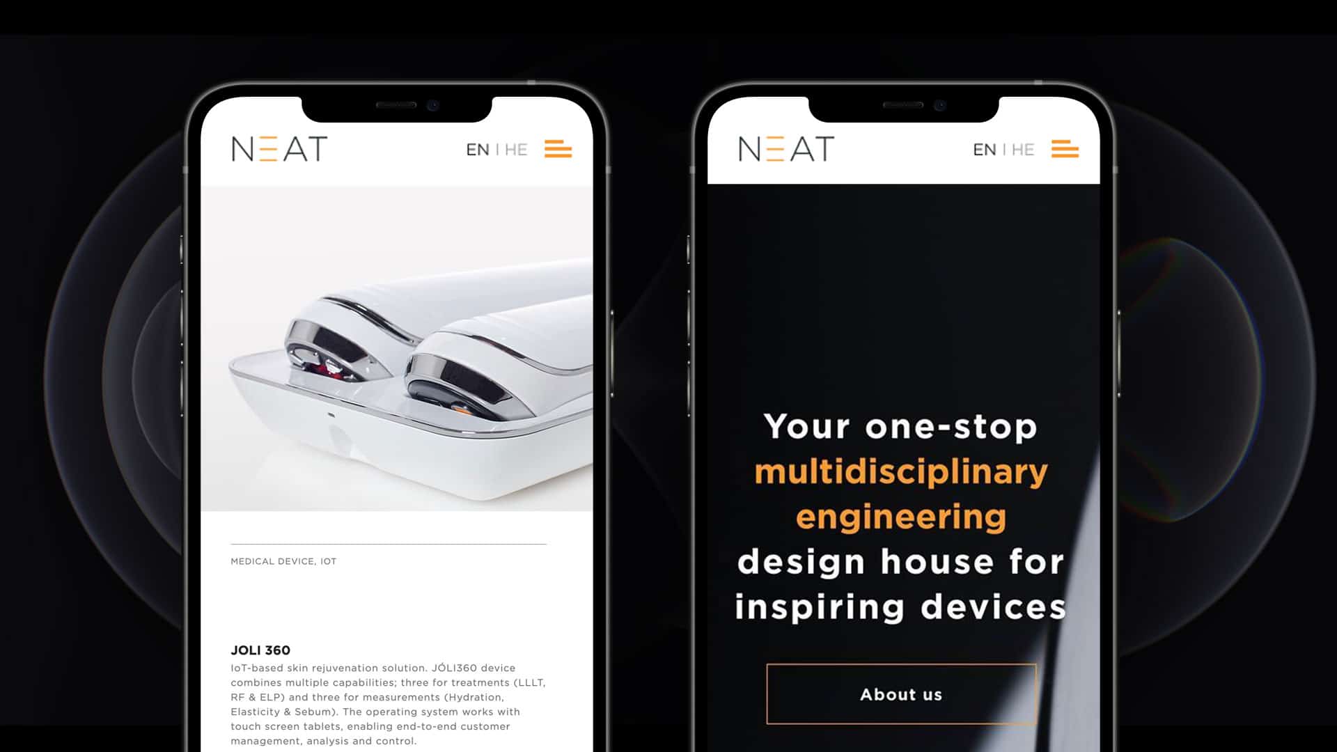
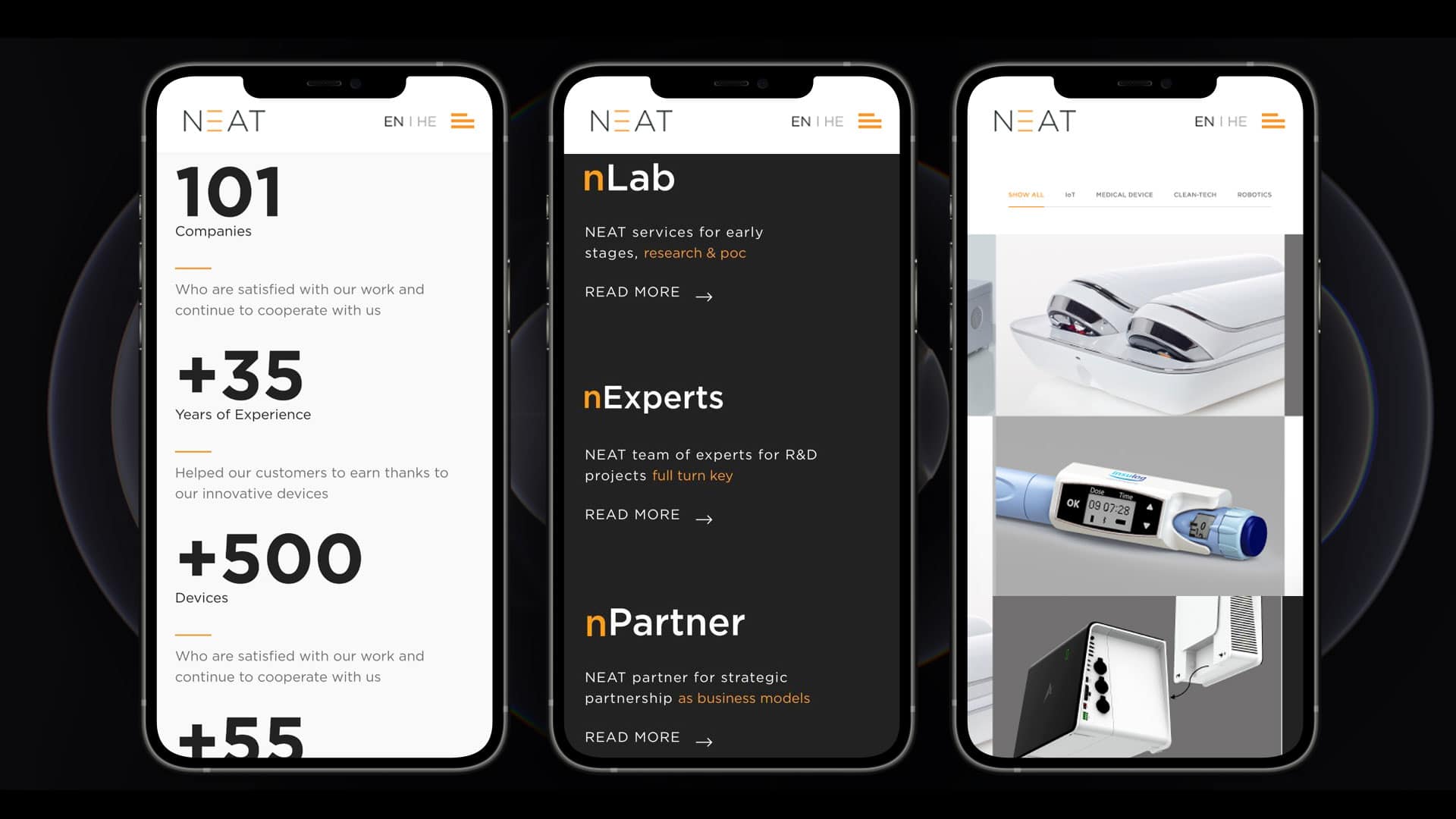
A graphic identity was built that takes up space at every touchpoint — from marketing materials to digital brand communications. We challenged ourselves to create a graphic reality that would be both progressive and classic, that would remain relevant even after a decade – a brand that not only looks good, but functions as a complete experience.