Ola Kala - Between Sketch and Reality

Ole Kala | Branding Language Development | Blog | Meki | Graffiti | Restaurant | Interior Design

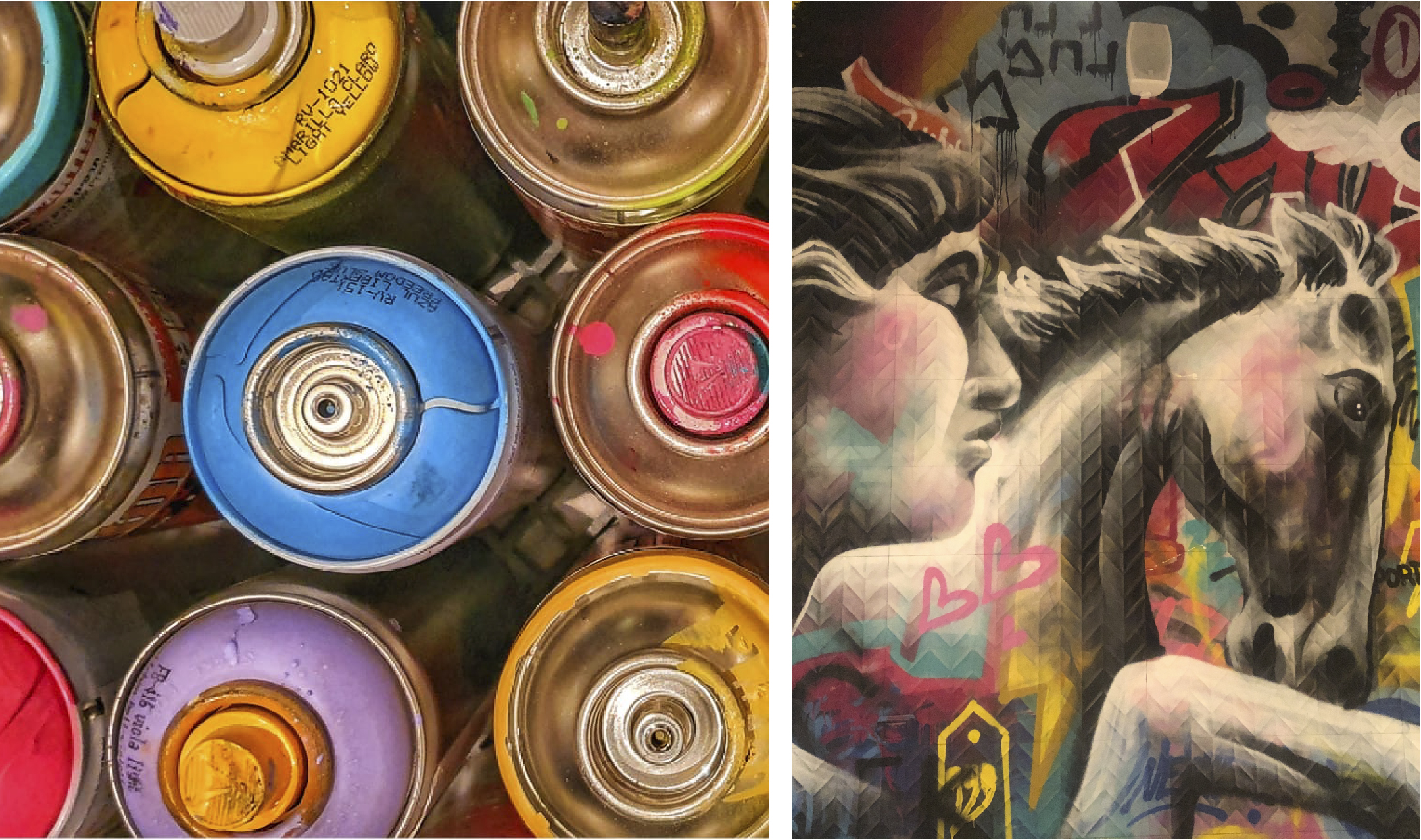
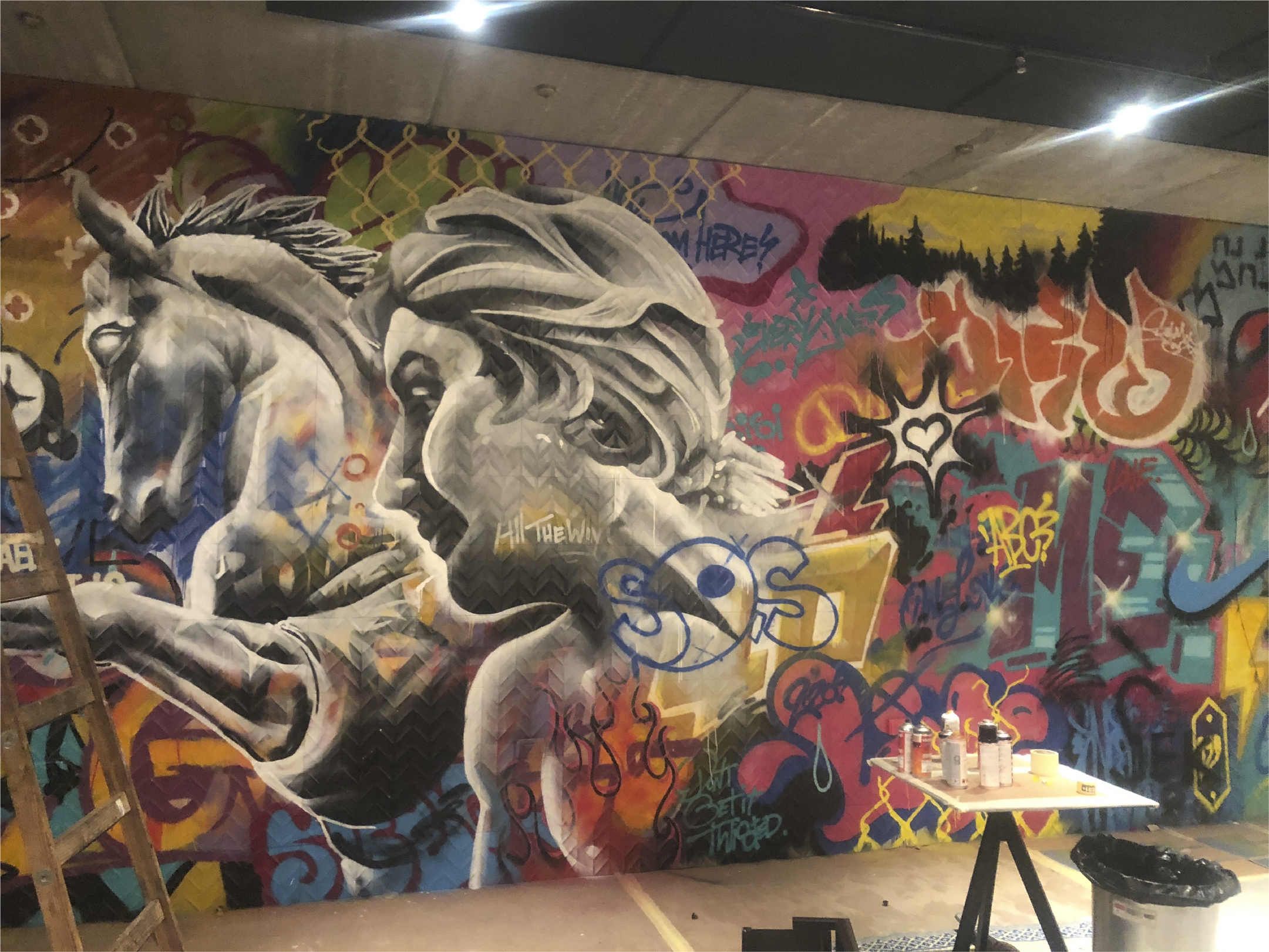
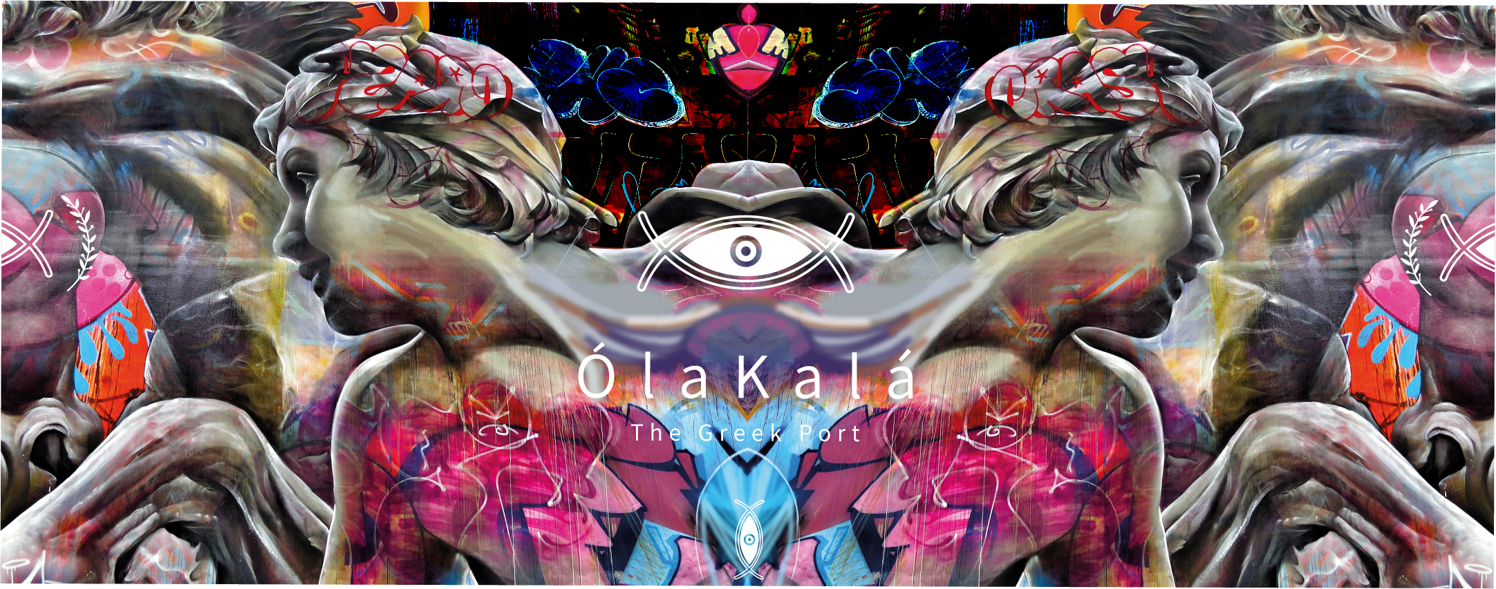
It's always fun to embark on a new project. Especially with Ziv and Eldad. This time we built a brand for a Greek-Turkish fusion restaurant in Caesarea, OLA-KALA (Everything is good). When I arrived at the place, I immediately imagined a huge graffiti on the wall. One that does something to the body, that you can't remain indifferent to. That makes you feel small and big at the same time. It took me a while to convince the right people and this is the result... 

In the picture above you can see the sketch and below the real thing :) 

Ole Kala | Branding Language Development | Blog | Meki | Graffiti | Restaurant | Interior Design

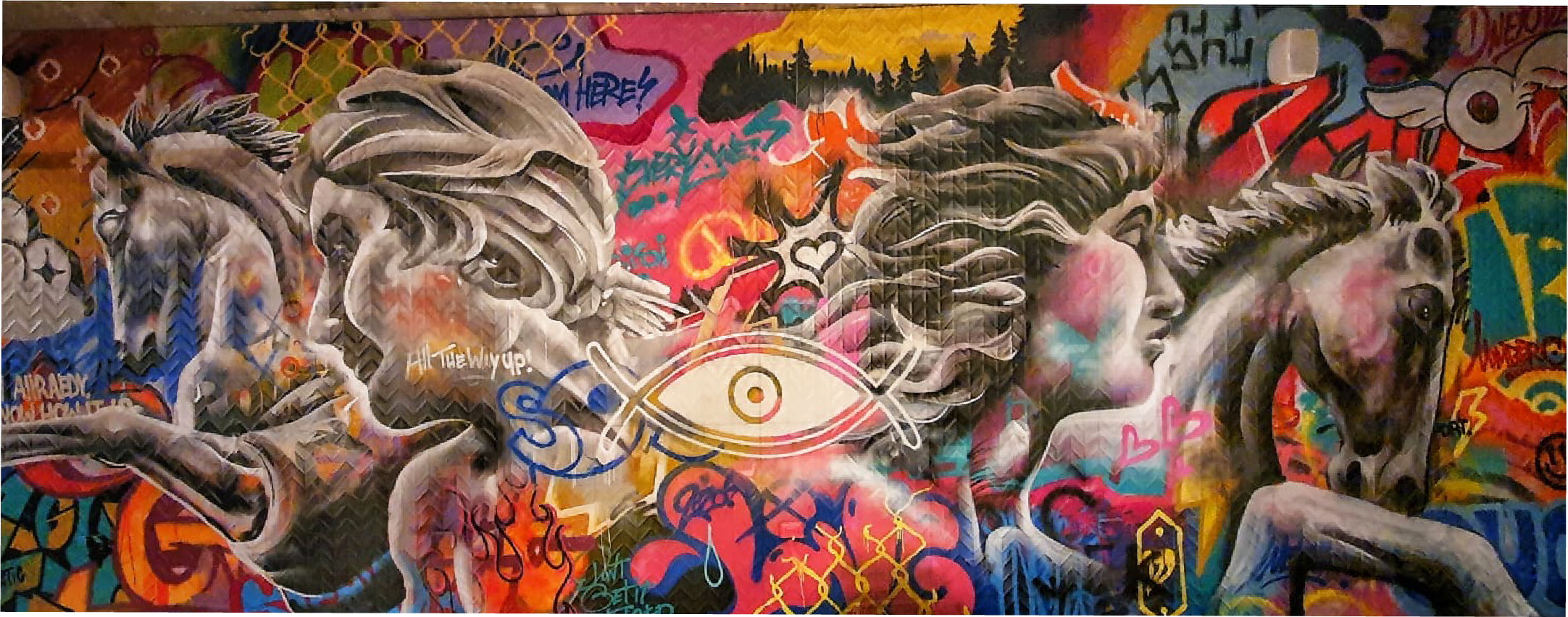
It's surprising how an idea processed on a computer with a certain type of means comes out so similar to the real thing. The tools and proportions seem to be from two different worlds and yet you can still touch the dream. Thanks to the amazing graffiti artist OneLove

Ole Kala | Branding Language Development | Blog | Meki | Graffiti | Restaurant | Interior Design

More posts

Wine, Prada and research

I don't know anyone who doesn't like wine. Red, white, pink, sparkling, still, dry, semi-dry, quarter-dry, wine. Here are some results from very diverse studies that examined the advantages and disadvantages of drinking wine. The results are a bit ambiguous :) "Drinking a glass of wine with meals reduces the risk of type 2 diabetes". "A bottle of wine is worth 10 cigarettes" "Red wine improves the health of cells in blood vessels".…

WPO-World Packaging Awards

At the World Packaging Awards in Milan, inside the Versace Palace. 500 projects from 40 countries stood before the judges. Then our name was called. Not once, but twice. GoChess — first place. 32ºN — first place. Two completely different packaging solutions. Both were built with precision, with a story, and with complete respect for the product inside. It was never about trends. It was about faith. Q - Structure is a language. Q…

Milk = MILK

תראו באיזו פשטות יכול מותג חלב לבלוט מעל המתחרים. הכל בעזרת עיצוב נקי פשוט ומינימליסטי של אריזה סופר קריאייטיבית.הצבעים של הקרטונים מסמלים את אחוז השומן שיש בכל אריזה, מספר שגם מודגש בבירור עם פונט מאוד מדוייק, שמופיע בפרונט.אפשר בשקט להפסיק עם ציורים של פרות, בתים ומדשאות. NotFromHere