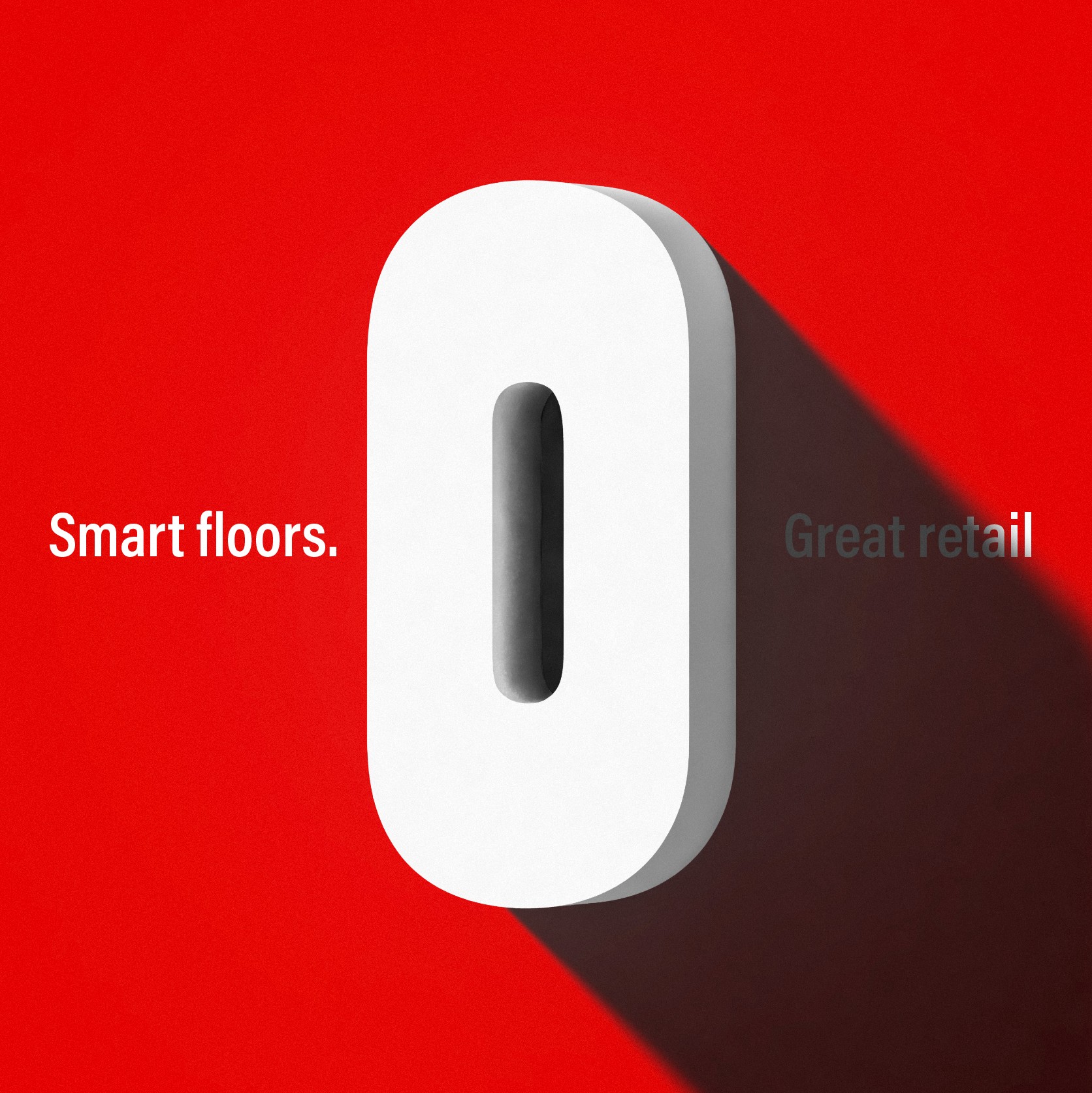
Lifebuoy
Brand: Lifebuoy
Industries
Consumer brand & Electronics, Fashion & Lifestyle, Technology & InnovationServices
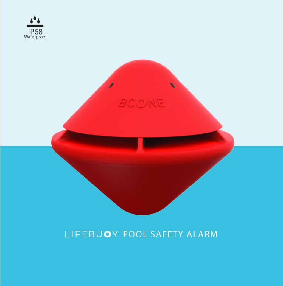
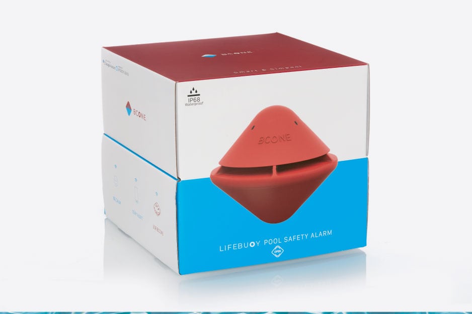
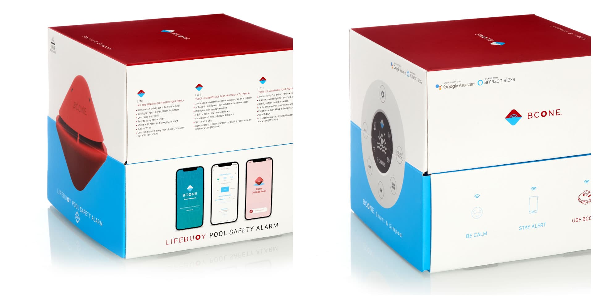
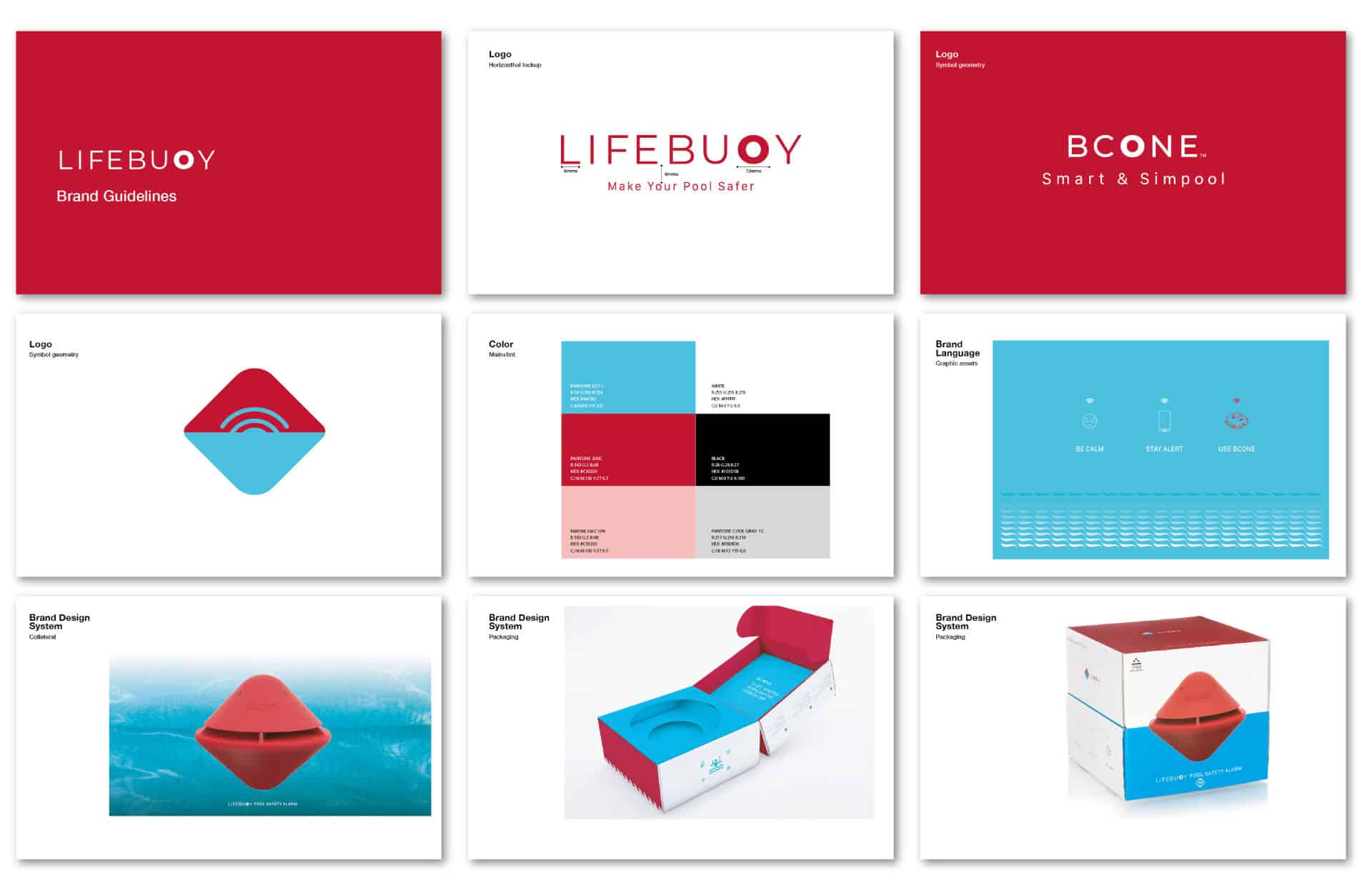
Brand Strategy & Positioning, Package design & unboxing experience, Graphic Design, Unboxing Experience, Packaging Production, Packaging EngineeringLifebuoy called on NFH to breathe identity into their pool safety alarm. We designed branding and packaging that looks as safe as it feels—translating rescue into design.
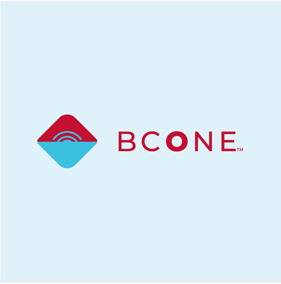
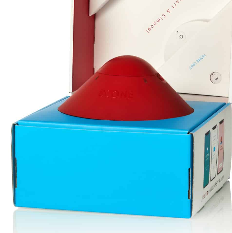
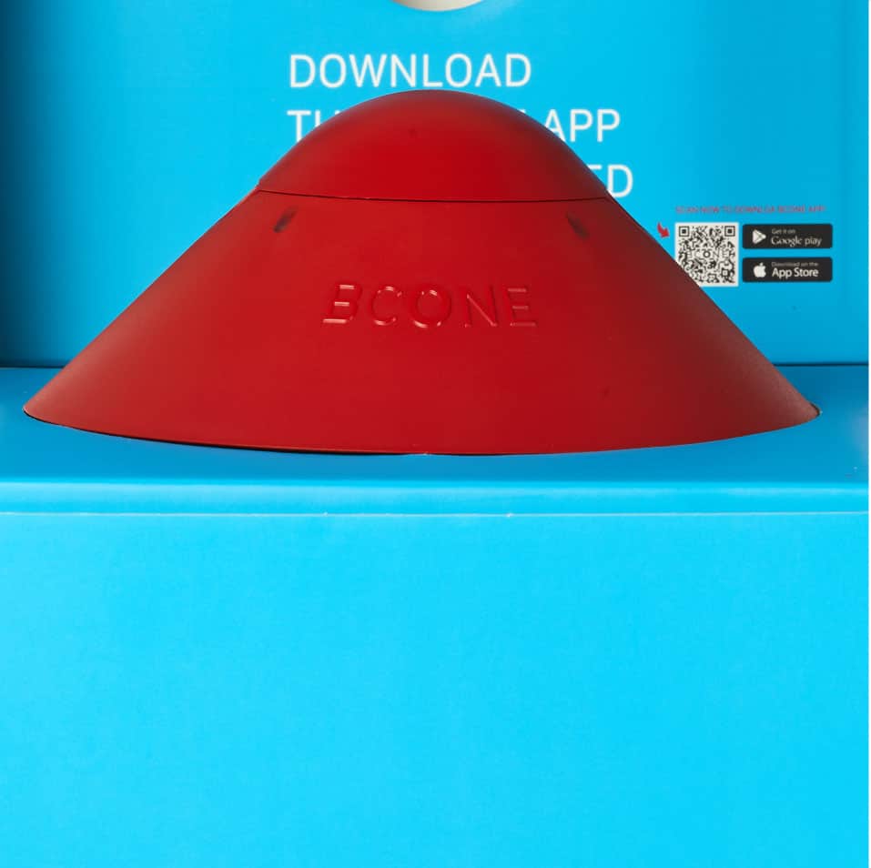
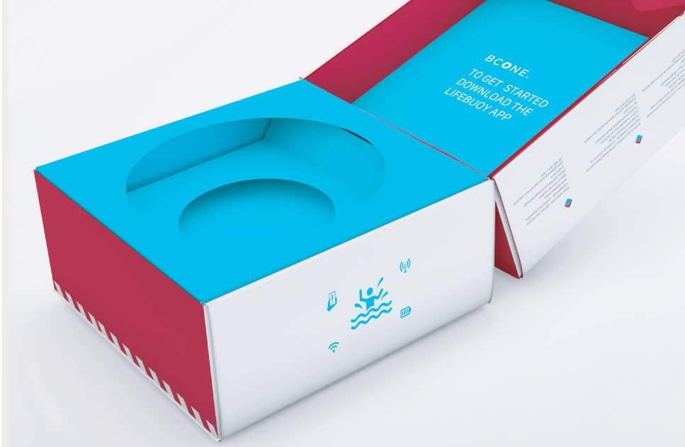
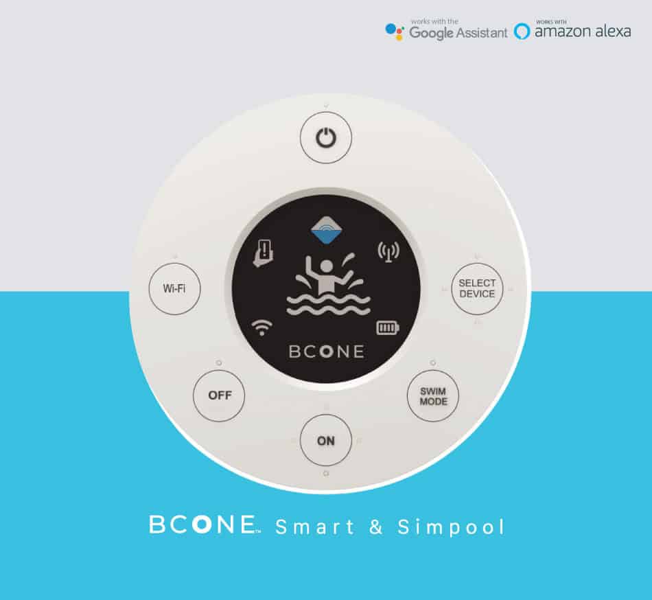
We grounded the visual system in water safety and reassurance. A palette of rescue red and pool-blue creates visual calm and clarity. The logo’s rounded “O” evokes a lifebuoy, a symbol of safety that echoes across product and packaging. The emblem’s half-red, half-blue buoy form, enhanced by subtle ripple graphics, tells the story of protection in motion. Inside, the alarm floats in its packaging, creating a 3D scene where the product feels weightless and safe—like catching a wave of security before it’s even powered on.