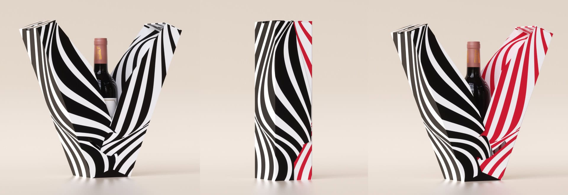
What color do you like the most? And why do you always wear black? Black for me is a state of mind. Black is not sad – I don’t think that color has one meaning like ours. It doesn’t have one meaning. Colors are part of a whole story. Don’t be afraid to use colors, but keep in mind that color is a name and it conveys a message, a line within the story. A little bit of color palette and a little bit of meaning, besides meanings, it’s worth remembering that colors have a story of collective memory – black text on white paper with a frame is burned into our memory as a sign of mourning —
Black – Black color conveys mystery and protection. Black can also be a color that conveys luxury. In psychology, black conveys control. In design we use it in many cases, it can convey luxury and it can convey sadness. Black is dark and black can also be a lifestyle.
Red – Red symbolizes passion and determination. Red can also convey war. In psychology it is a very masculine and energetic color. In design, red can scream war and red can be very minimalist. Red always has presence and power. Red is also often characterized as a color that creates a feeling of hunger.
Blue – Blue is the color of the sea, of the ocean, of the sky. Blue symbolizes freedom and blue symbolizes technology. For years, IBM took “ownership” of the color blue, it even earned the nickname, “The big Blue.” Blue is calming, it conveys stability.
Orange – Orange is a color of fire and energy. Orange has spiritual values, it is a color that speaks to the viewer and to the center of the body. Orange symbolizes more control compared to red, which is associated with an explosion of passions. It has a dimension of curiosity, and it arouses a desire to reach out and touch.

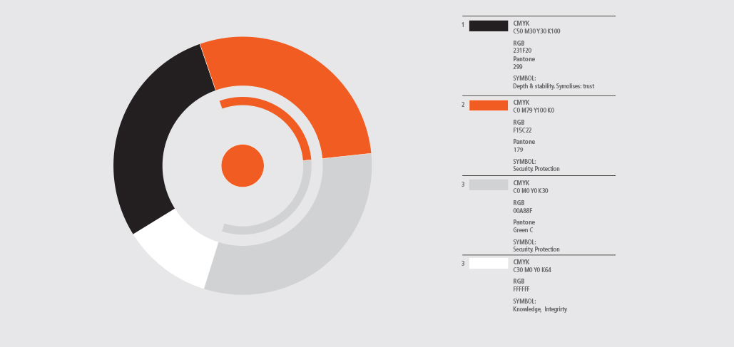
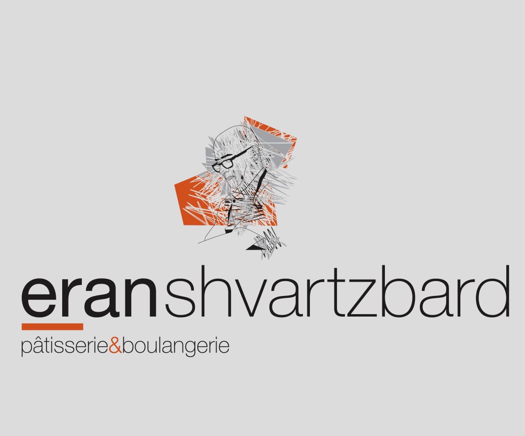
Under the branding of chef "Eran Schwarzbard" We used three colors of black, white and orange. Three colors. Minimalist branding with a freehand illustration by the chef. The inspiration for the brand was Eran's desserts and pastries.


