package design

Everysight How to design packaging for smart glasses

Smart Glasses Packaging Design - NFH

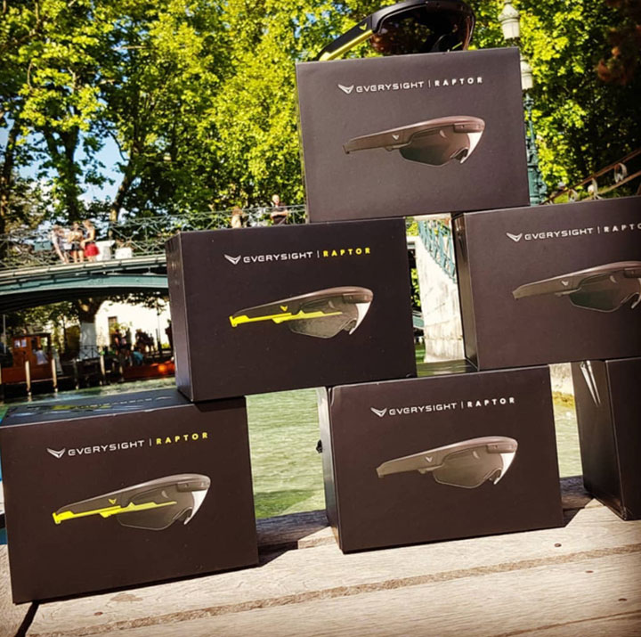
חברה שמטרתה לדמיין מחדש את היומיום, בעסק מהפכני שמשנה את הדרך שבה משתמשים חווים מידע. הם עושים זאת באמצעות פיתוח של AR, לקבל את כל המציאות באקסטרים בתוך העדשה.

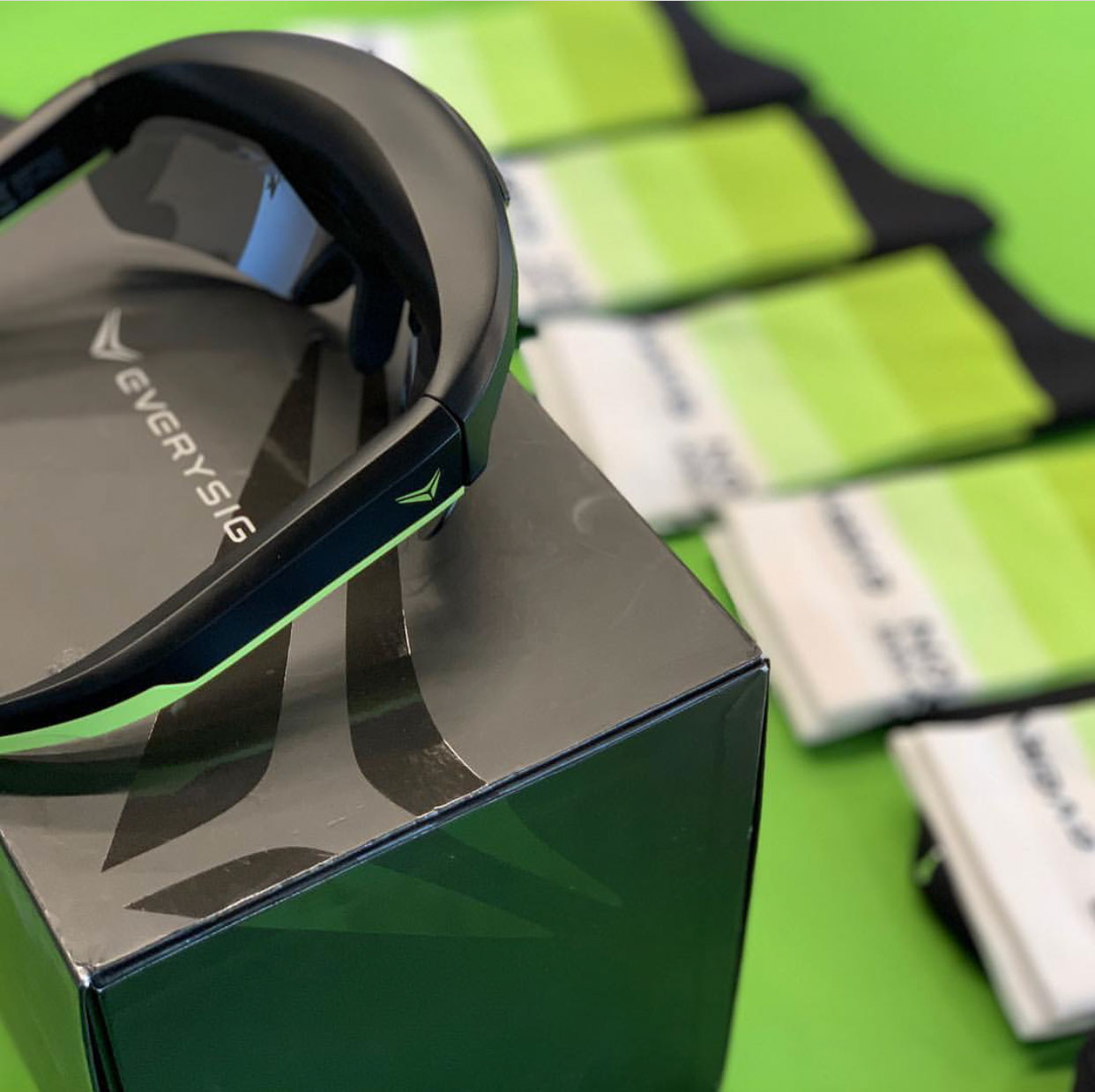
מוצרי הדגל של Everysight זה משקפי רפטור שמיועדים במיוחד לרוכבי אופניים. ההלבשה הטכנולוגית מציעה למשתמשים בזמן אמת תוך כדי רכיבה מידע על מהירות, מרחק, קצב הלב ומידע נוסף שמוצג בצורה נוחה ולא פולשנית.

הרוכבים יכולים להתפאר במפרט הטכני שיכול לצלם תמונות, להקליט את הטיול ולהיעזר בתוכנת AR שמדריכה את הרוכב במהלך המסע. בנוסף לזה, המערכת מאפשרת לרוכבים כשהם רוצים להיות מחוברים לבלוטוס, שמקשר עם השיחות, ההודעות האימיילים ותקשורת נוספת מבלי לגעת בנייד.

Eveysight_Notfromhere_PackageDesign

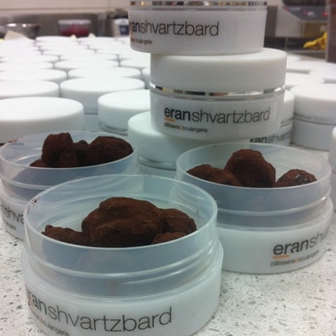
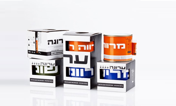
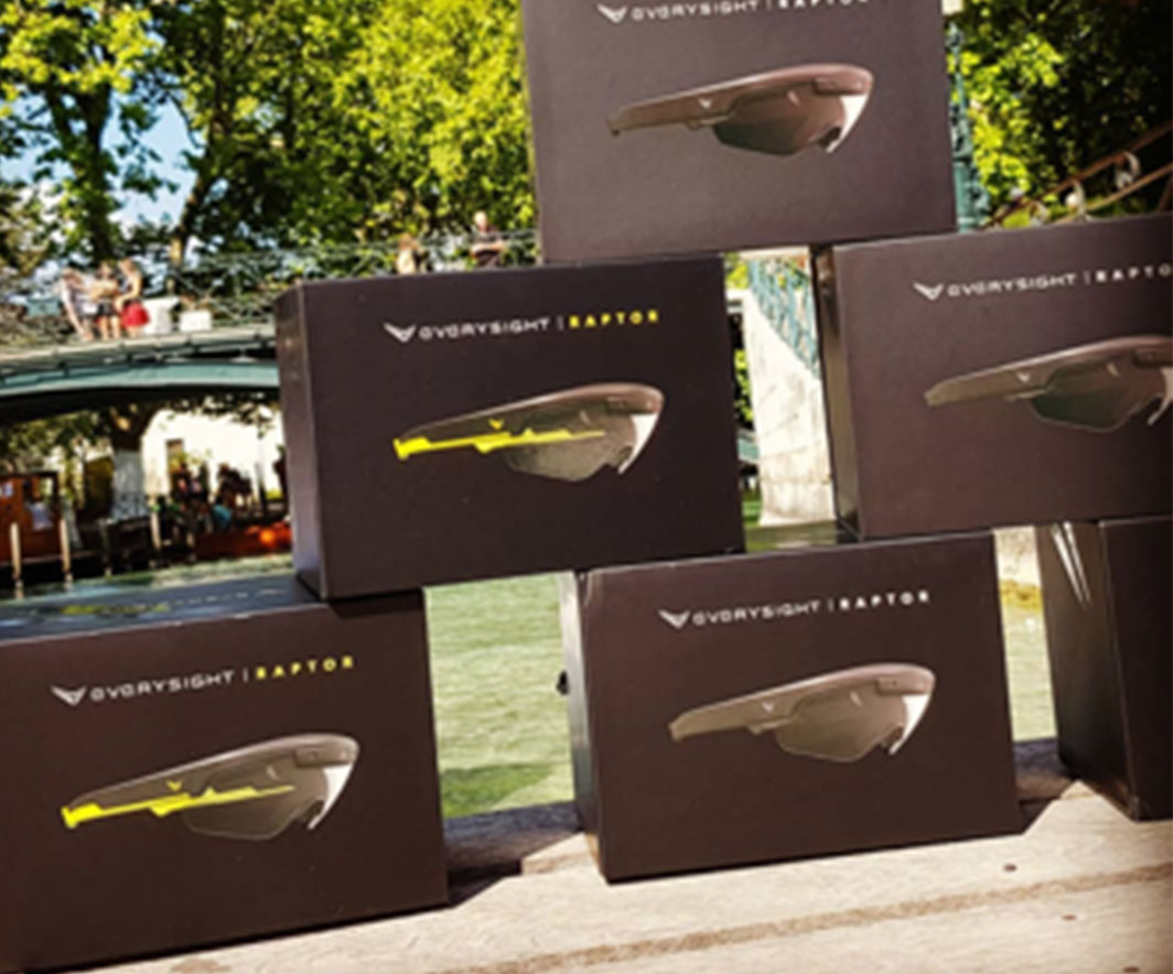
When packing and packaging designers Or a product whose cost and value are high, it is important to create a proper platform for the product. The design process, like everything in life, must be consistent with the product. The experience of opening the packaging is almost like entering a hall of spectacles. In the photograph, you can see color matches between print and plastic — it is very important to achieve the same leading shade of The brand In all products.

More posts

Wine, Prada and research

I don't know anyone who doesn't like wine. Red, white, pink, sparkling, still, dry, semi-dry, quarter-dry, wine. Here are some results from very diverse studies that examined the advantages and disadvantages of drinking wine. The results are a bit ambiguous :) "Drinking a glass of wine with meals reduces the risk of type 2 diabetes". "A bottle of wine is worth 10 cigarettes" "Red wine improves the health of cells in blood vessels".…

WPO-World Packaging Awards

At the World Packaging Awards in Milan, inside the Versace Palace. 500 projects from 40 countries stood before the judges. Then our name was called. Not once, but twice. GoChess — first place. 32ºN — first place. Two completely different packaging solutions. Both were built with precision, with a story, and with complete respect for the product inside. It was never about trends. It was about faith. Q - Structure is a language. Q…

Milk = MILK

תראו באיזו פשטות יכול מותג חלב לבלוט מעל המתחרים. הכל בעזרת עיצוב נקי פשוט ומינימליסטי של אריזה סופר קריאייטיבית.הצבעים של הקרטונים מסמלים את אחוז השומן שיש בכל אריזה, מספר שגם מודגש בבירור עם פונט מאוד מדוייק, שמופיע בפרונט.אפשר בשקט להפסיק עם ציורים של פרות, בתים ומדשאות. NotFromHere