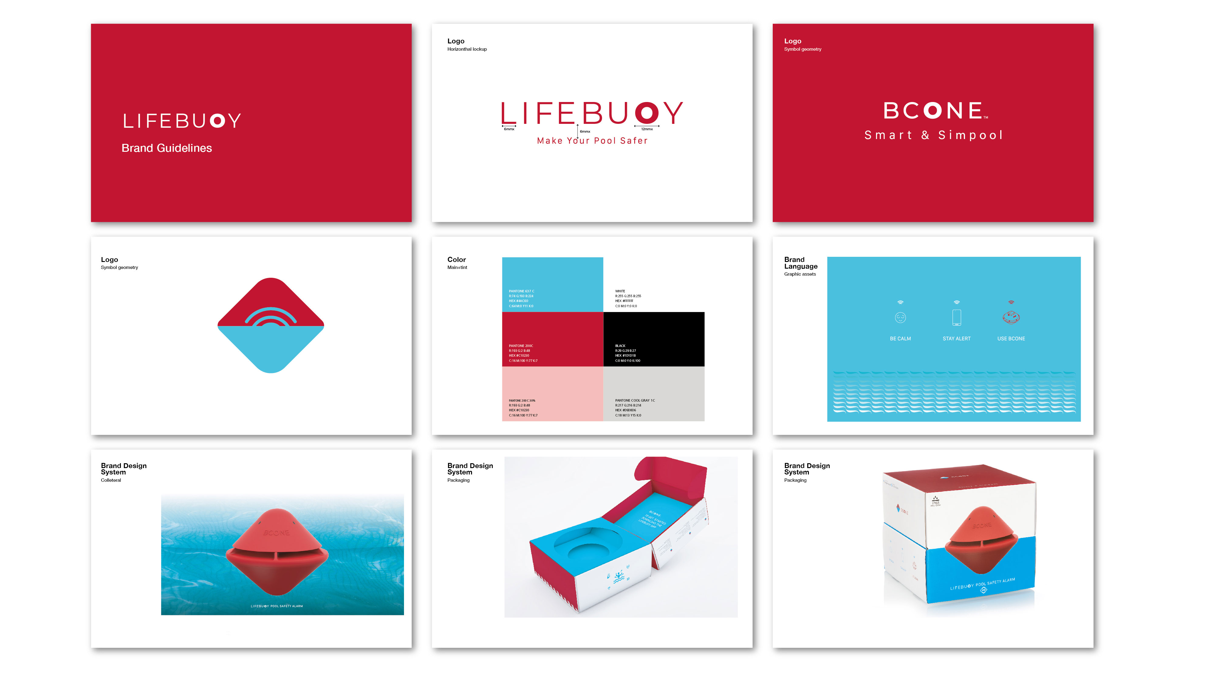
The branding positioning Lifebuoy as the new front-line pool safety alarm brand. Presenting the new Bcone as the next generation of the pool saftey alarm
Using a dominant relationship between red and light blue. The red represents the color of the product and the azure that of course represents the pool and at the same time the chosen shade the azure that produces a pleasant feeling of calm. The combination of the two has created a strong and dominant brand language. A dialogue between the calm, the quiet and the sense of security that the color red is presenting. The logo: The Typeface logo The logo, very minimalist, built from a classic typeface, with round corners creates a pleasant and safe feeling, the round & bold O element, is an abstraction to a life guard wheel which of course means the company name. The same O is also repeated in the product logo
The symbol design is based on the shape of the floating Bcone. The colors – half blue half red, emphasizing the way you see the Bcone inside the pool. Using the ripple element, telling the complete story of the product.
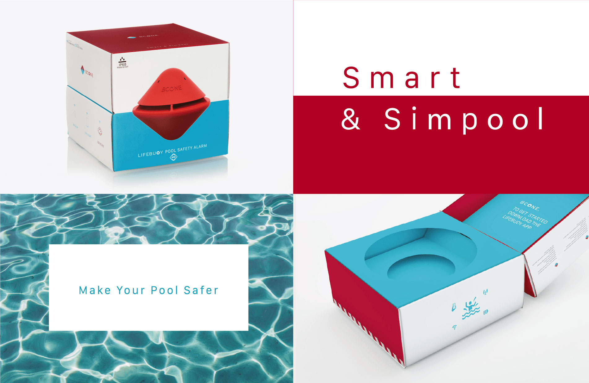
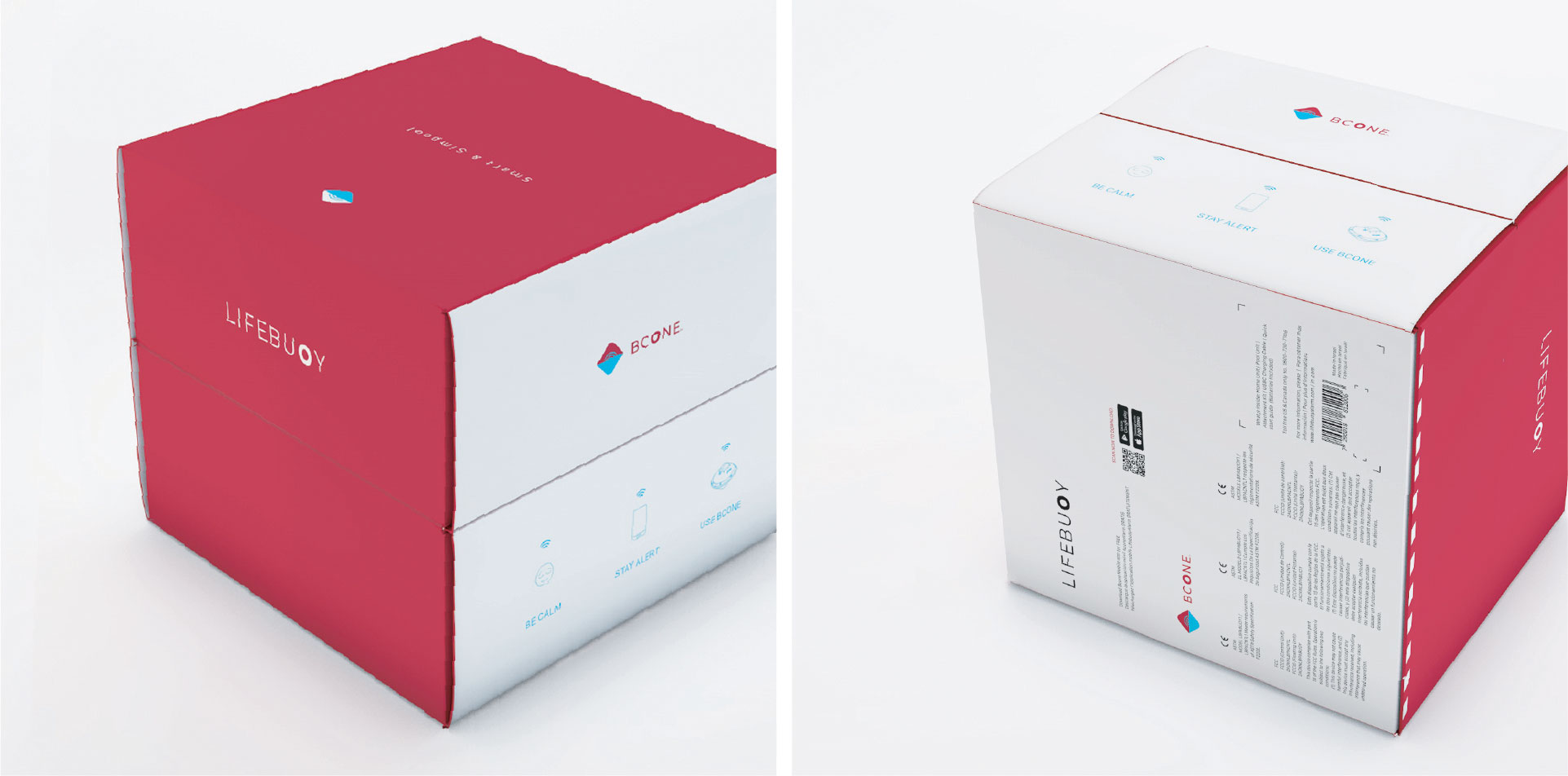
The Lifebuoy, Bcone package defining the company’s innovative approach. We did with the package design the same thing we did with the brand – The complete unboxing experience, and the look of the product inside the package, follow the same lines.
The NotFromHere team has created the creative 3D experience of the product floating in the package, like it is floating in the pool
האתר עובר כעת תהליך הנגשה ובסיומו יותאם במלואו להמלצות התקן הישראלי (ת”י 5568) לנגישות תכנים באינטרנט ברמת AA ואת המלצות מסמך WCAG2.0 מאת ארגון W3C.
כבר עכשיו, האתר מותאם לתצוגה בדפדפנים הנפוצים ולשימוש בטלפון הסלולרי.
אנו עושים שימוש בשפה פשוטה וברורה עד כמה שניתן.
קיים מבנה קבוע לדפי האתר הדינמיים.
אמצעי הנגישות באתר:
מבחינת התאמה לדפדפנים – האתר נתמך ע”י הדפדפנים נפוצים, בגרסתם העדכנית ביותר.
להגדלת התצוגה באתר – גולשים המתקשים בראייה וברצונם להגדיל את התצוגה באתר יכולים לעשות זאת ע”י לחיצה בו זמנית על המקשים Ctrl” – ו “+” (קונטרול ופלוס). במחשבי PC או Command ו “+” (קומנד ופלוס) במחשבי מקינטוש. כל לחיצה על צמד המקשים האלו תגדיל את התצוגה ב-10%.
כדי להקטין את התצוגה יש ללחוץ בו זמנית על המקשים Ctrl”” ו “-” (קונטרול ומינוס) במחשבי PC או Command ו “-” (קומנד ומינוס) במחשבי מקינטוש.
הפעלת האתר באמצעות מקלדת – גולשים המתקשים בהפעלת עכבר יכולים לגלוש באתר באמצעות מקלדת. לחיצה חוזרת ונשנית על המקש Tab תעביר בין הקישורים השונים בעמוד. לחיצה על Enter תפעיל את הקישור המסומן.
בנוסף ניתן להפעיל את כלי הנגישות המיוצג באתר עם סמל כיסא הגלגלים המופיע מצד שמאל בדף, שבו ניתן לבצע פעולות שונות ומגוונות כגון:
הגדלת טקסט
הקטנת טקסט
גווני אפור
ניגודיות גבוהה
נגודיות הפוכה
רקע בהיר
הדגשת קישורים
פונט קריא
איפוס לברירת המחדל של האתר
נתקלתם בקושי?
אתר norfromhere ממשיך להתעדכן באופן שוטף, ולכן על אף מאמצנו הרבים להנגשת האתר, יתכן ויתגלו חלקים באתר הדורשים מאמצי הנגשה נוספים.
נשמח לעמוד לשירותכם בכל שאלה, בקשה או הצעות לשיפור
באמצעות הממונה על הנגישות באתר notfromhere, גיא לב, בכתובת מייל [email protected]
או באמצעות טופס צור קשר או במוקד שירות לקוחות טלפוני בטלפון 04-9020590
כדי שנוכל לסייע ולתת שירות בדרך הטובה ביותר בבקשה צרפו פרטים מלאים ככל שניתן:
תיאור הפעולה אותה ניסיתם לבצע
קישור -“העתק הדבק” לכתובת הדף בו גלשתם ונתקלתם בבעיה
תיאור הבעיה בה נתקלתם
סוג וגרסה של הדפדפן בהם אתם גולשים במחשב שברשותכם
סוג הטכנולוגיה המסייעת (במידה והשתמשתם)
אנחנו נטפל בבעיה ונחזור אליכם בהקדם עם סיוע אישי ופרטים על הטיפול בו נקטנו.