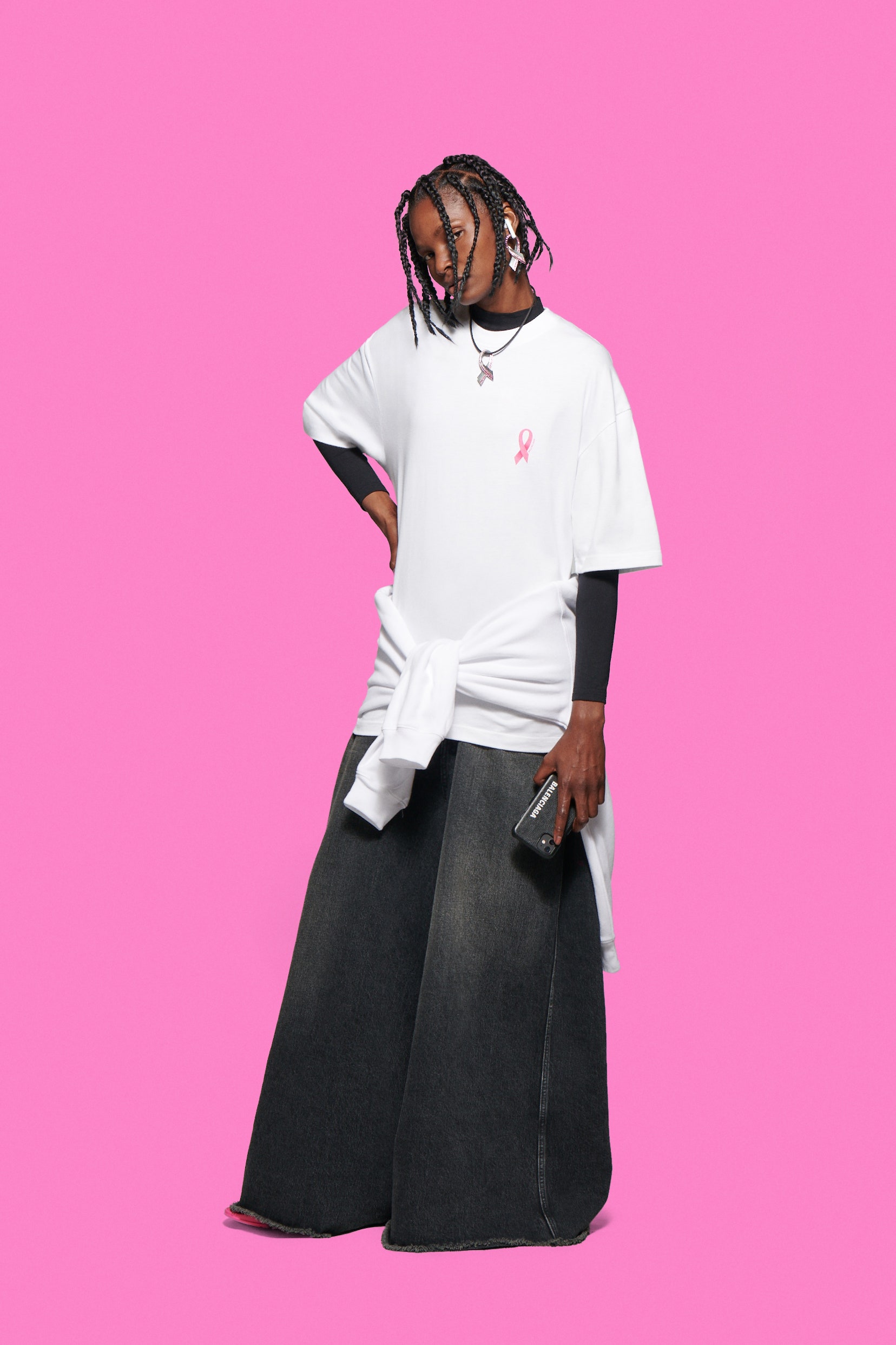
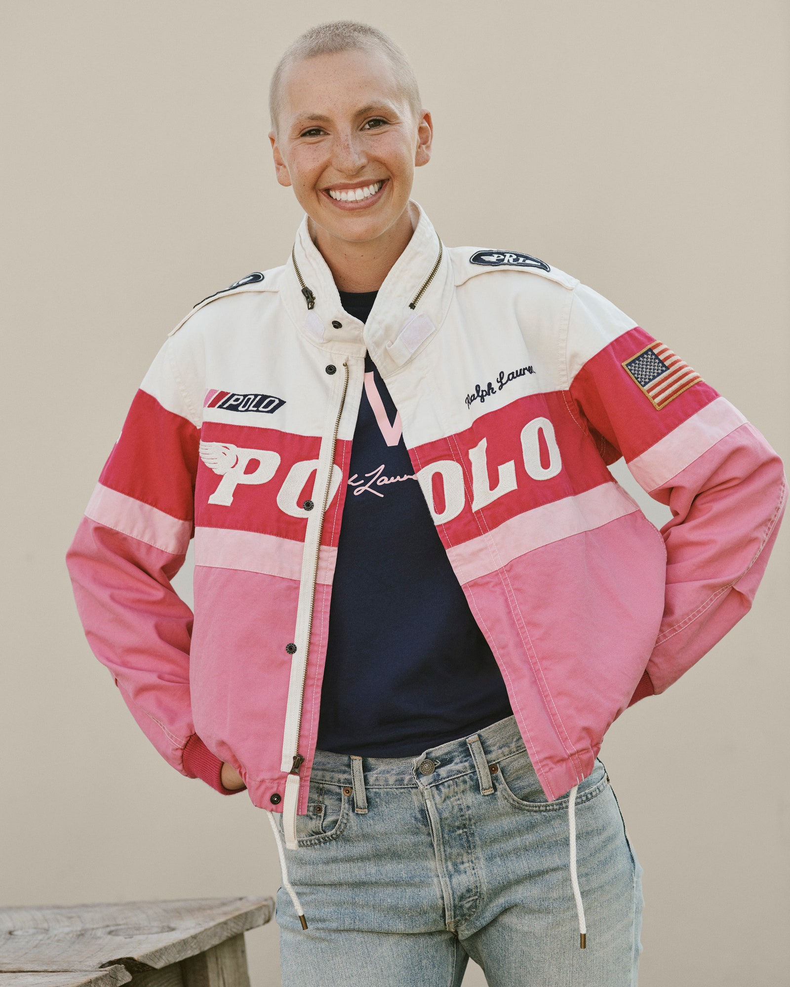
October is Breast Cancer Awareness Month. Many brands are working to help raise awareness and raise funds for the cause by “turning the brand pink,” temporarily changing their logo or products to pink with proceeds donated to the cause. From companies whose entire business is breast cancer solutions to fashion brands like Ralph Lauren who are working to raise awareness for the disease, everyone is expressing themselves in their own way – from turning their website and logo pink for a month to designing a line of fabrics or a special item designed in honor of this month.
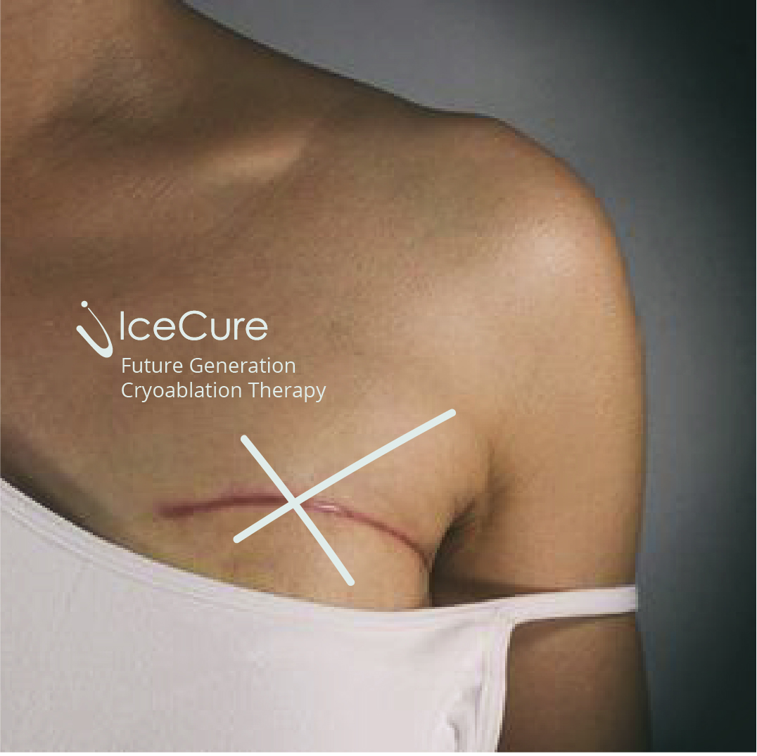
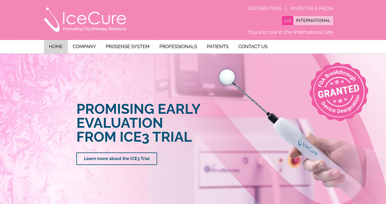
We had the honor of working on the branding and visual identity of IceCure, a company that dedicates all of its efforts and technologies to developing breast cancer treatment. IceCure Developed breast cancer treatments using innovative cryoablation therapy. The treatment essentially turns a tumor into a ball of ice. In honor of this month, they changed the entire color scheme of their website – their original palette is blue. Ralph Lauren, Balenciaga, Isabelle Marat and other designers designed clothing items especially for the month, all in order to do important work in raising awareness.
It’s always good to know that our role as designers is much bigger than just making something nice. Being part of great companies and people who do great things, and impact the lives of others is why we do what we do. The job of a graphic designer is not just to design… the job is to transform ideas into visual messages, into products, to communicate the brand message with shapes and colors. At the end of the day, it’s all about communication, the way we communicate with each other, with our clients and customers. Graphic Design Deals with visual communication.