Plasmatica Brand Identity health care device company
Plasmatica Brand Identity health care device company
Home » projects » Plasmatica Brand Identity health care device company
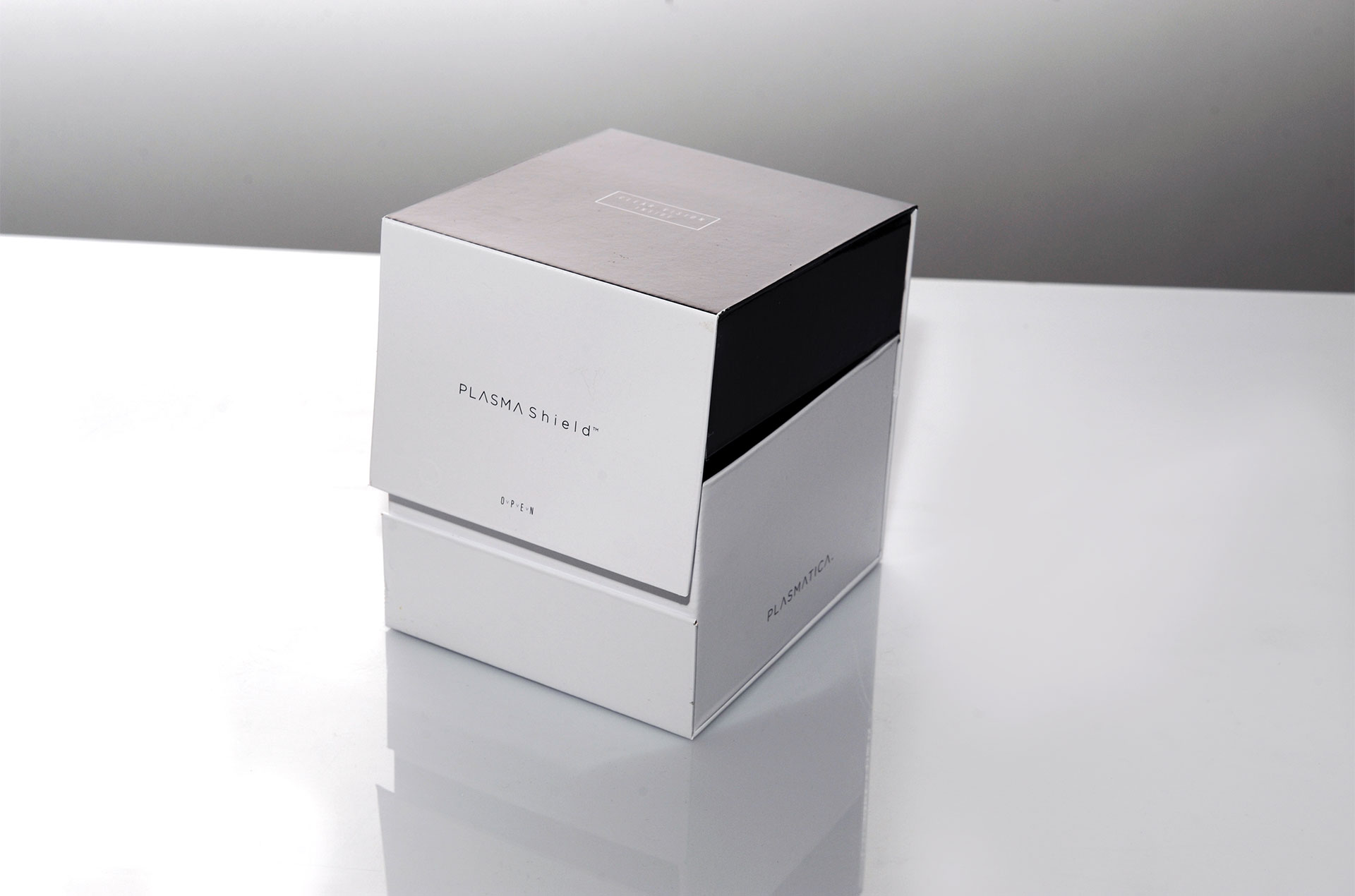
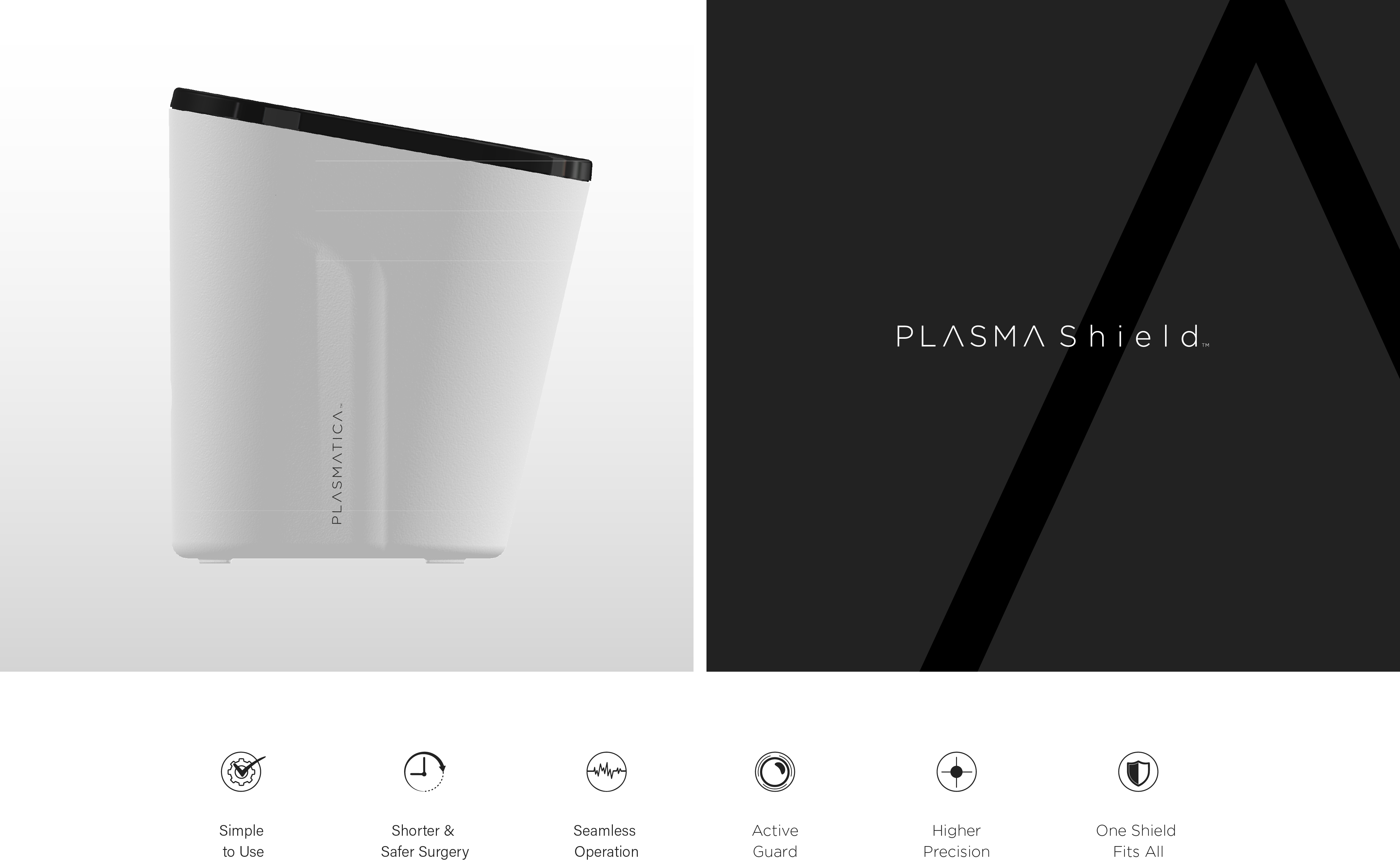
A new brand identity system designed for a startup medical technology company that helps surgeons perform better surgeries. The innovative device that keeps the vision clear.
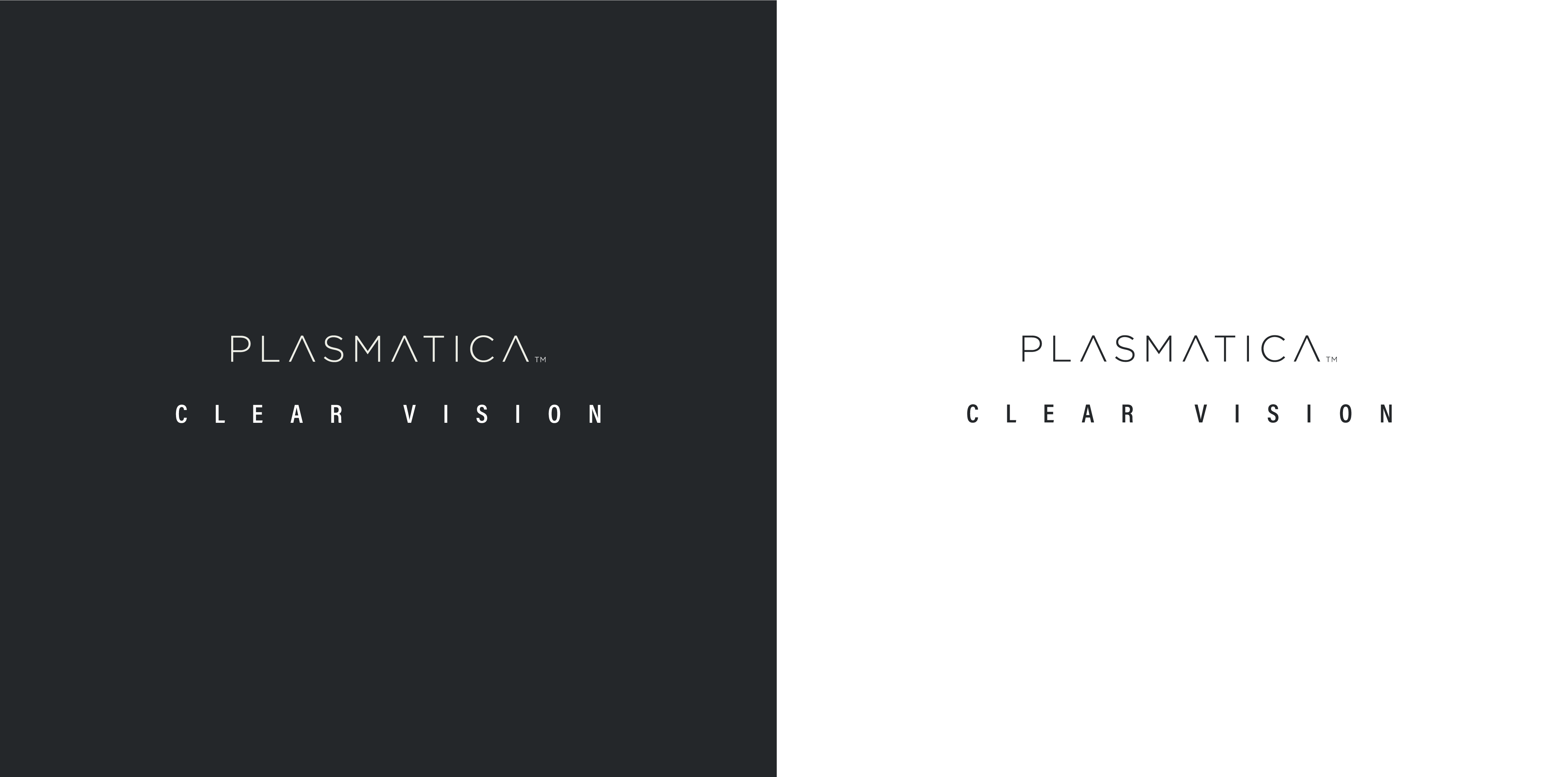
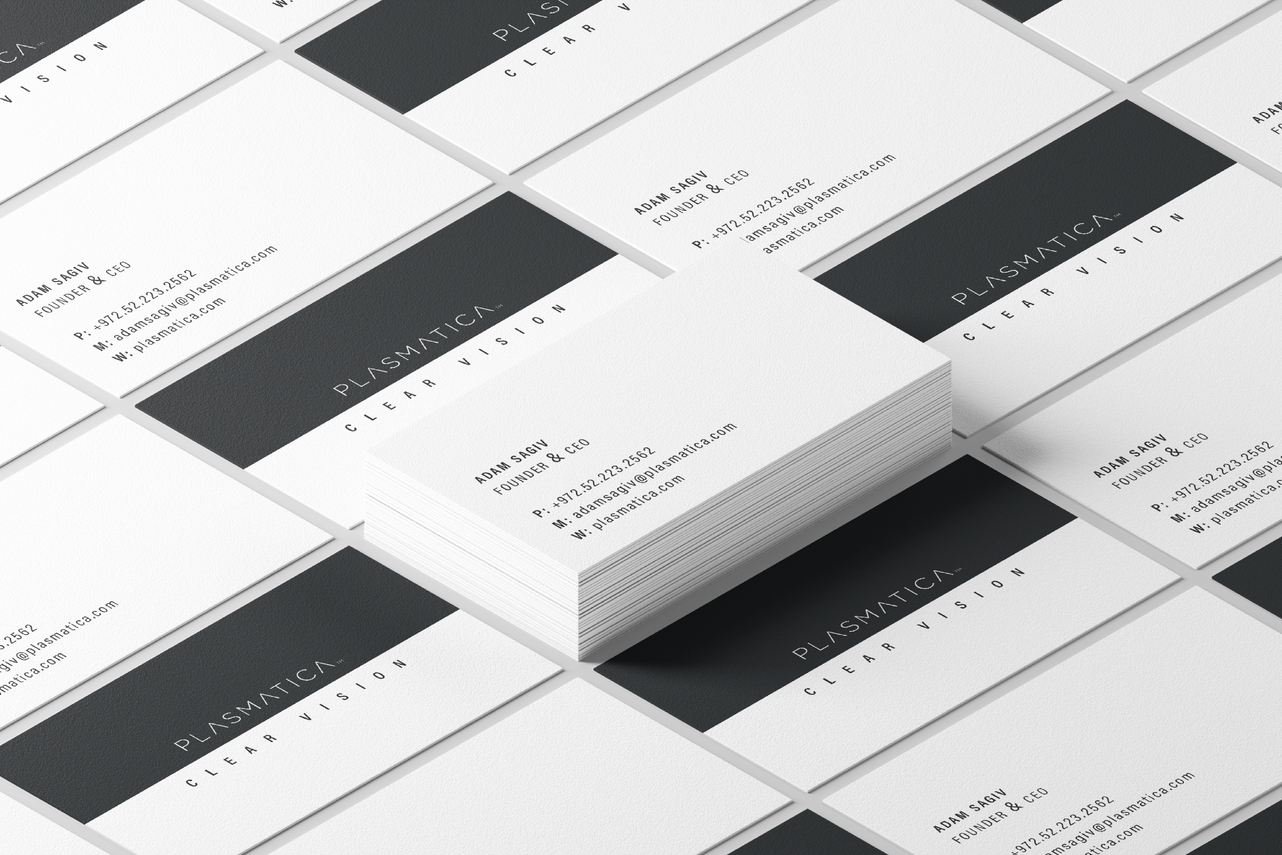
The brand identity visualizes blurred view becoming clear vision using PlasmaShield. The super-light font selection for the logo, with a lot of spacing and air, communicates clarity and clear vision. The black and white color palette with a glimpse of the Plasma purple supports the medical language of the device.
The NotFromHere team wanted to create a brand language that would align with high-end technological standards. We wanted to deliver the same clarity with graphic shapes and language. A complete black and white brand with the flair of a purple plasmatic layer on top.
האתר עובר כעת תהליך הנגשה ובסיומו יותאם במלואו להמלצות התקן הישראלי (ת”י 5568) לנגישות תכנים באינטרנט ברמת AA ואת המלצות מסמך WCAG2.0 מאת ארגון W3C.
כבר עכשיו, האתר מותאם לתצוגה בדפדפנים הנפוצים ולשימוש בטלפון הסלולרי.
אנו עושים שימוש בשפה פשוטה וברורה עד כמה שניתן.
קיים מבנה קבוע לדפי האתר הדינמיים.
אמצעי הנגישות באתר:
מבחינת התאמה לדפדפנים – האתר נתמך ע”י הדפדפנים נפוצים, בגרסתם העדכנית ביותר.
להגדלת התצוגה באתר – גולשים המתקשים בראייה וברצונם להגדיל את התצוגה באתר יכולים לעשות זאת ע”י לחיצה בו זמנית על המקשים Ctrl” – ו “+” (קונטרול ופלוס). במחשבי PC או Command ו “+” (קומנד ופלוס) במחשבי מקינטוש. כל לחיצה על צמד המקשים האלו תגדיל את התצוגה ב-10%.
כדי להקטין את התצוגה יש ללחוץ בו זמנית על המקשים Ctrl”” ו “-” (קונטרול ומינוס) במחשבי PC או Command ו “-” (קומנד ומינוס) במחשבי מקינטוש.
הפעלת האתר באמצעות מקלדת – גולשים המתקשים בהפעלת עכבר יכולים לגלוש באתר באמצעות מקלדת. לחיצה חוזרת ונשנית על המקש Tab תעביר בין הקישורים השונים בעמוד. לחיצה על Enter תפעיל את הקישור המסומן.
בנוסף ניתן להפעיל את כלי הנגישות המיוצג באתר עם סמל כיסא הגלגלים המופיע מצד שמאל בדף, שבו ניתן לבצע פעולות שונות ומגוונות כגון:
הגדלת טקסט
הקטנת טקסט
גווני אפור
ניגודיות גבוהה
נגודיות הפוכה
רקע בהיר
הדגשת קישורים
פונט קריא
איפוס לברירת המחדל של האתר
נתקלתם בקושי?
אתר norfromhere ממשיך להתעדכן באופן שוטף, ולכן על אף מאמצנו הרבים להנגשת האתר, יתכן ויתגלו חלקים באתר הדורשים מאמצי הנגשה נוספים.
נשמח לעמוד לשירותכם בכל שאלה, בקשה או הצעות לשיפור
באמצעות הממונה על הנגישות באתר notfromhere, גיא לב, בכתובת מייל [email protected]
או באמצעות טופס צור קשר או במוקד שירות לקוחות טלפוני בטלפון 04-9020590
כדי שנוכל לסייע ולתת שירות בדרך הטובה ביותר בבקשה צרפו פרטים מלאים ככל שניתן:
תיאור הפעולה אותה ניסיתם לבצע
קישור -“העתק הדבק” לכתובת הדף בו גלשתם ונתקלתם בבעיה
תיאור הבעיה בה נתקלתם
סוג וגרסה של הדפדפן בהם אתם גולשים במחשב שברשותכם
סוג הטכנולוגיה המסייעת (במידה והשתמשתם)
אנחנו נטפל בבעיה ונחזור אליכם בהקדם עם סיוע אישי ופרטים על הטיפול בו נקטנו.