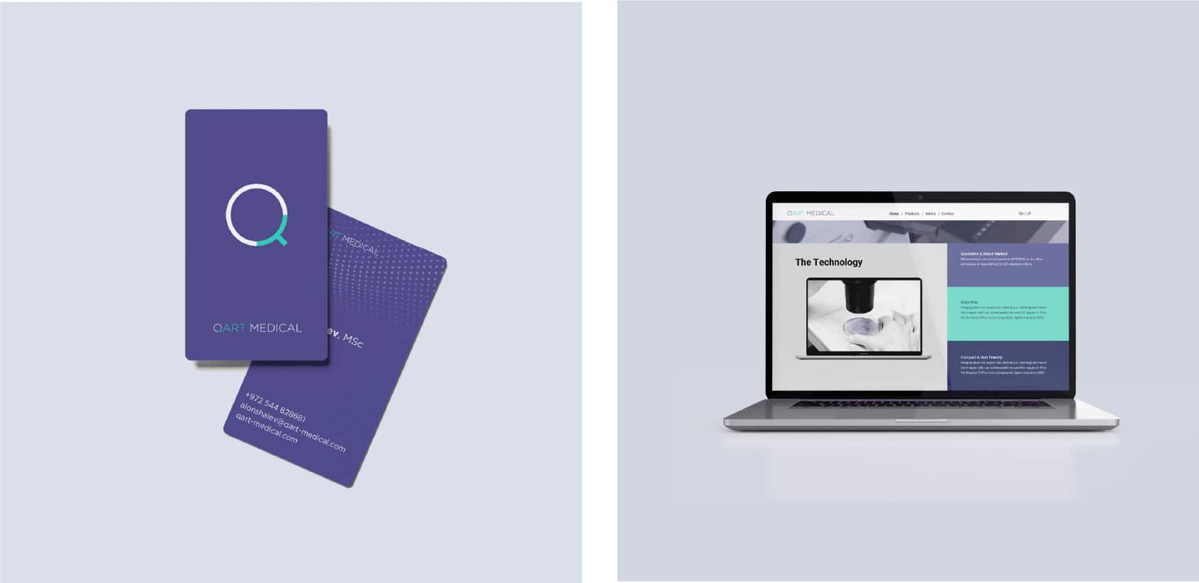
QArt Medical
Brand: QArt
Industries
Health Care, Medical Device & WellnessServices
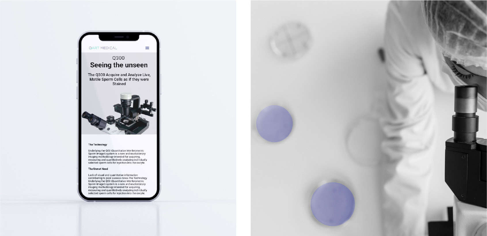
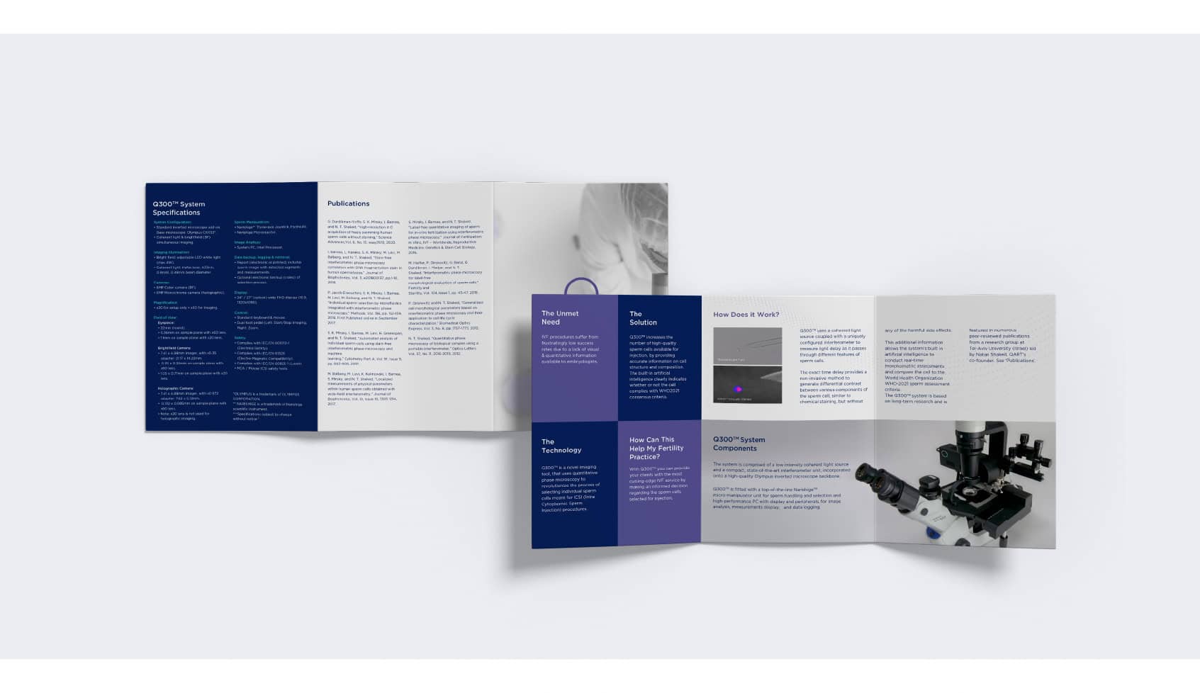
Brand Strategy & Positioning, Digital design and Marketing materials, Graphic Design, Digital design and developmentBrand identity for an international medical technology brand to improve IVF success rates by improving sperm selection/
The goal of the design brief was to bring the brand identity in line with advanced technology. To tell the story to investors of a progressive company – as a modern, self-confident company, with assets and technological knowledge. The goal of the branding was to create a brand that is consistent in terms of its visibility, graphic language and what it transmits and to create a sense of security, peace and longevity.
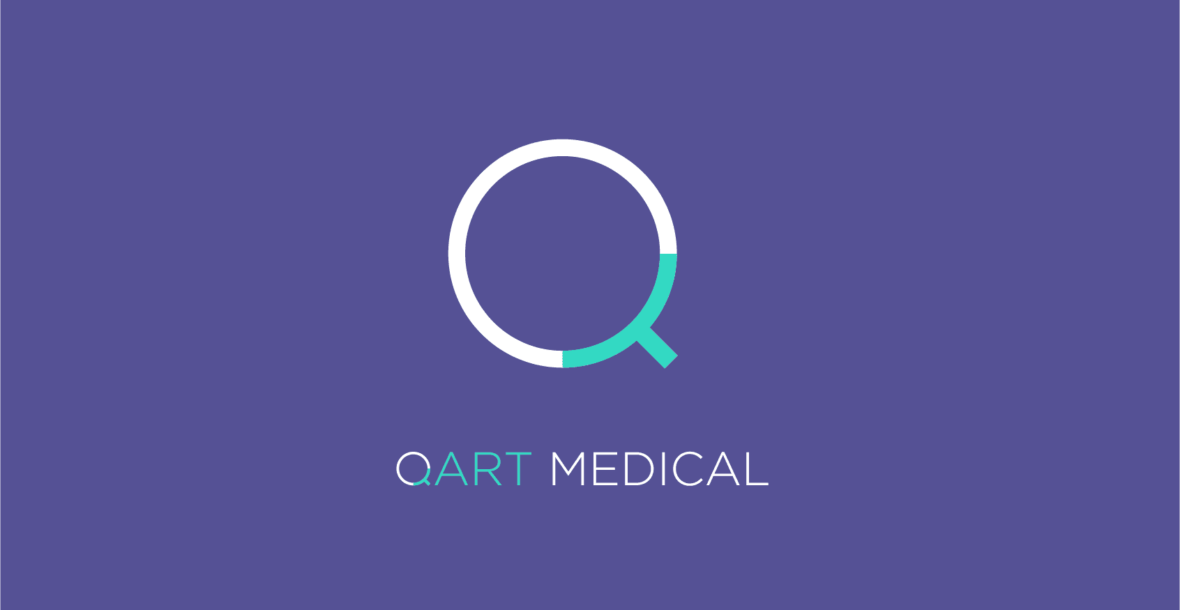
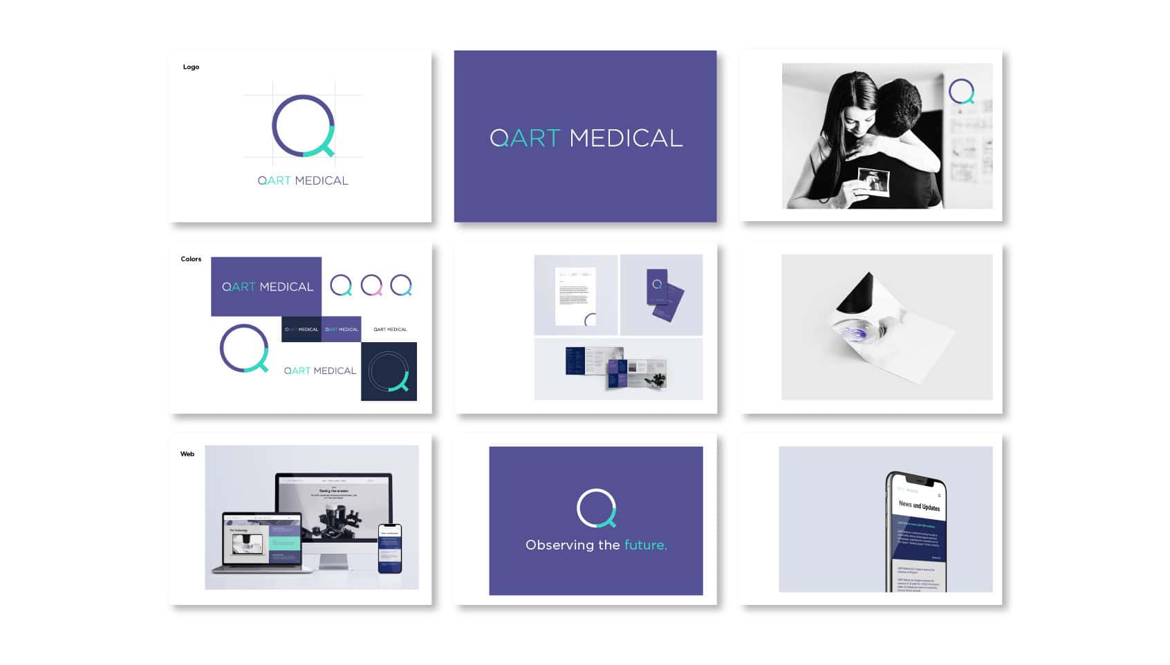
NotFromHere focused on the letter 'Q' in the logo. The graphic and typographic treatment and the choice of form of the letter were intended to tell the story of in vitro fertilization and make the icon and logo something memorable and associated with the brand.
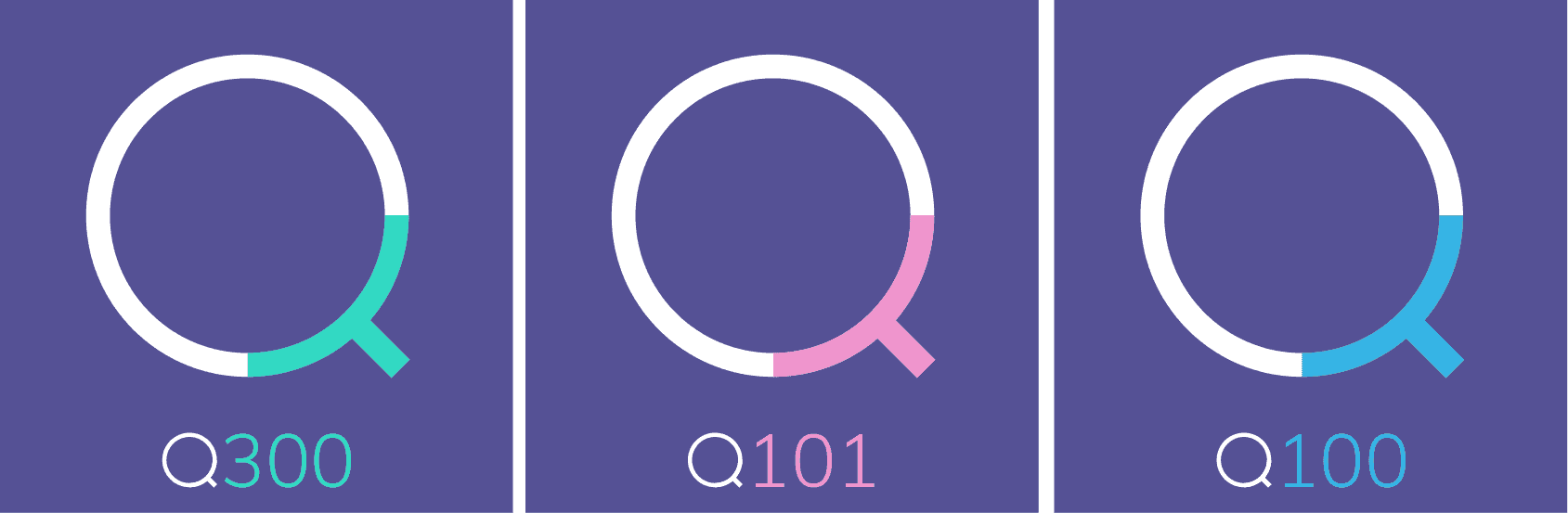
The typographic treatment of the logo helps to read the name Q-Art – Quantitative Assisted Reproductive Technologies. The Q symbol serves as an iconic symbol that creates a complete graphic language that accompanies the brand’s various products.