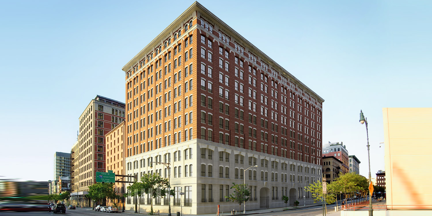
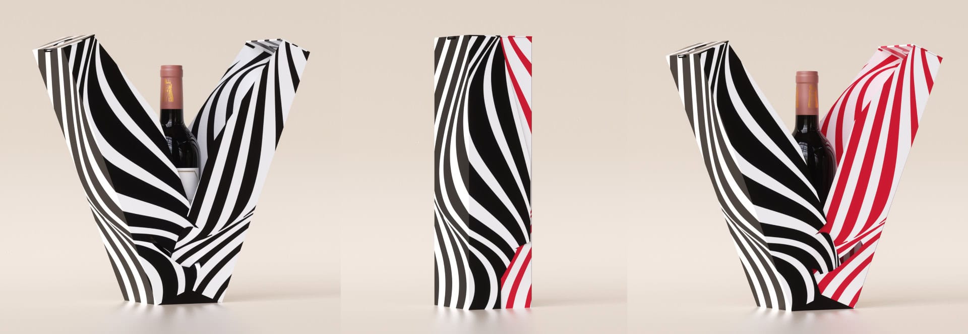
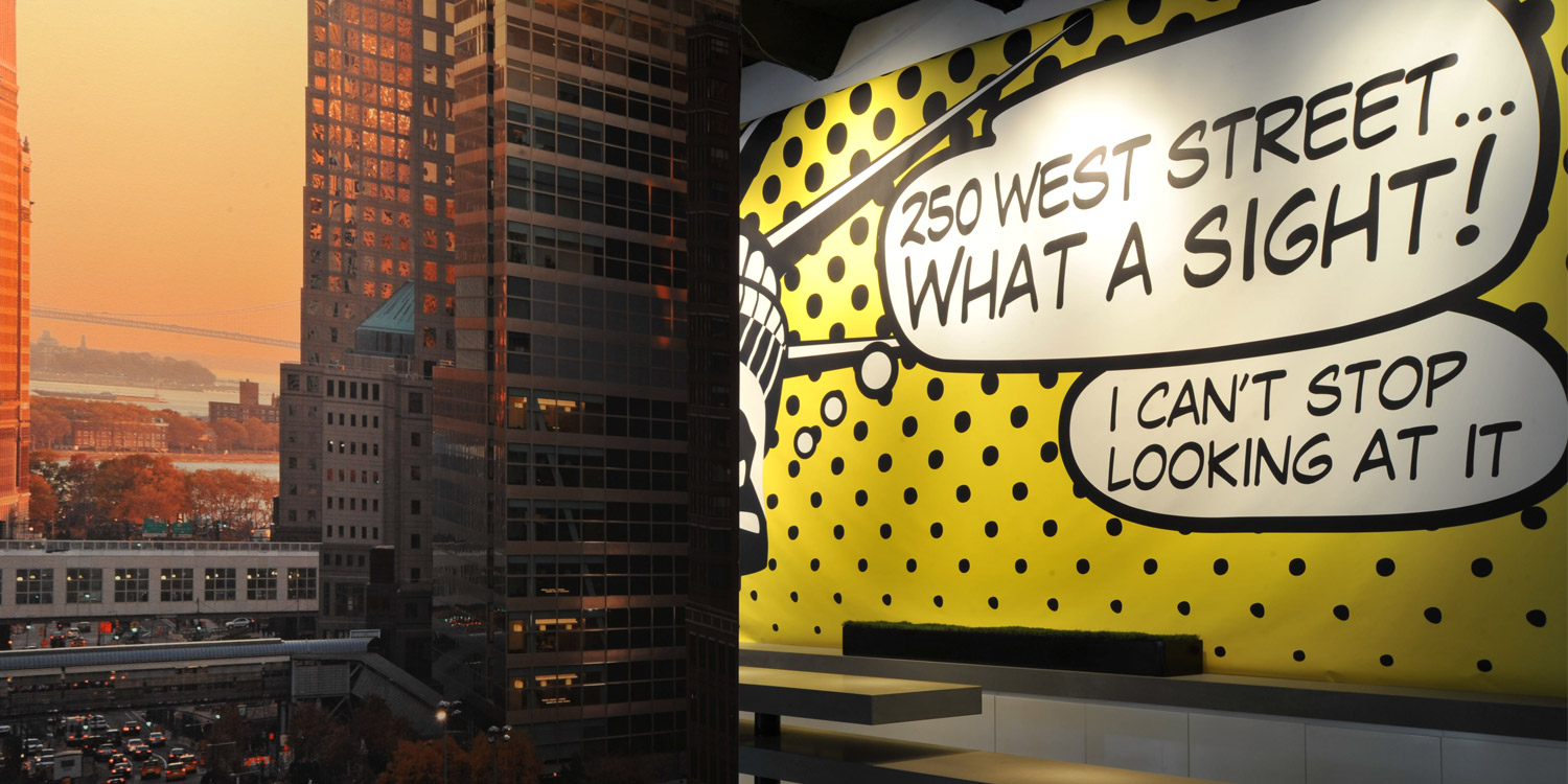
The eternal debate: what is more important, content or image… A website for an architecture firm

1

Designing a website for an architecture studio is a complex task. Designing for designers, as they say. A studio active in the international arena with diverse projects, from hotels to residential buildings to exhibition spaces and so on. The idea was to convey originality, happiness, experientiality, professional knowledge, and yet a dynamic young studio that maintains a sense of renewal. Today, the eternal debate is between what sells or, more accurately, what Google is looking for.. which is words.. and giving respect to our world, the world of the visual. Maybe one day we will return to a world where a small number of words were worth a lot and one valuable visual was worth 1000 words… We are prisoners of our world that enacts laws whose meaning is unclear. We are part of this network, doing what they say – – – in this project, the visual won. The visual went head to head with the Google spider and told it, ”I don’t care about you, you can look for words elsewhere.” You have to be in a certain position to be able to say that – that’s true, but it’s important to stop sometimes and remember, or rather, to recall the essence.  www.gnarchitect.com -Photo: GNA Architects  

1 1

More posts

Wine, Prada and research

I don't know anyone who doesn't like wine. Red, white, pink, sparkling, still, dry, semi-dry, quarter-dry, wine. Here are some results from very diverse studies that examined the advantages and disadvantages of drinking wine. The results are a bit ambiguous :) "Drinking a glass of wine with meals reduces the risk of type 2 diabetes". "A bottle of wine is worth 10 cigarettes" "Red wine improves the health of cells in blood vessels".…

WPO-World Packaging Awards

At the World Packaging Awards in Milan, inside the Versace Palace. 500 projects from 40 countries stood before the judges. Then our name was called. Not once, but twice. GoChess — first place. 32ºN — first place. Two completely different packaging solutions. Both were built with precision, with a story, and with complete respect for the product inside. It was never about trends. It was about faith. Q - Structure is a language. Q…

Milk = MILK

See how easily a dairy brand can stand out from the competition. All with the help of a clean, simple, minimalist design and super creative packaging. The colors of the cartons symbolize the percentage of fat in each package, a number that is also clearly highlighted with a very precise font, which appears on the front. You can safely stop with drawings of cows, houses and lawns. NotFromHere C