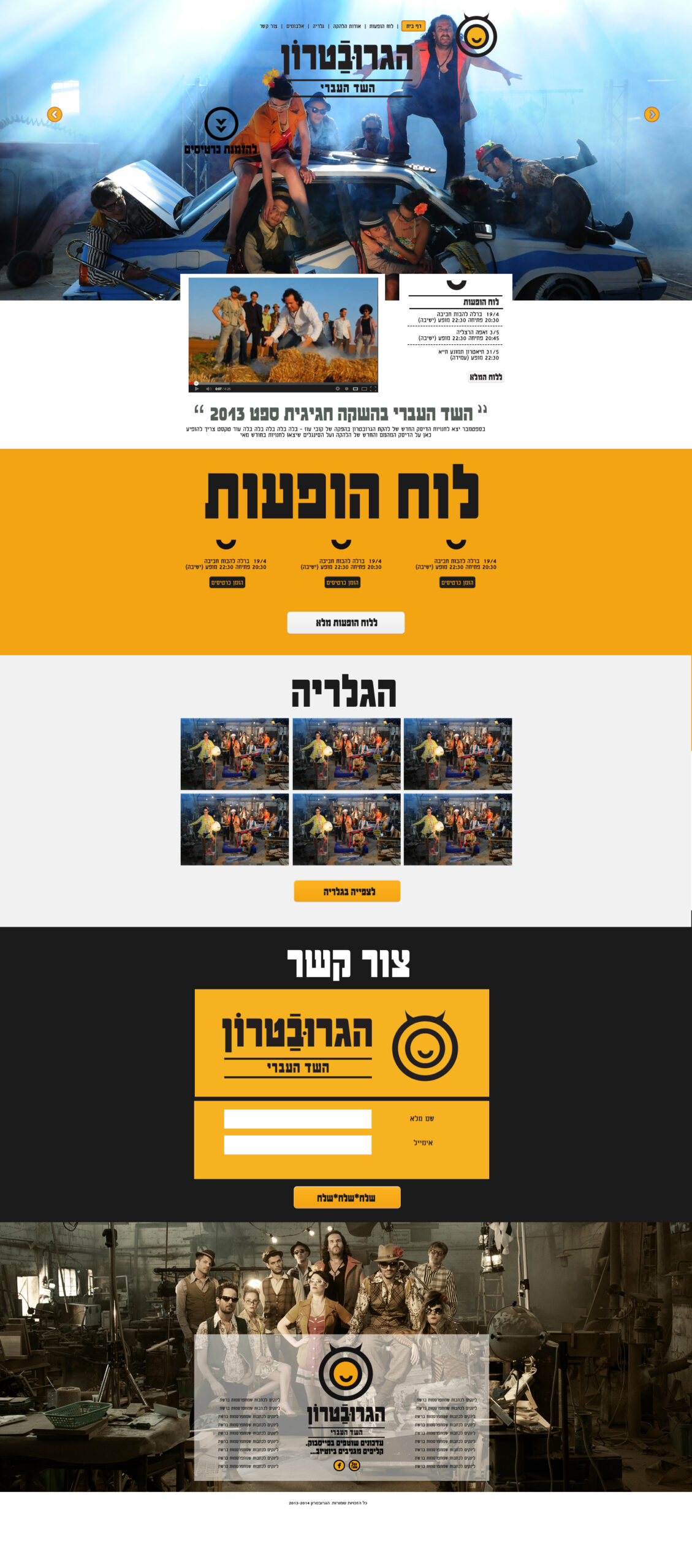
The Groovetron album booklet design

Website design

An unforgettable experience with one of our favorite bands that were here, The Groovetron; The design project started with a creative and fun concept that we enjoyed executing until its completion. To start, we built a cool and original photo set for the project from the ground up. We allowed the band to come to life with a series of entertaining scripts and interesting photo direction, in order to create a project that could capture the personality and expression of the members of the Israeli cover band and appeal to a global fan base.

We all had a lot of fun, and after seeing the final product, we unanimously agreed that it was exactly what the band and the creative team wanted. 'The project resulted in a full and stylish CD booklet that complements the launch of the band's latest album, site And lots of other cool things.

As designers of digital and print media, products, packaging and websites, ongoing partnerships with past clients are the best feedback we can receive. We had a great time with you, the Gravatrons, and we can't wait for the next exciting opportunity to work with your band. All photos courtesy of the talented Raanan Tal.
More posts

Wine, Prada and research

I don't know anyone who doesn't like wine. Red, white, pink, sparkling, still, dry, semi-dry, quarter-dry, wine. Here are some results from very diverse studies that examined the advantages and disadvantages of drinking wine. The results are a bit ambiguous :) "Drinking a glass of wine with meals reduces the risk of type 2 diabetes". "A bottle of wine is worth 10 cigarettes" "Red wine improves the health of cells in blood vessels".…

WPO-World Packaging Awards

At the World Packaging Awards in Milan, inside the Versace Palace. 500 projects from 40 countries stood before the judges. Then our name was called. Not once, but twice. GoChess — first place. 32ºN — first place. Two completely different packaging solutions. Both were built with precision, with a story, and with complete respect for the product inside. It was never about trends. It was about faith. Q - Structure is a language. Q…

Milk = MILK

See how easily a dairy brand can stand out from the competition. All with the help of a clean, simple, minimalist design and super creative packaging. The colors of the cartons symbolize the percentage of fat in each package, a number that is also clearly highlighted with a very precise font, which appears on the front. You can safely stop with drawings of cows, houses and lawns. NotFromHere C