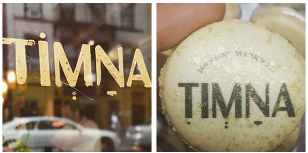
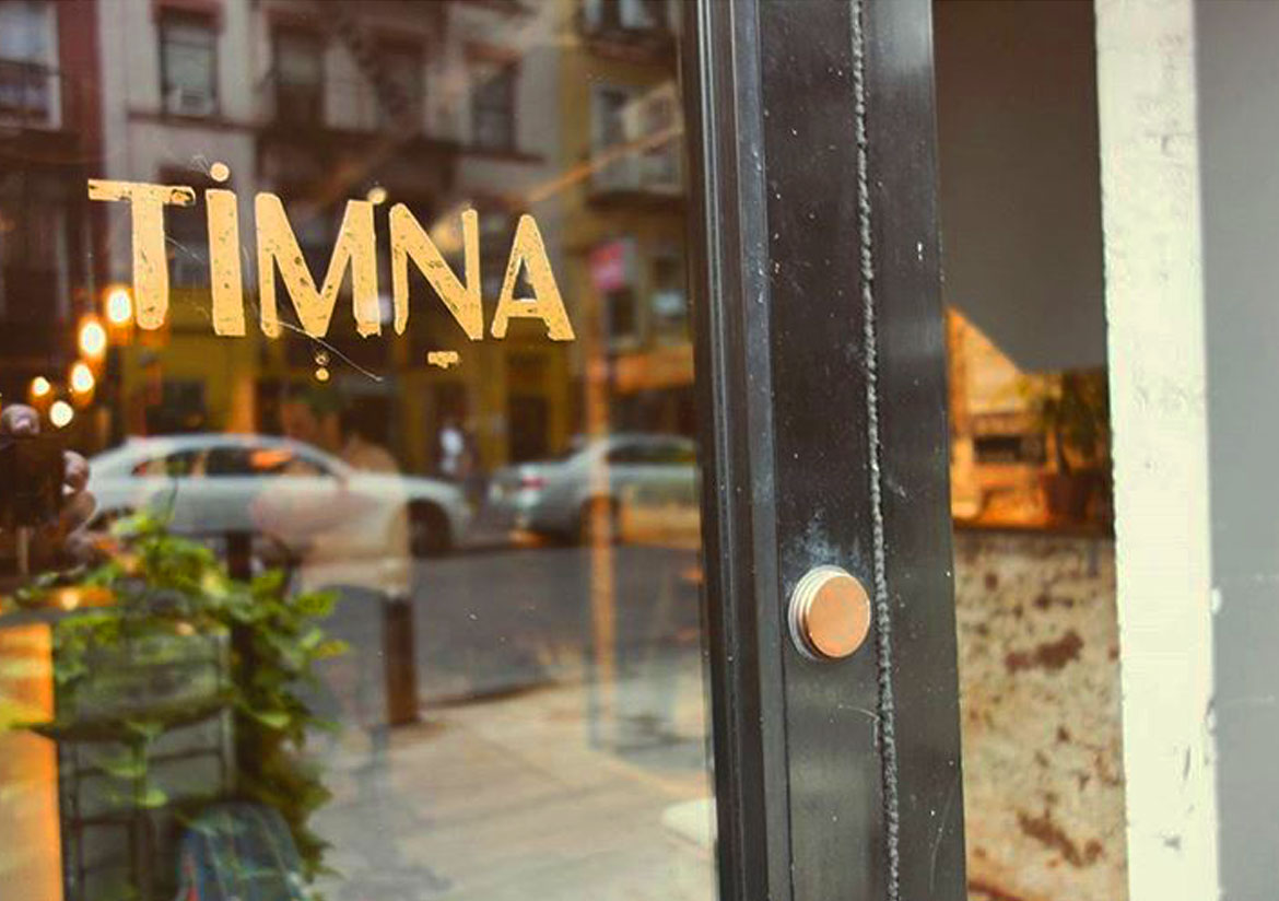
The work was carried out in collaboration with the owner and head chef of the restaurant. Tamna. The design team of NotFromHere They took off into a challenge of bringing the owner's vision to their restaurant in New York City. They say that a logo tells a story, perhaps it is even the beginning of a story, the monologue. There is work here with three elements, the first element is the name, the word. The word is an ancient biblical word presented in Latin letters. The second element is the character of the place and the character of the people behind the project. The choice was to use typographic work here that combines distinct elements from the Hebrew language, punctuation along with foreign letters for a name that is a biblical Hebrew word. Three elements that create a harmonious typographic logo. The restaurant is a mix of modern Israeliness with Mediterranean cuisine in the heart of the city that never sleeps. Timna is a cultural place with urban inspiration that combines the spirit of the old culture of the Middle East and the Mediterranean.
The restaurant takes its name from two places: the Timna Valley in Israel and the ancient city of the same name in Yemen, with strong roots dating back to the Spice Route in Egypt.
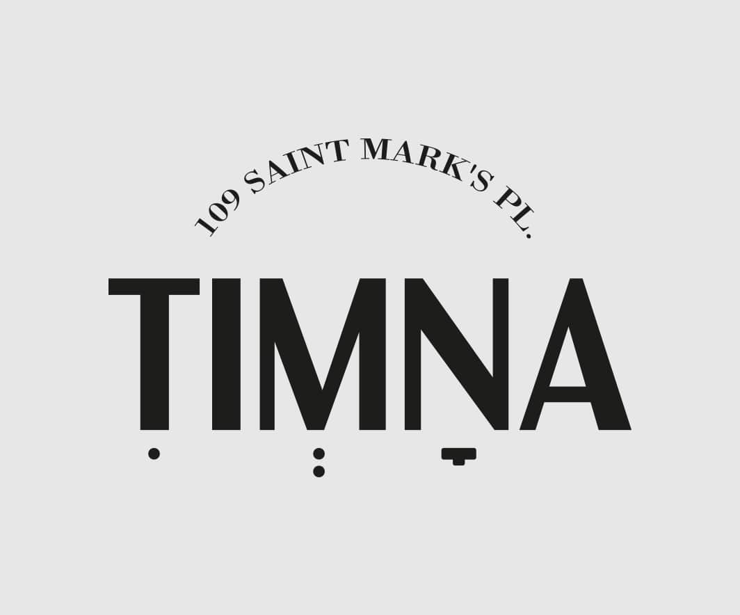
Timna Restaurant, located at 109 St. Marks in New York City, has quickly become one of the main venues in Manhattan’s East Village. The restaurant was named ‘Best New Restaurant of 2015,” and was recommended by USA Today as well as by newspapers such as the New York Times, Wall Street Journal Zagat, Time Out, The Village Voice, and The New Yorker.