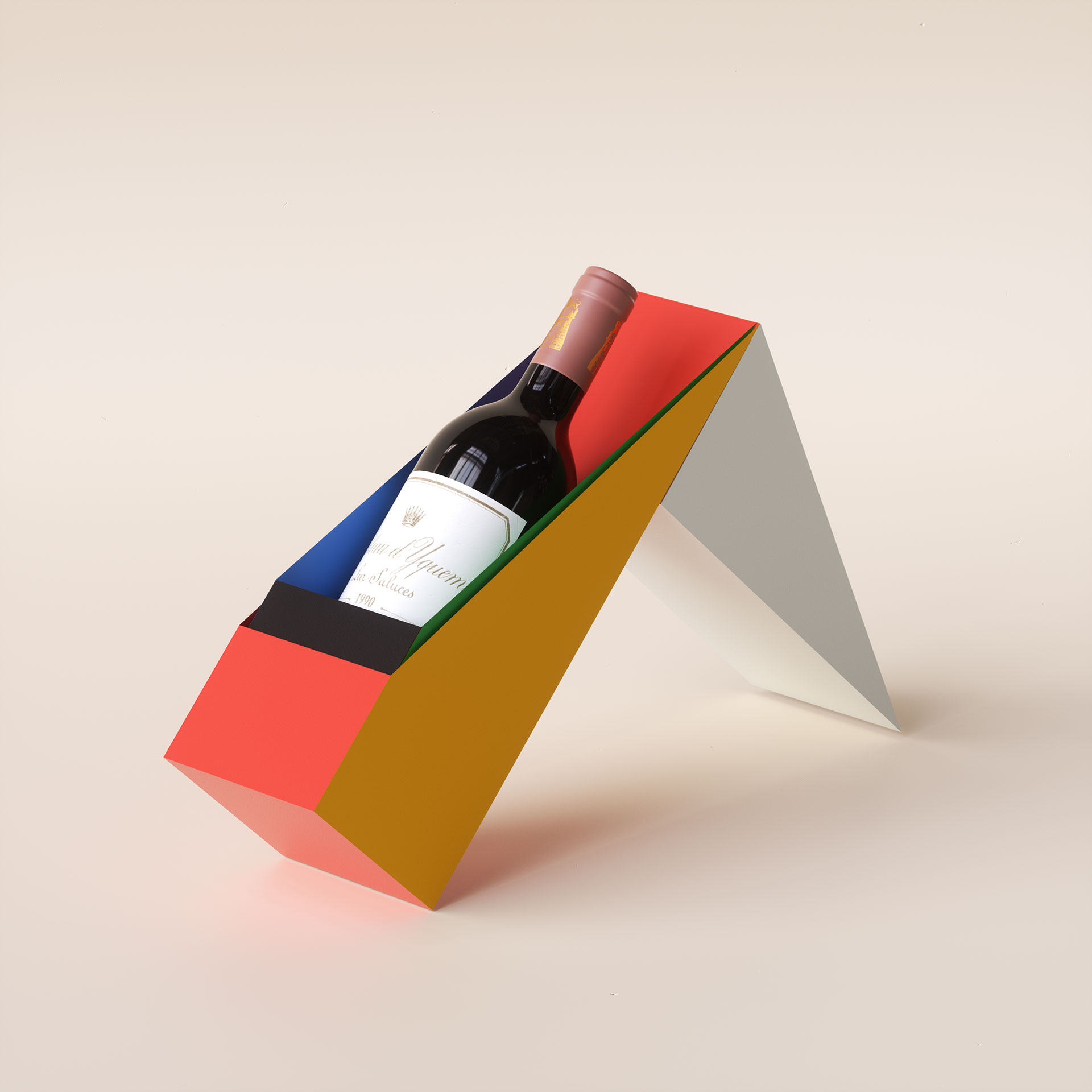
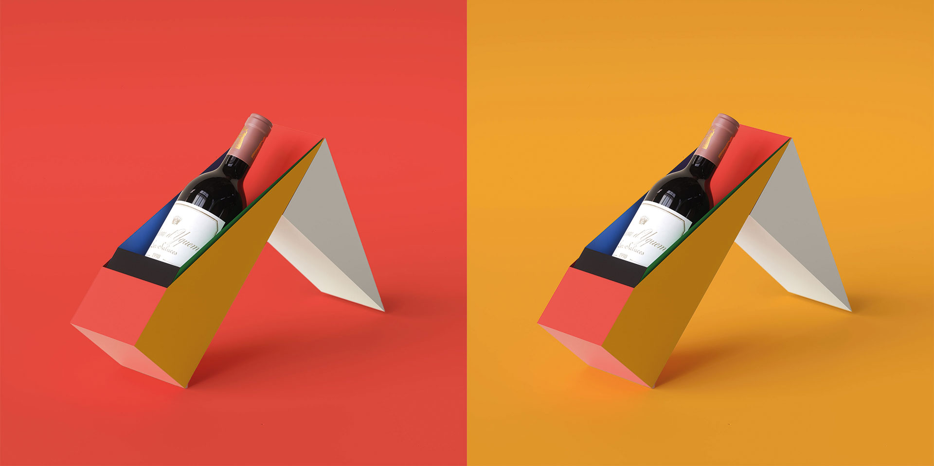
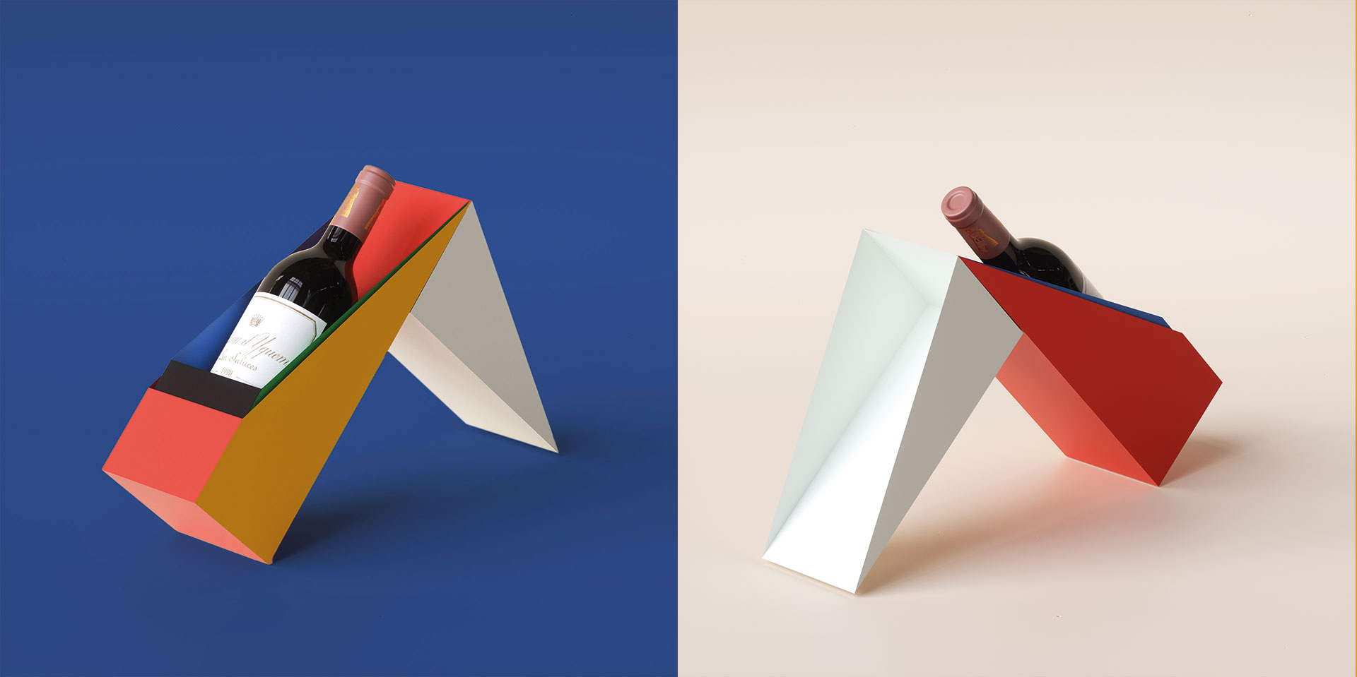
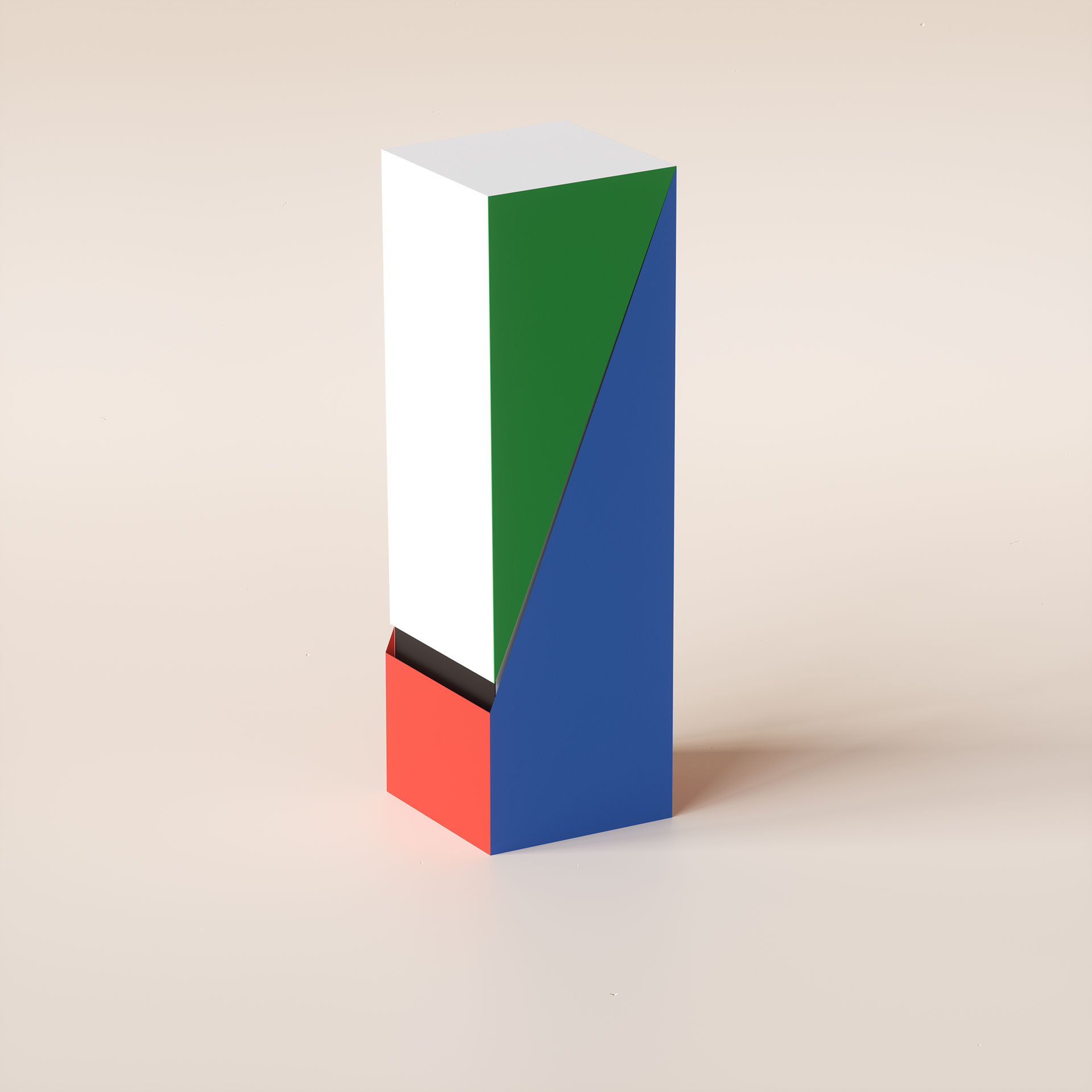
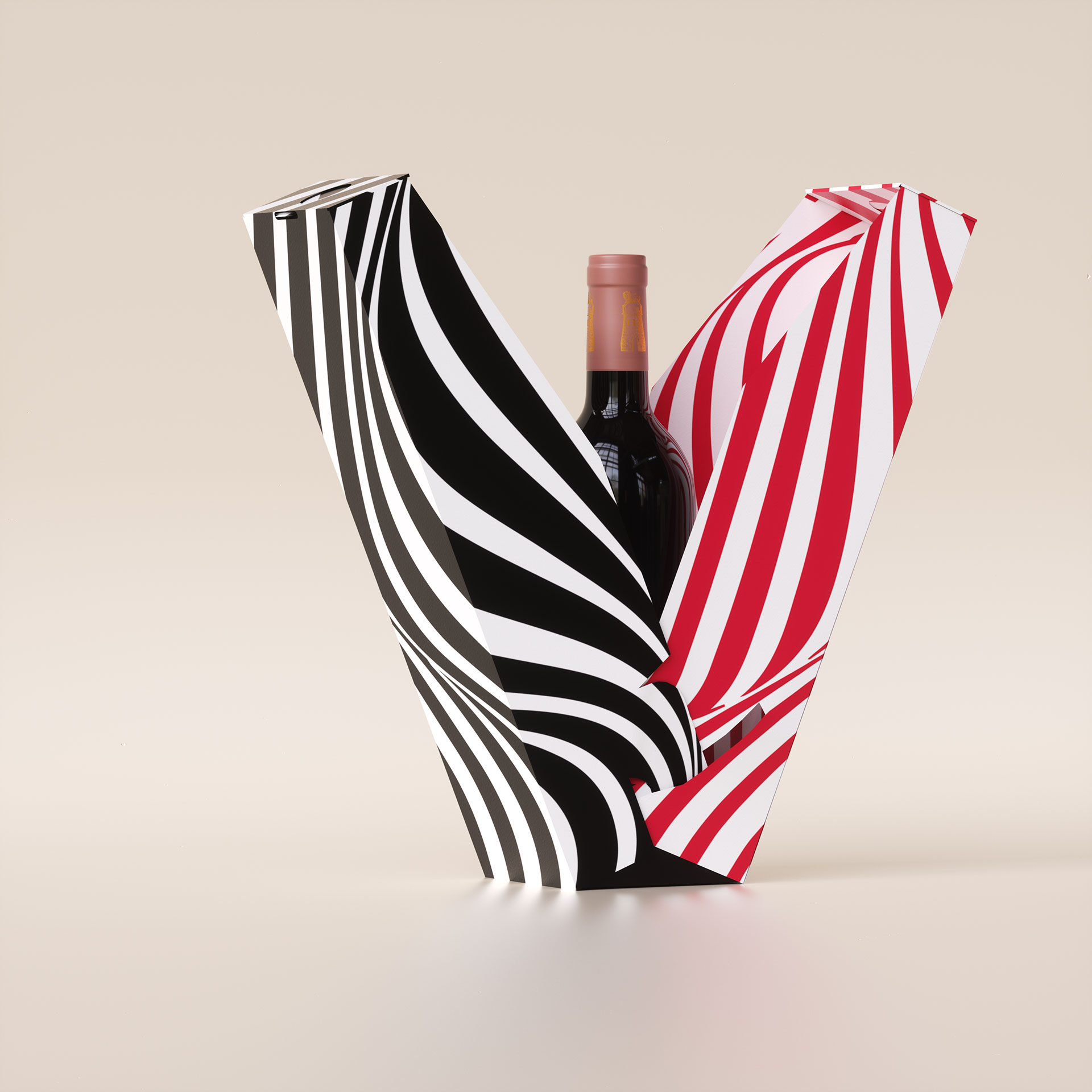
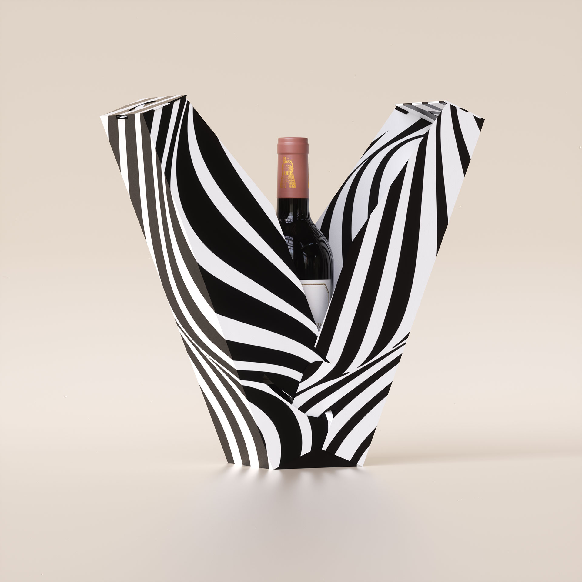
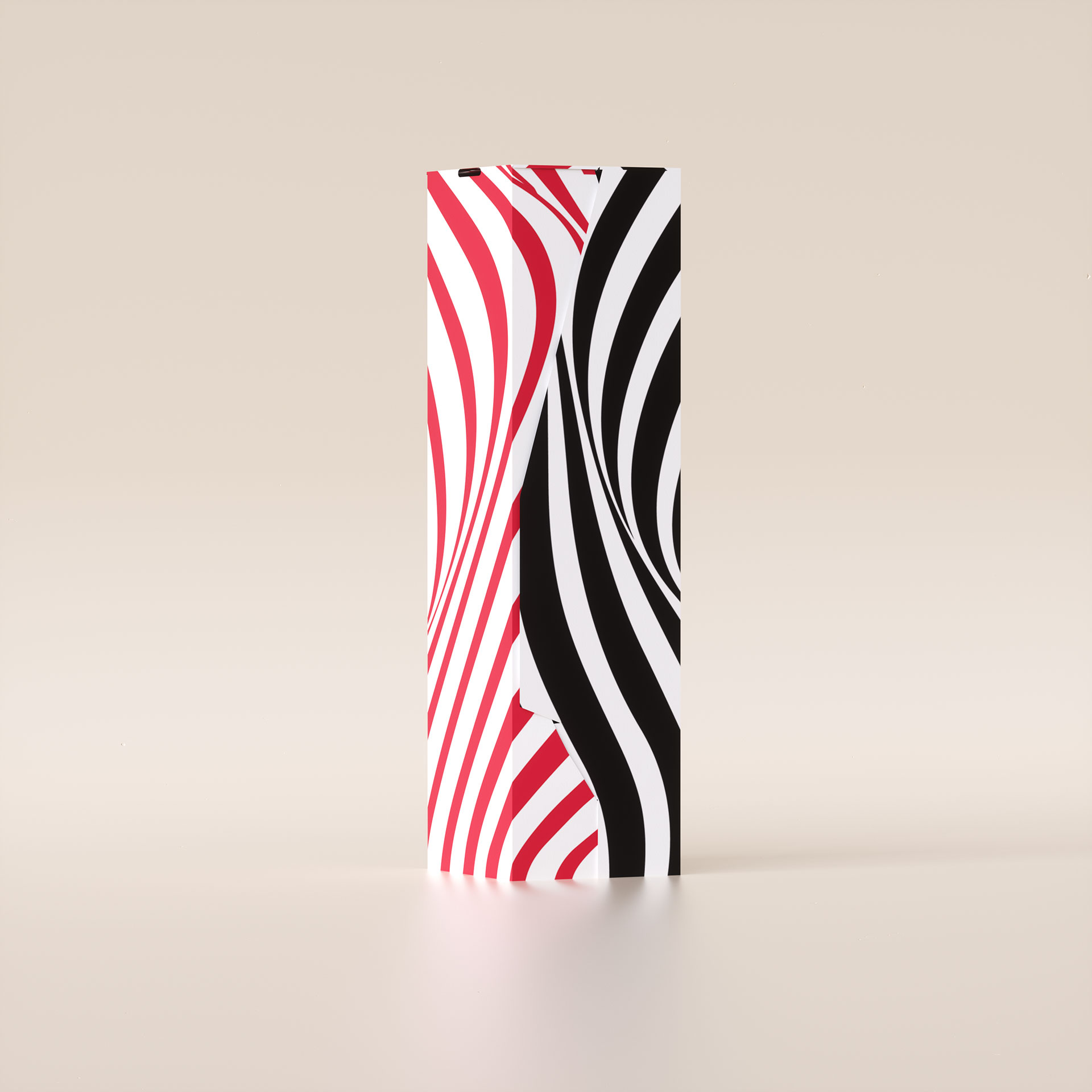
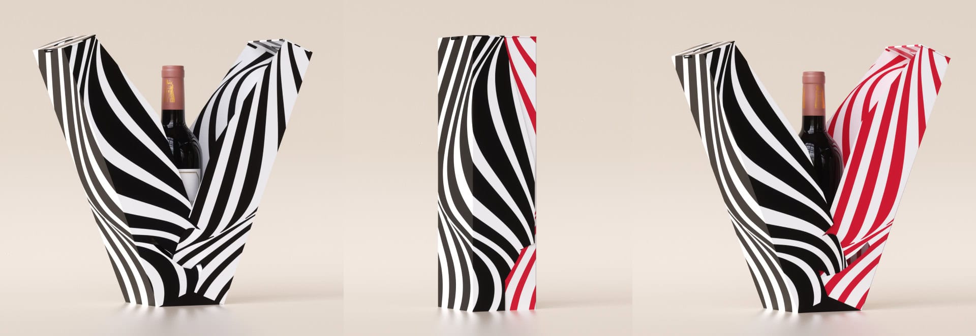
Creativity and art in the design of wine cases that provide an unusual visual experience
עיצוב ייחודי של סטודיו NotFromHere עיצוב מארז יין מקרטון קשיח, שילוב בין פונקציונאליות לתוצאה עיצובית משובחת. חיבור הוליסטי בין המשולש הקדוש, מותג, מוצר, אריזה. שילוב בין פונקליונאליות לאסתטיקה. עיצוב המארז משמש כחלק בלתי נפרד מהיין עצמו כאשר שניהם מדברים אחד עם השני ומעצימים את חווית המותג. המארז כולו מקרטון, מחומרים הניתנים למיחזור.
בדומה להתייחסות שלנו למבניות ולפריסה ישנה התייחסות לחווית הפתיחה – חווית האנבוקסינג שמלווה אותנו. ניסינו לייצר חוויה שתהייה בהלימה לחווייה של הפתיחה של בקבוק היין. בואו ניתן לו לנשום לרגע.
I don't know anyone who doesn't like wine. Red, white, pink, sparkling, still, dry, semi-dry, quarter-dry, wine. Here are some results from very diverse studies that examined the advantages and disadvantages of drinking wine. The results are a bit ambiguous :) "Drinking a glass of wine with meals reduces the risk of type 2 diabetes". "A bottle of wine is worth 10 cigarettes" "Red wine improves the health of cells in blood vessels".…
At the World Packaging Awards in Milan, inside the Versace Palace. 500 projects from 40 countries stood before the judges. Then our name was called. Not once, but twice. GoChess — first place. 32ºN — first place. Two completely different packaging solutions. Both were built with precision, with a story, and with complete respect for the product inside. It was never about trends. It was about faith. Q - Structure is a language. Q…
תראו באיזו פשטות יכול מותג חלב לבלוט מעל המתחרים. הכל בעזרת עיצוב נקי פשוט ומינימליסטי של אריזה סופר קריאייטיבית.הצבעים של הקרטונים מסמלים את אחוז השומן שיש בכל אריזה, מספר שגם מודגש בבירור עם פונט מאוד מדוייק, שמופיע בפרונט.אפשר בשקט להפסיק עם ציורים של פרות, בתים ומדשאות. NotFromHere