[bread]
ההבדל בין מעצב גרפי למעצב אופנה הוא שעיצוב גרפי אינו מותנה בטרנדים, בעיצוב אופנה יש בין 2–4 קולקציות לשנה, ומה שהיה אופנתי השנה יהיה לא רלוונטי בשנה הבאה. לכן כל המושג טרנדים בעיצוב אריזות הוא משפט טרנדי לחלוטין שכל המשמעות שלו היא מילות חיפוש בגוגל.
So here are four packaging design trends worth looking at this year –
And of course also to respond:
1 IN-House user experience
2 Minimalism
3 Recycling materials & Environmental vision
4 Brand Messages
INHouse user experience
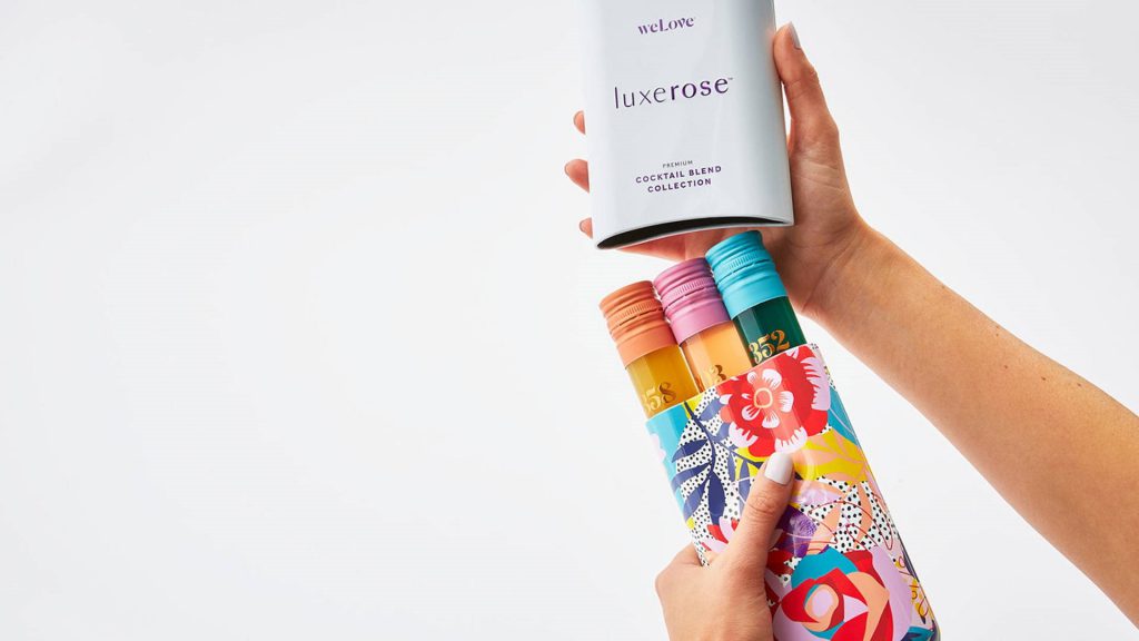
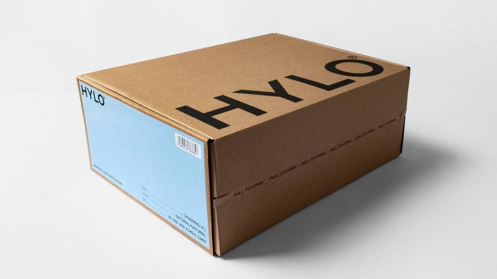
עם כל שנה שעוברת ואיתה ההתחזקות של האיקומרס, משתנה החוקיות לגבי מה נכון ומה צריך לעשות כשמעצבים אריזה. בטוחה ששמעתם בעבר את המונח האלגוריתם של גוגל והשינויים שהוא מביא, ככה אמזון ודומיה משפיעים על האופן ועל השינויים שאנחנו לוקחים כשמעצבים אריזה.
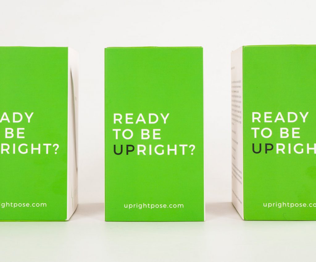
במקום להסתכל על המוצר במדפים או בחנויות מהממות עם תצוגה של ארגזי תאורה שקופים, אנחנו מסתכלים על המוצר בסדרה של ארבע עד שש תמונות ובמקרה הטוב אחת מהן היא האריזה – לכן השיקולים בעיצוב האריזה של לבלוט על המדף על פני האחרים כבר לא משחקים תפקיד.
מה שחשוב הוא מה קורה כשהאריזה מגיעה הביתה. העיצוב שלה, הנראות שלה – הנייר שעליו היא מודפסת, המסרים שהמותג מעביר, למעשה זאת האפשרות לתקשר עם הלקוח שלנו באופן הרבה יותר אישי, ולהעביר אותו חוויה ותהליך אינטימי שקורה בבית.
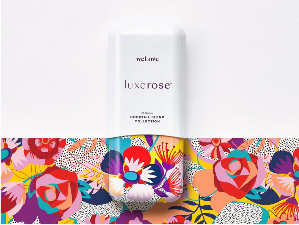
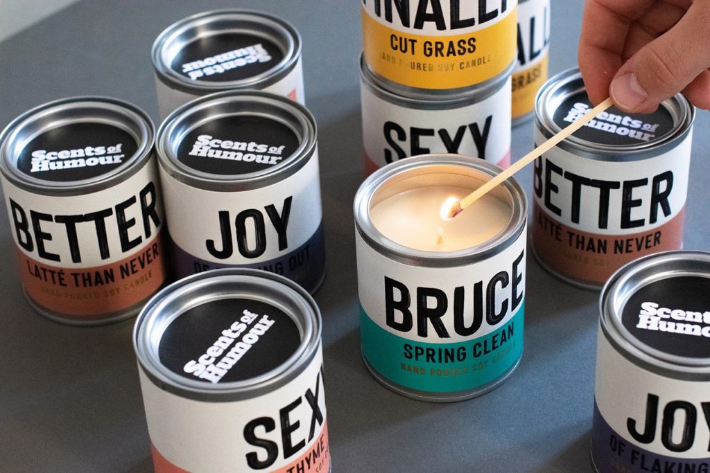
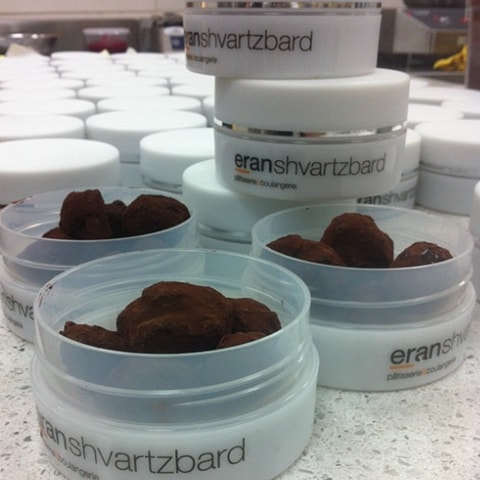
Minimalism
בתוך כל העודף מידע וההצפה של תוכן, ויזואל, צבע, מילה ווידאו שרודפים אחרינו בכל מקום שאנחנו נמצאים בו, דווקא בתוך העולם של האריזות נוצר איזה רגע של שקט. רגע שאפשר שנייה לנשום לתוכו.
המינימליזם, שבעבר היה יותר מוקצה כי רצו להגיד המון דברים על האריזה, מקבל זכות קיום חדשה שמתאפשרת וכן כי מישהו בכל זאת התחיל את הטרנד הזה. אז נכון שאפל (Apple) התחילו עם זה כבר לפני כמה שנים – ונכון שאני סותרת את עצמי כי אמרתי שאין טרנדים – אז אני אדייק: זה לא טרנד, זו מניירה עיצובית.
היא מתאפשרת כשהמוצר שארוז בתוך האריזה שייך למותג. וכשיש מותג חזק אז אפשר הכל, ואפשר גם לא להגיד כלום ואפשר לשים לוגו קטן ואולי בכלל לוותר על הלוגו ולשים רק סמל, ומי שאמיץ עושה גם אריזה לבנה לגמרי. באמת שבתוך העולם המינימליסטי הגבולות הם אינסופיים. וכדי לחזק את הטענה שזה לא טרנד – אז קנדינסקי עשה ריבוע שחור, ריבוע לבן כבר לפני הרבה הרבה מאד שנים. מותג כבר אמרנו…
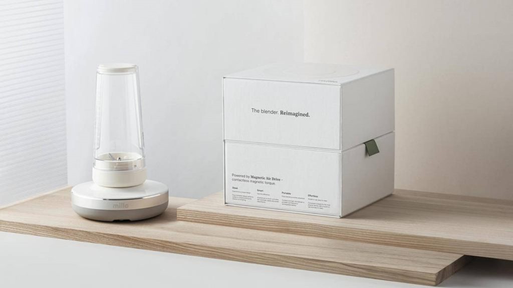
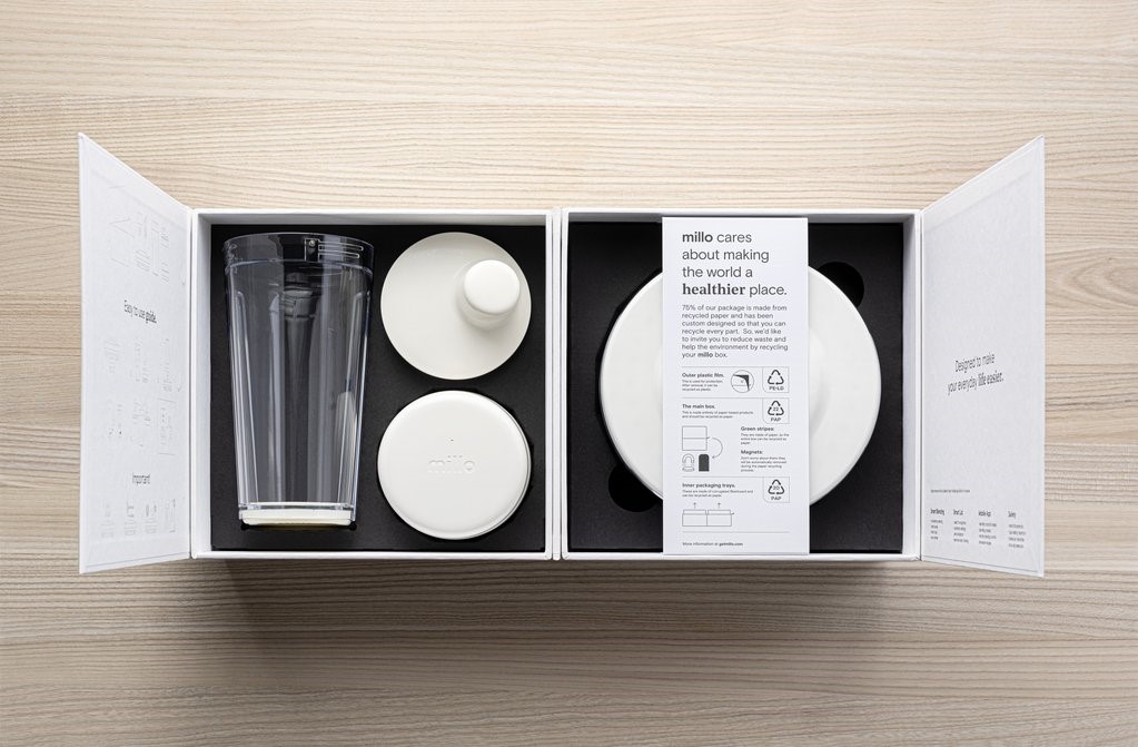
source: https://thedieline.com/blog/2020/12/18/millos-blender-gets-futuristic-packaging-that-thinks-ahead
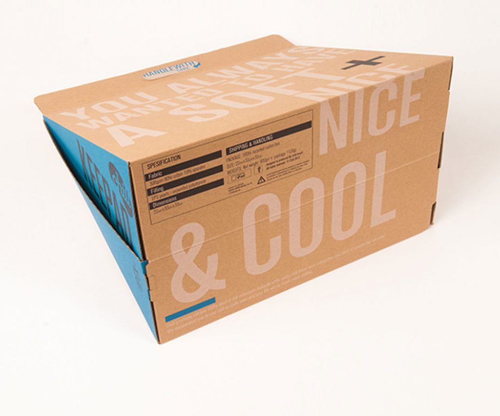
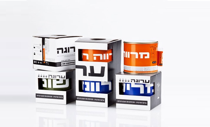
Recycling materials & Environmental vision
שימוש בקרטון חום, הדפסה בצבע אחד, שימוש בצבעים על בסיס סויה כל אלו אינם ברירות מחדל, אלא ערכים שבאים מחזון, מאמונה ומהידיעה שאנחנו כאן בשביל קודם כל לתת. חברות רבות מפנימות את הדרך ששוב גם כאן התחילו גדולים וטובים כמו פטגוניה, שהיא בין המותגים המובילים וכנראה אף אחד לא עושה את מה שהיא עושה, אבל שוב גם כאן נכנס משהו מהסעיף הקודם – של מותג חזק אבל זה כבר במאמר הבא.
שימוש בחומרים ממוחזרים ובהדפסה במעט צבעים מתאפשר היום כי, וזה חוזר קצת לדברים שנכתבו בסעיף הראשון, המותגים לא מתחרים על המדפים ולא מתחרים על נראות במדף. החוויה והתוצאה בשימוש בחומר ממוחזר חשובה ומהווה סיפור וקשר ישיר בין המותג והלקוח בשלב פתיחת האריזה בבית. הקופי שמשחק על החזון של המותג יחד עם הסיפור של האג’נדה הסביבתית מייצר חוויה שלמה והוליסטית.
Brand Messages
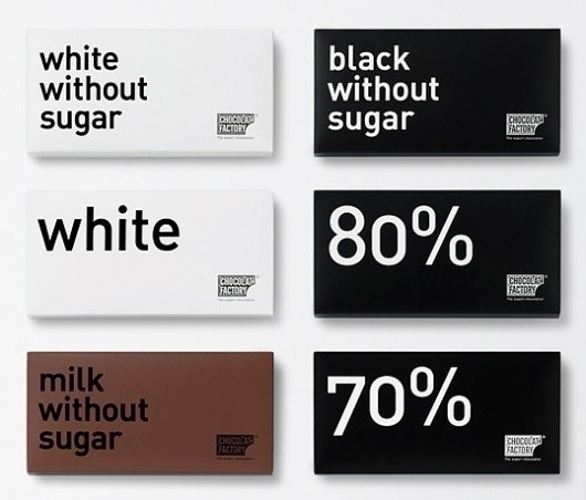
Messages on packaging: A recurring debate between the designer and the client about the number of messages, their multiple nature, and their size. Multiple messages do not present the desired result but create excess information, overload, and along the way we lose the client who will ultimately skim through things and prefer to move on with life with a little less messages.
Hierarchy is a complicated thing, and it is true that it is difficult to decide what is more important, but we must make a decision in this place and understand that in order to achieve the result we need to be very focused. In addition to the fact that we lose the customer, we also do not really convey to him a clear message of what we want to say. What is important now is what is the most important thing that can be said about the product, the message that we want the reader to understand and feel immediately when he examines the packaging.